Are you ready to learn how to create a choropleth map with JavaScript like a boss? Maps are a powerful way to visualize data, but building one from scratch can be a daunting task. Don’t worry, I’m here to help!
In this tutorial, I’ll guide you through the process of building a JavaScript choropleth map step by step. And to make things more interesting, we’ll use Queen Elizabeth II’s state visits as an example to showcase the power of this type of map.
Get ready to impress yourself and your audience with stunning data visualizations, and let’s get started on this exciting journey together!
What Is a Choropleth Map?
A choropleth map is a type of thematic map that uses color to represent values of a specific quantity within different regions or geopolitical areas. The map is divided into areas or polygons, and the color of each area represents the value of the data being visualized. Typically, darker shades of color indicate higher values, while lighter shades represent lower values.
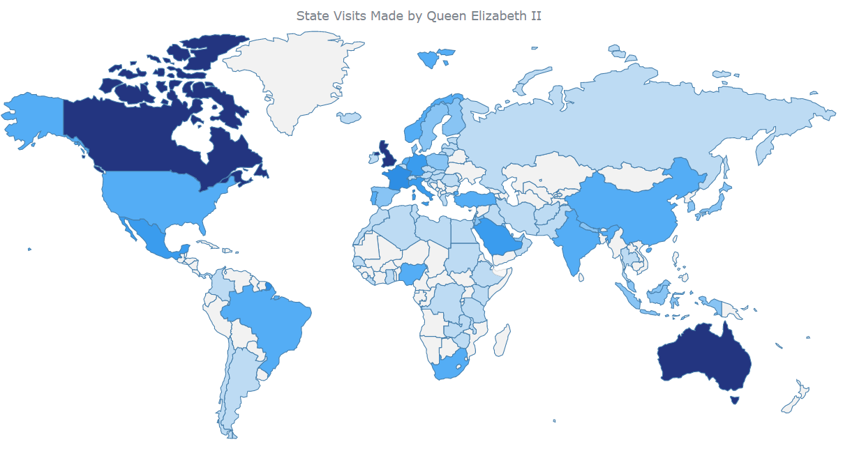
So, as I mentioned, in this tutorial, we’ll be creating a JS-based choropleth map to showcase Queen Elizabeth II’s state visits around the world. By using different colors to represent the number of visits in each region, we can easily identify which areas the Queen visited the most frequently. The final interactive choropleth map will look like this:
How To Build a Basic Choropleth Map
Creating a choropleth map with JavaScript may seem challenging, but fear not! There are just four simple steps to follow:
- Set up an HTML page to display the map.
- Add all the necessary JavaScript files.
- Include the data.
- Write the required JavaScript code to render the map.
Once you’ve completed these four steps, you’ll have a beautiful choropleth map that accurately represents your data. So, let’s dive into each step in more detail and learn how to easily create a stunning JavaScript choropleth map!
1. Set up an HTML Page To Display the Choropleth Map
To start creating the choropleth map, the first step is to set up an HTML page with a div element and give it a unique ID to reference it later.
I’ll set the width and height of the div element to 100% to render the map on the whole page, but you can adjust these values to suit your needs. This div element will be the container for the chart, and the ID will be used to reference it in the JavaScript code. So, let’s get started by creating the HTML page for the upcoming choropleth map!
<html>
  <head>
    <title>JavaScript Choropleth Map</title>
    <style type="text/css">
      html, body, #container {
        width: 100%; height: 100%; margin: 0; padding: 0;
      }
    </style>
  </head>
  <body>
    <div id="container"></div>
  </body>
</html>
2. Add All the Necessary JavaScript Files
To easily create data visualizations for the web, I use a JavaScript charting library with in-built utilities and functions. With the vast number of such JS libraries available, the process for creating charts and maps is similar in essence and logic across most of them. In this tutorial, I am using the AnyChart JS charting library as it is beginner-friendly, with extensive documentation and plenty of examples to help you get started.
It is needed to link the required JS scripts in the <head> section of the HTML page. These scripts include the Core and Geo Maps modules and the file that contains geodata for the world map, all of which are available on the CDN. I’ll also use two more script files to connect the data to the choropleth map. One is the Data Adapter, which will help load the data, and the other is Proj4js, a JavaScript library that will transform the coordinates from one coordinate system to another so the data can be plotted on the map accurately.
<html>
  <head>
    <title>JavaScript Choropleth Map</title>
    <script src="https://cdn.anychart.com/releases/8.11.0/js/anychart-base.min.js"></script>
    <script src="https://cdn.anychart.com/releases/8.11.0/js/anychart-map.min.js"></script>
    <script src="https://cdn.anychart.com/releases/8.11.0/geodata/custom/world/world.js"></script>
    <style type="text/css">
      html, body, #container {
        width: 100%; height: 100%; margin: 0; padding: 0;
      }
    </style>
  </head>
  <body>
    <div id="container"></div>
    <script>
      // All the code for the JS choropleth map will come here
    </script>
  </body>
</html>
3. Include the Data
Alright, let’s get the data loaded up and plotted on the JS choropleth map! First things first, I have collected the data on the state visits made by Queen Elizabeth II from Wikipedia and put it in a JSON file for easy access. You can find it here.
All the necessary files are already linked in the <head> section of the HTML page. So it’s possible to use the loadJsonFile() method inside a <script> tag in the body of the page to load the JSON file containing the Queen’s state visits data.
anychart.data.loadJsonFile(<fileURL>, function (data) {});Great! Now that everything is set up and ready to go, it’s time to move on to the main part of the journey: creating the choropleth map visualization! Let’s do this!
4. Write the Required JavaScript Code To Render the Map
You can get the choropleth map rendered with just a few lines of JS code. First, make sure that all the code is inside the function anychart.onDocumentReady() so that the page is fully loaded before executing anything else. Once the data file is loaded, set the data, create the map, and set the geodata.
<script>

  anychart.onDocumentReady(function() {

    // load data from a json file
    anychart.data.loadJsonFile('https://gist.githubusercontent.com/shacheeswadia/8f45da54d9bf2032fee201dbfc79e0e4/raw/5d10d58f40b4a1d994cef36dbc64545ef90ead80/queenVisits.json',
    function (data) {

      // create a dataset
      let dataSet = anychart.data.set(data);

      // create a map instance
      let map = anychart.map();

      // set the geodata
      map.geoData("anychart.maps.world");

      // the rest of the JS code will be here

    });

  });

</script>
Now, create a series with the choropleth() function and the loaded data. For the coloring, let’s set up a linear color scale with four different shades of blue based on the colors on the royal website. As per convention, the darker the shade of a country, the higher the number of visits to that region.
// create a choropleth series
let series = map.choropleth(dataSet);

// set the map colors
series
  .colorScale(
     anychart.scales.linearColor("#f2f2f2", "#42a5f5", "#1976d2", "#233580")
   );
Finally, give a title to the map, set the container, and draw the resulting map.
// set the map title
map.title("State Visits Made by Queen Elizabeth II");

// set the container
map.container('container');

// initiate the map drawing
map.draw();
And voila! A beautiful and functional choropleth map is ready! Check out how it looks. You can find the entire code below or view and play with it here.
<html>
  <head>
    <title>JavaScript Choropleth Map</title>
    <script src="https://cdn.anychart.com/releases/8.11.0/js/anychart-base.min.js"></script>
    <script data-fr-src="https://cdn.anychart.com/releases/8.11.0/js/anychart-map.min.js"></script>
    <script src="https://cdn.anychart.com/releases/8.11.0/geodata/custom/world/world.js"></script>
    <style type="text/css">
      html, body, #container {
        width: 100%; height: 100%; margin: 0; padding: 0;
      }
    </style>
  </head>
  <body>
    <div id="container"></div>
    <script>
      anychart.onDocumentReady(function () {
        // load data from a json file
        anychart.data.loadJsonFile(
          "https://gist.githubusercontent.com/shacheeswadia/8f45da54d9bf2032fee201dbfc79e0e4/raw/5d10d58f40b4a1d994cef36dbc64545ef90ead80/queenVisits.json",
          function (data) {
            // create a dataset
            let dataSet = anychart.data.set(data);
            // create a map instance
            let map = anychart.map();
            // set the geodata
            map.geoData("anychart.maps.world");
            // create a choropleth series
            let series = map.choropleth(dataSet);
            // set the map colors
            series
              .colorScale(
                anychart.scales.linearColor("#f2f2f2", "#42a5f5", "#1976d2", "#233580")
              );
            // set the map title
            map.title("State Visits Made by Queen Elizabeth II");
            // set the container
            map.container("container");
            // initiate the map drawing
            map.draw();
          }
        );
      });
    </script>
  </body>
</html>
How to Customize a Choropleth Map
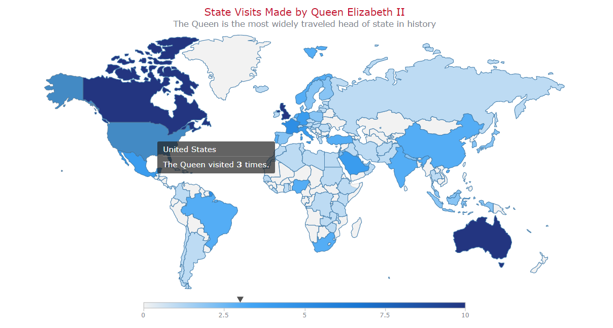
The existing choropleth map is already impressive, but let me show you how to make it even more insightful and engaging! In the following steps, I’ll demonstrate how you can customize the choropleth map to add more visual appeal and interactivity:
- Modify the colors by hovering over map areas.
- Add a color legend.
- Improve the tooltip and the title format.
- Add zoom controls.
1. Modify the Colors by Hovering Over the Areas
You can make the map more visually appealing by modifying the colors of the hovered regions. By default, hovered regions become gray, but you can change this to a darker shade of the base color to make it more intuitive. This can be achieved by changing the fill color of the region when it is hovered and using the darken() function.
series
  .hovered()
  .fill(function (d) {
    return anychart.color.darken(d.sourceColor, 0.2);
  });
2. Add a Color Legend
Adding a color legend to your choropleth map is always a great idea, as it can help your audience understand the values and colors used in the map.
To add a color legend, you only need to enable the color range. This will automatically create a legend that represents what color indicates what value. By default, the color range is disabled. To enable it, you just need to add a few lines of code:
map.colorRange()
  .enabled(true);
And voila! You now have a beautiful and informative color legend to complement your choropleth map.
3. Improve the Tooltip and Title Format
Let’s take the choropleth map to the next level by improving the tooltip and the title format. Tooltips are a powerful way to showcase additional information, and they can be made even better by enabling HTML for customizing the tooltip and formatting the value.
I thought it would be nice to add a custom text and indicate how many times the Queen visited the hovered country. Additionally, the specific case of the United Kingdom can be handled to showcase that the Queen lived there.
With these changes, the tooltip is not only more informative but also more visually appealing. The users will enjoy the playful tone of the tooltip while learning interesting facts about the Queen’s travels.
} else {
return (
“
The Queen visited ” +
d.value + “ times.
”
);
}
});” data-lang=”text/javascript”>
series
  .tooltip()
  .useHtml(true)
  .format(function (d) {
    if (d.name == "United Kingdom") {
      return "<h6 style="font-size:14px; font-weight:400; margin: 0.2rem 0;">The Queen lived here.</h6>";
    } else {
      return (
        "<h6 style="font-size:14px; font-weight:400; margin: 0.2rem 0;">The Queen visited <b>" +
          d.value + "</b> times.</h6>"
      );
    }
  });
In addition to customizing the tooltip, why not enhance the chart title using HTML? For example, a subtitle will provide more context, and custom text styling will make it all shine.
map
  .title()
  .enabled(true)
  .useHtml(true)
  .text(
    '<span style="color: #c8102e; font-size:18px;">State visits made by Queen Elizabeth II</span>' +
      <span style="font-size: 15px;">(The Queen is the most widely travelled head of state in history)</span>'
  );
4. Add Zoom Controls
Adding zoom controls to a world map can be a great way to allow users to zoom into specific areas of interest. To get started, add the required scripts and CSS links to your HTML document’s <head> section. Once you have done this, you can create the zoom controls and render them on the map with just a few lines of code.
<script src="https://cdn.anychart.com/releases/8.11.0/js/anychart-exports.min.js"></script>
<script src="https://cdn.anychart.com/releases/8.11.0/js/anychart-ui.min.js"></script>

<link rel="stylesheet" type="text/css" href="https://cdn.anychart.com/releases/8.11.0/css/anychart-ui.min.css">
<link rel="stylesheet" type="text/css" href="https://cdn.anychart.com/releases/8.11.0/fonts/css/anychart-font.min.css">
var zoomController = anychart.ui.zoom();
zoomController.render(map);It’s worth noting that the zoom feature can be particularly useful when working with large and detailed choropleth maps. In this case, it can be a great way to allow users to explore specific regions or areas of interest in more detail.
And now, just sit back and admire your beautiful JavaScript choropleth map! With the addition of customized colors, a color legend, improved tooltips and titles, and zoom controls, it’s an interactive and engaging visualization that is sure to impress. See the complete code for this project below, and feel free to play with it and see the choropleth map’s full interactive version live here.
<html>
  <head>
    <title>JavaScript Choropleth Map</title>
    <script src="https://cdn.anychart.com/releases/8.11.0/js/anychart-base.min.js"></script>
    <script src="https://cdn.anychart.com/releases/8.11.0/js/anychart-map.min.js"></script>
    <script src="https://cdn.anychart.com/releases/8.11.0/geodata/custom/world/world.js"></script>
    <style type="text/css">
      html, body, #container {
        width: 100%; height: 100%; margin: 0; padding: 0;
      }
    </style>
  </head>
  <body>
    <div id="container"></div>
    <script>
      anychart.onDocumentReady(function () {
        // load data from a json file
        anychart.data.loadJsonFile(
          "https://gist.githubusercontent.com/shacheeswadia/8f45da54d9bf2032fee201dbfc79e0e4/raw/5d10d58f40b4a1d994cef36dbc64545ef90ead80/queenVisits.json",
          function (data) {
            // create a dataset
            let dataSet = anychart.data.set(data);
            // create a map instance
            let map = anychart.map();
            // set the geodata
            map.geoData("anychart.maps.world");
            // create a choropleth series
            let series = map.choropleth(dataSet);
            // set the map colors
            series.colorScale(
              anychart.scales.linearColor("#f2f2f2", "#42a5f5", "#1976d2", "#233580")
            );
            // customize the colors in the hovered state
            series.hovered().fill(function (d) {
              return anychart.color.darken(d.sourceColor, 0.2);
            });
            // create the map legend
            map.colorRange().enabled(true);
            // create zoom controls
            let zoomController = anychart.ui.zoom();
            zoomController.render(map);
            // customize the tooltip text
            series
              .tooltip()
              .useHtml(true)
              .format(function (d) {
                if (d.name == "United Kingdom") {
                  return "<h6 style="font-size:14px; font-weight:400; margin: 0.2rem 0;">The Queen lived here.</h6>";
                } else {
                  return (
                    "<h6 style="font-size:14px; font-weight:400; margin: 0.2rem 0;">The Queen visited <b>" +
                    d.value +
                    "</b> times.</h6>"
                  );
                }
              });
            // set the map title
            map
              .title()
              .enabled(true)
              .useHtml(true)
              .text(
                '<span style = "color: #c8102e; font-size:18px;">State Visits Made by Queen Elizabeth II</span>' +
                  '<br/><span style="font-size: 15px;">The Queen is the most widely traveled head of state in history</span>'
              );
            // set the container
            map.container("container");
            // initiate the map drawing
            map.draw();
          }
        );
      });
    </script>
  </body>
</html>
Conclusion
Сhoropleth maps are a powerful tool for visualizing data on a geographic scale. Using JavaScript, you can create stunning interactive ones that communicate complex information in a clear and concise manner.
Whether you’re tracking the travels of a monarch or visualizing the spread of a pandemic, the possibilities are endless. So, let your imagination run wild and start exploring the world through the lens of data!
Source link