In this article, I’ll show how to use modern CSS techniques to create an eye-catching, custom range slider with nothing but the native HTML <input> element.
Range sliders (<input type="range">) let users choose a value within a given range, providing an alternative input types such as <input type="number">.
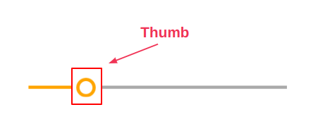
The default range slider styles don’t look great. The image below gives an idea of how range the sliders we’ll be styling are displayed by default in Chrome, Firefox and Safari.
But <input> elements are hard to style. Most of the online solutions for styling them rely on JavaScript and some cluttered code. Worse still, some of these techniques also break the accessibility of the element.
So let’s look at how to do things better, using just CSS, and without compromising accessibility. The CodePen demo below shows what we’ll be building.
See the Pen
CSS only custom range sliders by Temani Afif (@t_afif)
on CodePen.
Cool right? You’ll also find variations on these styles at the end of the article!
The Structure of the Range Input Element
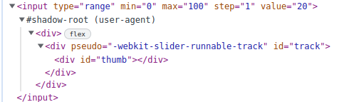
Let’s start by dissecting the structure of the range input element. It’s a native element, and each browser has its own implementation of such elements. We mainly have two different implementations.
There’s one for Webkit and Blink browsers such as Chrome, Edge, Safari, and Opera:
<input type="range" min="0" max="100" step="1" value="20">
  <div>
    <div pseudo="-webkit-slider-runnable-track" id="track">
      <div id="thumb">
    </div>
   </div>
  </div>
</input>
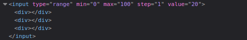
And this is the one for Firefox:
<input type="range" min="0" max="100" step="1" value="20">
  <div></div>
  <div></div>
  <div></div>
</input>
There’s a third implementation for IE, but thankfully that browser is all but dead and gone now!
Such inconsistency between browsers is what makes the task difficult, as we need to provide different styling for each implementation. I won’t dig more into this, as the article would never end, but I highly recommend reading this article by Ana Tudor for more in-depth exploration.
The only thing you need to keep in mind is that, whatever the implementation, we always have the “thumb” as a common component.
I’m only going to style this element, which will make my custom range slider easy to customize. Let’s jump straight into the code to see the magic in play.
Customizing the Input
The first step is to reset and disable all the browser default styles by using appearance: none and some other common properties:
input {
  appearance :none;
  background: none;
  cursor: pointer;
}
In a more complicated scenario, we may need to add more code in case other default styles are applied to our element. Simply just need to make sure we have a “naked” element without any visual styling.
Let’s also define a few CSS variables so we can easily create different variations for the range slider:
input {
  --c: orange;
  --g: 8px;
  --l: 5px;
  --s: 30px;

  width: 400px;
  height: var(--s);
  appearance :none;
  background: none;
  cursor: pointer;
}
At this step, only the thumb is visible with its default styles, as the CodePen demo below shows.
See the Pen
Default input styles — by Temani Afif by SitePoint (@SitePoint)
on CodePen.
Styling the Thumb Element
Let’s style the thumb element. We’ll start with the basic setup:
<thumb selector> {
  height: var(--s);
  aspect-ratio: 1;
  border-radius: 50%;
  box-shadow: 0 0 0 var(--l) inset var(--c);
  appearance: none;
}
The code should be self-explanatory. Nothing fancy so far, and we’ll get the result shown below.
See the Pen
Styling the thumb — by Temani Afif by SitePoint (@SitePoint)
on CodePen.
Note the use of two different selectors, as we explained in the first section:
input[type="range" i]::-webkit-slider-thumb { }

input[type="range"]::-moz-range-thumb { }
But how do you know the selector to use?
I’ve simply inspected the code of the input using the browser’s developer tools to see the selector each browser is using to style the thumb. The article I shared previously shows you how to manipulate the developer tools to get such information.
Adding Some Magic with border-image
Now we’re going to use a magic CSS trick to complete our slider. It involves the use of border-image:
border-image: linear-gradient(90deg,var(--_c) 50%,#ababab 0) 1/0 100vw/0 calc(100vw + var(--g));
I know it looks scary, but let’s dissect that line and you will see it’s not that difficult. The above is the shorthand for the following:
border-image-source: linear-gradient(90deg,var(--c) 50%,#ababab 0);
border-image-slice: 1;
border-image-width: 0 100vw;
border-image-outset: 0 calc(100vw + var(--g));
From the MDN page, we read:
The
border-imageCSS property draws an image around a given element. It replaces the element’s regular border.
Our image will be a gradient having two colors — the main one (defined by --c), and a gray color. We need the border image to cover the whole space of the input horizontally, so we use a big value for the left and right width (100vw) while we keep the top and bottom at (0).
But the border-image-width is limited to the element size. To overcome this, we need to also use a big value for the border-image-outset to increase the space available for the border image. From MDN again:
The
border-image-outsetCSS property sets the distance by which an element’s border image is set out from its border box.The parts of the border image that are rendered outside the element’s border box with
border-image-outsetdo not trigger overflow scrollbars and don’t capture mouse events.
When you first see the slider, it looks like we’re increasing the main color on the left, but in reality we’re sliding a fixed gradient that’s overflowing our element.
The following demo provides an overview of what’s happening under the hood.
See the Pen
Overview of the border-image trick by SitePoint (@SitePoint)
on CodePen.
Drag the thumb and slide it to see how things are moving. I’m using a small value for the width and outset so we can easily understand the trick.
Also, note that the outset needs to be bigger than the width to have the gap. For this reason, it’s defined to be equal to the width plus the value of the gap.
By adding overflow: hidden to the input element and using a big value, the illusion is perfect, as shown below.
See the Pen
Range Slider — overflow: hidden by SitePoint (@SitePoint)
on CodePen.
What about the
border-image-slice? Why the value of1?
This property is a bit tricky, but mandatory when using border-image. In our case, this value isn’t very relevant and a small positive value will do the job. I have a detailed Stack Overflow answer if you want to learn more about it.
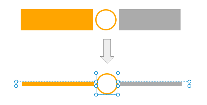
The last step is to decrease the size of the bar to match the size we defined by the variable --l. For this, we’re going to use clip-path:
clip-path:
    polygon(
       0     calc(50% + var(--l)/2),
      -100vw calc(50% + var(--l)/2),
      -100vw calc(50% - var(--l)/2),
       0     calc(50% - var(--l)/2),
       0 0,100% 0,
       100%  calc(50% - var(--l)/2),
       100vw calc(50% - var(--l)/2),
       100vw calc(50% + var(--l)/2),
       100%  calc(50% + var(--l)/2),
       100% 100%,0 100%);
The image below provides an overview of the different points to understand the shape of the polygon.
That’s it! We have a custom range slider with a few lines of code that you can easily control by adjusting a few variables.
See the Pen
Final Range Slider — by Temani Afif by SitePoint (@SitePoint)
on CodePen.
Adding Some Animation
What about some subtle animation when we interact with the slider? It doesn’t need a lot of code, and it will enhance the UX of the slider.
First, we’re going to transform the thumb from a border-only circle into a full circle when we click on it. For this, we increase the spread value of the box-shadow. Remember that we’ve used box-shadow to define the border of the thumb:
box-shadow: 0 0 0 var(--l) inset var(--c);
We update the var(--l) to var(--s) using the :active selector and the :focus-visible. The latter is related to keyboard navigation and allows us to have the same effect whether we use the mouse or the keyboard.
The code is as follows:
input[type="range" i]::-webkit-slider-thumb {
  box-shadow: 0 0 0 var(--l) inset var(--c);
  transition: .3s;
}

input[type="range" i]::-moz-range-thumb {
  box-shadow: 0 0 0 var(--l) inset var(--c);
  transition: .3s;
}

input:active::-webkit-slider-thumb,
input:focus-visible::-webkit-slider-thumb {
  box-shadow: 0 0 0 var(--s) inset var(--c);
}

input:active::-moz-range-thumb,
input:focus-visible::-moz-range-thumb {
  box-shadow: 0 0 0 var(--s) inset var(--c);
}
It’s a bit lengthy for a box-shadow transition, right? We can optimize it using a CSS variable:
input[type="range" i]::-webkit-slider-thumb {
  box-shadow: 0 0 0 var(--_b,var(--l)) inset var(--c);
  transition: .3s;
}

input[type="range" i]::-moz-range-thumb {
  box-shadow: 0 0 0 var(--_b,var(--l)) inset var(--c);
  transition: .3s;
}

input:active,
input:focus-visible {
  --_b:  var(--s);
}
I’m expressing the spread value using a variable, and I’m simply updating that variable on :active and :focus-visible.
I’m also going to add a little animation to the color. I’ll make it a bit darker on :hover. For this, I won’t update the color, but rather mix it with black using the new color-mix() function. This trick allows us to use the main color defined by --c rather than define a new dark color for each slider manually:
--_c: color-mix(in srgb, var(--c), #000 var(--p,0%));
I’m defining a new variable that will replace the --c in the code. Then by adjusting the percentage of the black color (#000) using the variable --p, I’m controlling the “darkness” of the color:
input:focus-visible,
input:hover{
  --p: 25%;
}
This feature isn’t yet supported in every browser, so the use of a fallback is highly recommended:
@supports not (color: color-mix(in srgb,red,red)) {
  input {
    --_c: var(--c);
  }
}
Our range slider is now perfect!
See the Pen
CSS only custom range sliders by SitePoint (@SitePoint)
on CodePen.
Conclusion
We’ve reached the end and haven’t had to deal with any complex browser-related implementation! We identified the selector of the thumb element and, using a few CSS tricks, we styled the whole range slider with it. Let’s not forget that we did this using only the <input> element, so we don’t have to worry about any accessibility issues, as we’ve kept the native functionality. The slider supports keyboard navigation without a problem.
Here are more examples of sliders using the same technique. I’ll let you dissect their code as an exercise.
See the Pen
Custom Range Slider — by Temani Afif by SitePoint (@SitePoint)
on CodePen.
See the Pen
Custom Range Slider — by Temani Afif by SitePoint (@SitePoint)
on CodePen.