[editor’s note: be sure to check out part 1 , part 2 , part 3 , and part 4 ]
in the fifth part of this javascript kinetic scrolling tutorial, a demo of the attractive cover flow effect (commonly found in some apple products) using the deadly combination of kinetic scrolling and css 3-d will be shown. the entire logic is implemented in ~200 lines of javascript code.
the cool factor of cover flow is in its fluid animation of the covers in the 3-d space. if you haven’t seen it before, you miss a lot! to get the feeling of the effect, use your browser (preferably on a smartphone or a tablet) to visit ariya.github.io/kinetic/5 . swipe left and right to scroll through the cover images of some audiobooks.
my first encounter to this cover flow effect was 6 years ago as i implemented this with pure software in c/c++. it ran quite well even on a lowly hardware (such as this 200 mhz htc touch ). of course, with gpu-accelerated css animation, there is no need to write an optimized special renderer for this. for this example, we manipulate the transformation matrix directly using css transform feature. to follow along, check the main code in coverflow.js .
there are several key elements in this demo. first, we will need a smooth scrolling with the right acceleration and deceleration using the exponential decay technique which was covered in part 2 . also, stopping the scrolling at the right position is necessary ( part 3 , see the snap-to-grid code) as we need to have all the cover images in the perfect arrangement, not halfway and not being stuck somewhere.
when you look at the code, the scrolling via mouse or touch events impacts the value of the variable offset . in fact, the code for doing that is line-by-line equivalent to what has been covered in the previous parts. on a normal circumstances, this offset is always an integer multiply of 200 (the cover image size, in pixels). when the user makes a touch gesture to drag the cover or when it is decelerating by itself, then the value could be anything. this is where we need to apply tweening to give the right transformation matrix for each cover image.
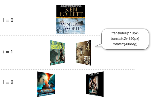
such a decoupling results in a modular implementation. all the events (touch, mouse, keyboard, timer) only deal with the change in offset, it has no knowledge as to how the value will be useful. the main renderer, which is the scroll() function, knows nothing on how that offset value is computed. its responsibility is very limited: given the offset, compute the right matrix for every single cover. this is carried out by going a loop through the stack of the covers, from the front-most image to the ones in the far background, as illustrated in this diagram. note how the loop also serves to set the proper z-index so that the center image becomes the front cover and so on.
every image is initially centered on the screen. after that, the right translation is in the x axis is computed based on the relative position of the image. for a depth perception, there will be an additional translation in the z axis , making the cover going farther from the screen. finally the image is rotated (in the y axis ) with a positive angle and a negative angle for the left and right side, respectively. the 3-d visual comes from the perspective of the main div element which is the parent of every single image element.
the entire scroll() is about 40 lines. if the explanation above is still confusing, it is always fun to step through the code and watch the variables as it goes through one cover to another. the code is not crazily optimized, it is deliberately chosen to be as clear as possible without revealing too much. having said that, with the most recent ios or android phones, the effect should be pretty smooth and there is not any problem achieving over 30 fps most of the time. you will get some minor extra frames (particularly useful for older devices) if the reflection effect is removed.
since this demo is intended to be educational, i left a few exercises for the brave readers. for example, the tweening causes only one cover to move at a time. if you are up for a challenge, see if you can move two covers, one that is going to the front and one that is going to the back. in addition, the perspective here is rather a cheat since it applies on the parent dom element (as you can witness, these transformed images have the same vanishing point). applying an individual perspective and y-rotation requires wrapping every img element with its container. of course, the 3-d effect does not have to be like cover flow as you could always tweak the matrix logic so that it resembles e.g. montagejs popcorn instead.
once you leave the flatland, there is no turning back!
Source link