Have you ever scanned a blog post and gave up reading midway through? Maybe the design looked like early ‘90s coding, or maybe the lines were too long or set in a tiny font? So, why did you give up reading that blog post? Maybe it has to do with readability.
Today, we’ll go through the basics of readability and how it functions as part of the user experience. Readability, as part of UX, is an integral way of presenting content so that it’s more understandable for readers.
We’ll take a deep dive into what makes up readability, and throughout, show how important readability is to anything you put up online.
Ready to increase your readability score?
Let’s dive in!
What is readability?
When we talk about readability, we really are talking about content. So what is readability and what does content have to do with it?
Readability measures the way your content is presented to modern audiences.
When you go online, most of what you see is text. According to discussions at ResearchGate, approximately 75 percent to 80 percent of total web data is text. Website readability measures how well your website users interact with your content.
Today, we’ll consider the notion of readability as a function of the way content is written; the legibility of how that content is presented; and how comprehensible it is to your target audience. These three scales must be balanced for your content to be truly readable.
Your text must be accessible to reach as many readers as possible.
Writing content for readability
Readability is just that: how easily your text allows your users to read it. It all starts with the way you write and structure your content. Keep in mind the following when writing your text:
1. Be mindful of your vocabulary
The vocabulary you use could easily turn into gatekeeping because not all users can access your content. For example, if you’re writing an app for beginner French language learners and you’re using advanced French for your content, then you’re keeping out the exact people you want to reach.
If you don’t already know, English is the most used language on the internet. But not all internet users are high-school-level English users. Some are Grade 5 or Grade 4 English users.
Some apps are designed to track readability because they know the importance of using the appropriate vocabulary for target users. Determine the vocabulary grades of your users, and match your content with it with apps such as Hemingway Editor.
The reading level of your target audience is important data you need to scope out. Once you discover this, make sure your content is reaching them by matching their vocabulary.
If you use the terminology and vocabulary of your target user, you’re more likely to be relevant to them, leading them to a more personalized experience. This is key.
2. Use an inverted pyramid delivery
Before the advent of the internet, the inverted pyramid was a key method of information delivery in journalism, as a way to make text more organized and easily understood. Now that we’re in the Information Age, we need easily understandable data delivery all the more.
So what is the inverted pyramid?
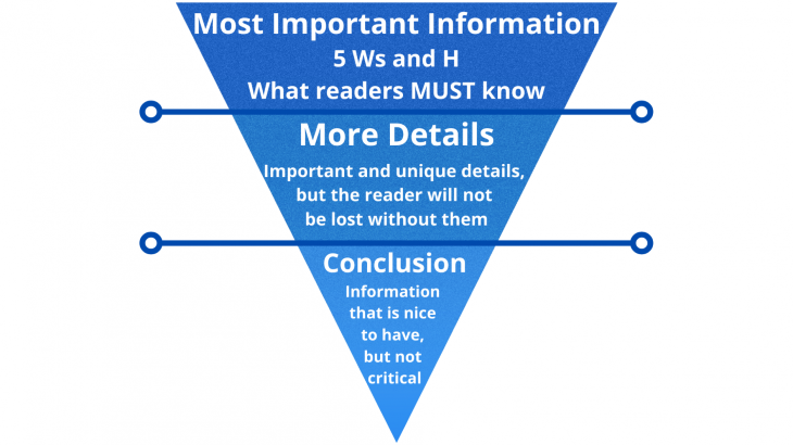
The inverted pyramid relays the lead or the most newsworthy information on top — the “what” of the content. This is followed by the crucial info or the important details — the “who,” “when,” and “where.” This is then wrapped-up by the tail or the background info — the “why” or “how.”
As you can see, writing in the inverted pyramid style relays information to readers from a top-down, structured method, so that the info is more easily scannable and readable.
The inverted pyramid makes the information relayed not only more easily accessible to your readers, but it also increases the impact of this info on audiences.
3. Breaking up text
If you want your content to be more accessible to your readers, you can’t leave the visual look of the text out of it.
According to a web usability and accessibility study by Yale University, content is more accessible when it’s organized. More on that later, but for now, organization is all about the visual cues you show to the reader. Included in the visual is your textual organization.
You don’t want this:

Instead, you want something like these:
When you’re typesetting your content for greater readability, you have to remember that the eye scans sentences from left to right. So, you must make it easy for the reader’s eye to return to the beginning of the next line, as much as possible. Use left-aligned paragraphs, avoid center-aligned text, and consider making the width of your text columns narrower.
Your paragraphs should also be broken up into about 2–3 sentences only. This makes your text easier to scan and to read. Remember, some of your users will only be scanning the text and not reading every single word. Always consider how you can make this process easier for your reader.
According to that Yale study, you can also organize your text numerically, chronologically, or alphabetically, such as in lists. Listing will more easily guide the user into your text by giving them visual clues to follow.
Remember that reading text is primarily visual. You must do all you can to allow this process to be as easy and digestible for the reader as possible.
Content that’s readable is the goal when you’re writing and organizing your content. Organizing information so that it’s more legible and easily comprehended is a huge part of readability in general, and legibility and comprehension in particular. We’ll talk more about this in the next section.
Organizing text and visual content for legibility
So, we’ve gone over how text can be structured to be more readable. Now, we’ll look into the whole UX equation to show how both text and images can work together to make your content more legible and accessible.
This requires the whole web page to not just contain text, but also visual content such as images, charts, and diagrams. The page must be logical, organized. and well-presented. This will also be more memorable for your target audience.
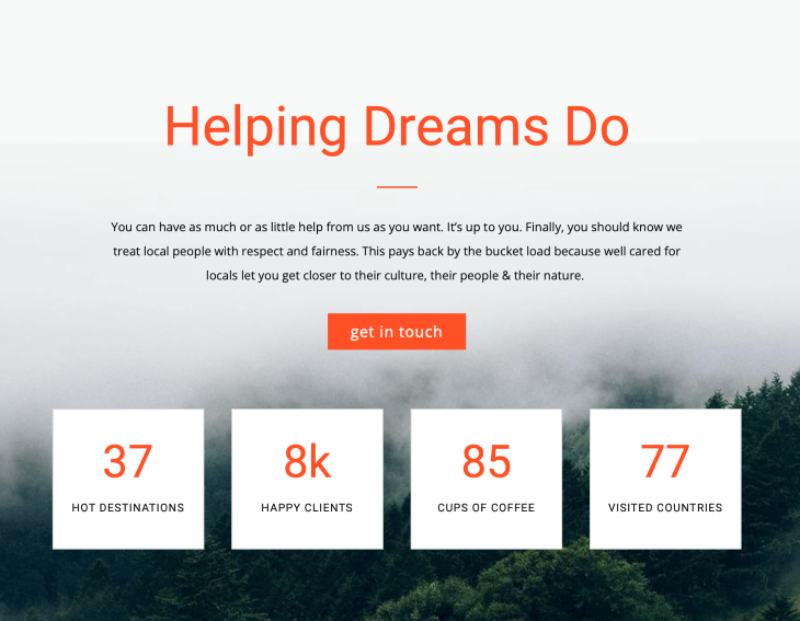
1. Images, charts, diagrams
According to photography website Photodoto, more than 3.2 billion photos get uploaded to the internet daily. And according to web developer site WebsiteSetup, there are over 1.7 billion websites in the world. It’s reasonable to assume that most of these active websites regularly use a subset of these 3.2 billion photos added to the internet daily.
Using images can clarify text, call attention to it, or break it up into more easily consumed blocks. The result of properly utilized images can make content comprehensible and memorable.
Not all images are photographs, of course. Some might be diagrams, screenshots, graphs, or even videos and animated gifs. There are websites, for example, that use dynamic elements to tell the viewer about changes in their content.
These visual elements can showcase your brand’s dynamism to your users and your potential consumers. You don’t want to use last year’s fashion in this year’s Met Gala, for example.
Making sure to use appropriate and cutting-edge images can do more than make your content readable — it can communicate your brand’s style. So be visually creative and bold.
2. Typesetting
With all the options available at even the basic level of web publishing, there is no longer any excuse for bad typesetting. Typesetting is the way the text is arranged, formatted, and layed out for a reader, using different fonts and glyphs in digital systems.
In UX design, you have to have an understanding of fonts, sizes, line lengths, and line spacing for everything that you put on your website. More on typography a little later on.
3. Headlines and Headings
Logical organization is a result of consistency in section labeling. This helps the reader to easily scan your content and always be aware of where they are in your text.
Section labeling can be done with the right HTML headings. Consider how to group and nest your content using a logical outline. The various levels of this outline can be communicated as header levels.
When you make a title, you immediately know that the headline or Heading 1 comes first. Then the H2, then the H3, then maybe even an H4 or H5. Try for simplicity,rather than overly deep nestings that might confuse your reader.
For more of the basics of headings and HTML, visit this guide on HTML. You don’t have to be a pro to code in HTML: just know the basic markups of copy.
Better typography for better comprehension
You already know your text has to be comprehensible to your audience. But how do you style information in order to ease comprehension? This happens through typographical considerations.
The four most important typographical elements that determine how readable your website will be are choice of font, font size or point size, line spacing, and line length. Here are the four practical typography elements from Butterick’s Practical Typography:
- Font: Your choice of font will determine if you’re a fun brand or a serious one. However, don’t let this get in the way of legibility. So avoid goofy or monospaced fonts that make it more difficult for your visitor to read your text. For example, the New York Times changed their font recently from Times New Roman to Georgia because they found Georgia to be bigger, wider, and easier to read.
- Point Size: The standard of HTML/CSS font size is 10–12 points in printed documents, 15–25 pixels on the web. If you cater to older audiences, you may want to use a larger font size. And of course, your primary font size will be different in headings or CTAs. Otherwise, just stick to this measure.
- Line Spacing: You want to add a line after each paragraph on your webpages. But your primary line spacing between each line should be 120–145 percent of the point size.
- Line Length: Have you ever read a really long line that is unforgiving in its ability to let you read it because it’s so long? Best to stick to 45–90 characters, including spaces, for each line.
A few more quick tips from Practical Typography:
- Use page margins to make the width of your text columns narrower
- Utilize responsive web design
- Learn the difference between sans and serif
- Discover the right font pairings
And if you’re looking for help while choosing fonts, visit this updated list of the most popular fonts and font pairings of 2023.
Memorability through consistency
While aiming for readability is a great goal, you can extend it even further to the idea of making a memorable mark on your audiences.
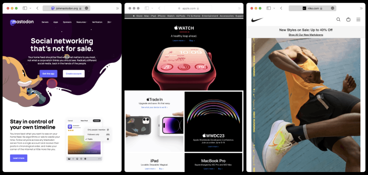
Think of your big brands, maybe Netflix or Nike. They all seem to be present in our collective memories because of how well designed the UX of their websites are. All share a distinctiveness in their choice of images, fonts, and even color palettes.
But being memorable is not just about distinctive or bold visual statements. It’s also about organization and consistency (or, how images, text, headers, buttons, menus, etc. all create one unified, cohesive look for your brand).
This might mean getting a specific style guide for your company or creating a brand deck. Organizing together all the elements of your brand identity in one guide or deck is a worthwhile endeavor in becoming more memorable to consumers.
Being readable is a good thing
Like a good book in the 17th century, you want your web pages to be relatable to the 21st century audiences. Readability is one of the ways your content can be made more scalable to your target audience.
Now that you’ve learned how to make your web pages readable, it’s time to apply it. After you’re done with the application, make sure to undergo readability testing. This allows test groups to go over the material and give it a readability score.
Congratulations on having made it this far, and I hope you apply these tips to your advantage!
Header image source: IconScout
LogRocket: Analytics that give you UX insights without the need for interviews

LogRocket lets you replay users’ product experiences to visualize struggle, see issues affecting adoption, and combine qualitative and quantitative data so you can create amazing digital experiences.
See how design choices, interactions, and issues affect your users — try LogRocket today.
Source link