Donations Make us online
Compliance with Web Content Accessibility Guidelines has enabled developers to better serve the needs of people with disabilities, including those who are visually impaired. However, WCAG does not fully consider how differences in visual impairment vary from one individual to the next.
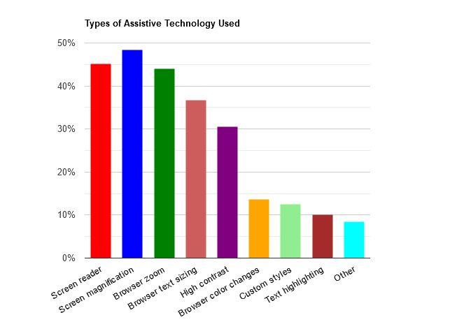
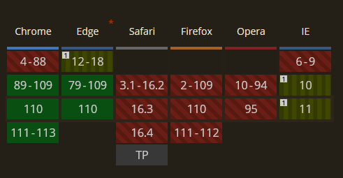
According to the WebAim survey, approximately 30% of internet users with low vision utilize high-contrast mode to enhance legibility and minimize visual clutter when visiting websites:
Yet, despite its high use rate, high-contrast mode receives less consideration from developers compared to other web accessibility features such as dark mode, keyboard navigation, reduced motion, and screen reader compatibility. So, why hasn’t high-contrast mode become more widely accepted among developers?
Its low adoption rate may be partly due to an assumption that implementing accessibility features for high-contrast users requires significant changes to a website’s style, leading to additional work. However, this assumption is not always accurate. By following some key practices, developers can avoid negatively impacting user experience for high-contrast users.
In this article, we will introduce essential practices for improving accessibility and enhancing UX for high-contrast users with CSS. We’ll also explore how to diagnose website accessibility issues.
Jump ahead:
What is Windows high-contrast mode?
There are two ways to implement high-contrast mode in a website: manual implementation and Windows high-contrast mode.
Manual implementation requires keeping the feature in mind and building it into the website from the start. This approach requires more effort and attention to detail. Using Windows high-contrast mode is a more straightforward process that involves leveraging the feature in the Windows operating system to override any styles set by the website and applying its custom color scheme.
Contrast mode is an accessibility feature in the Windows OS that is designed to make it easier for visually impaired users to see the screen. When turned on, contrast mode changes the look of websites and Windows applications by replacing the colors, backgrounds, and brightness of elements on the screen to provide a higher level of contrast. Contrast mode also reduces a website’s visual noise by removing certain elements. This feature makes it easier for visually impaired users to differentiate between elements and read text.
Using Windows high-contrast mode is the simplest way to implement high-contrast mode on your website, as many users with photosensitivity likely already have the feature enabled in their Windows OS. However, developers need to be aware of how the feature will affect the appearance of a website and make necessary changes to ensure that the site remains accessible and usable for all users.
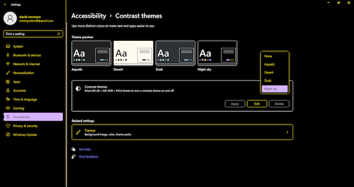
You can activate Windows high-contrast mode on your computer by going to Settings, clicking Accessibility, and then selecting Contrast themes. You will then be able to choose from four available themes. In the example below, we selected the Night sky theme:
Once activated, Windows high-contrast mode not only changes the contrast of the operating system, it also affects everything displayed on the screen, including browsers and websites. So it’s very important to ensure your website is compatible with this mode.
Here’s an example of how the LogRocket Blog homepage appears with high-contrast mode turned on:
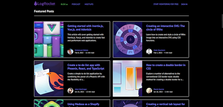
And here’s how it looks with high-contrast mode turned off:
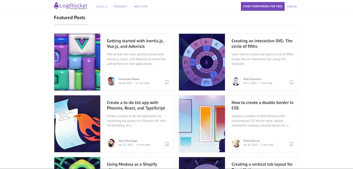
It’s evident that the LogRocket Blog’s webpage design follows the high-contrast approach. The only variations between both modes are the background of the “START MONITORING FOR FREE” button at the top, right of the page and the bookmark icons on the article cards. These differences exist because the browser automatically selects values for some properties, such as background color and SVG stroke, from the system colors set for high-contrast mode and applies them to the page elements, overriding the normal style cascading process.
Here’s a list of properties with values that are forced in high-contrast mode:
colorBackground-colorBackground-imagetext-decoration-colortext-emphasis-colorborder-coloroutline-colorcolumn-rule-color-webkit-tap-highlight-color- SVG
fillattribute - SVG
strokeattribute
So, in our example, the background-color value for the button element on the page is forcibly set to none, and the stroke attribute of the bookmark icon is removed due to the high-contrast mode enforcement. Some CSS properties are compatible with high-contrast mode by default but may exhibit unexpected behavior. We will discuss these properties in further detail later in this article.
High-contrast mode best practices
When high-contrast mode is activated, the browser prioritizes legibility over aesthetics. This is why most of the properties for beautifying a webpage, such as background-color and color, are forced to adopt the system color scheme.
Let’s take a look at fallback options to fix elements with unexpected behaviors in high-contrast mode.
Using semantic HTML
The significance of HTML semantics in web accessibility cannot be overstated. It is as important in forced mode as it is for screen readers. This is because the browser selects system colors for elements based on the semantics of the elements, rather than their appearance on the webpage or any added ARIA roles.
N.B., contrast mode is also known as forced mode; we’ll use this term for the remainder of this article
In the past, developers would “trick” screen readers by camouflaging div elements with ARIA roles. However, this approach is not feasible in forced mode since Windows doesn’t determine an element’s style based on its role on the webpage.
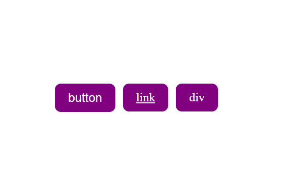
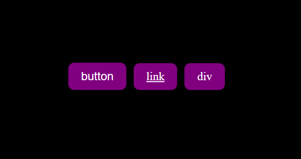
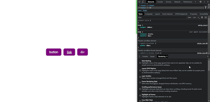
In the below example there are three elements: a div with a button role, a semantic button element, and an anchor tag with identical styles applied:
//html
<div>
      <button class="btn">
        button
      </button>
      <div role="button" class="btn" tabindex="0">
        div
      </div>
      <a href="#" class="btn">
        link
      </a>
</div>
//css
.btn{
    padding: 0.5em 1em;
    border: 2px solid purple;
    background-color: purple;
    border-radius: 0.5em;
    font-size: 1.5rem;
    text-decoration: none;
    color: white;
    margin-right: 15px;
}
Here’s how the elements appear in default mode:
And here’s how they appear in forced mode:
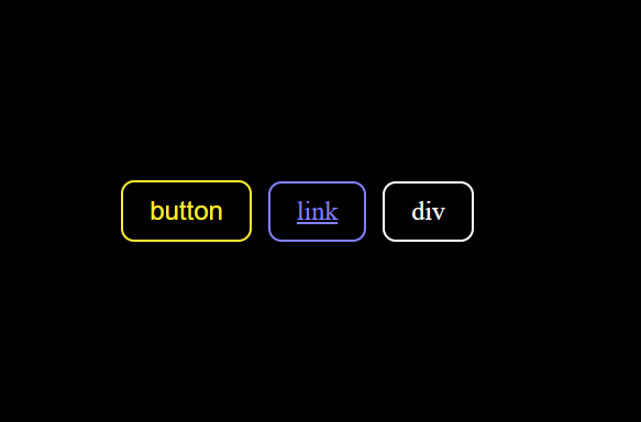
As you can see, each element has the same color in default mode, but this isn’t the case in forced mode. This highlights the importance of always using semantic HTML to prevent compromising or confusing the user’s experience.
Leveraging the transparent value
In some instances, an element’s border, outline, or text-decoration may clash with your design system, and you may need to set the value of the conflicting property to none. This approach could work in default mode but can significantly impede the user experience in forced mode.
Since forced mode overrides the background color of every element on the webpage, users may find it challenging to distinguish between components, such as buttons and links, and regular text on the page.
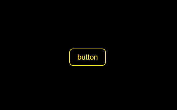
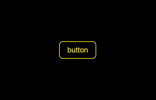
To better understand, let’s look at this example of a button element with border value set to none:
//html
<button class="btn">
   Button
</button>
//css
.btn{
    padding: 0.5em 1em;
    border: none;
    background-color: purple;
    border-radius: 0.5em;
    font-size: 1.5rem;
    color: white;
}
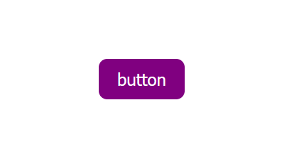
As you can see, the button looks good in the default mode. However, in forced mode, the background color, which provides depth to the element, is overwritten. As a result, the button could easily be mistaken for normal text:

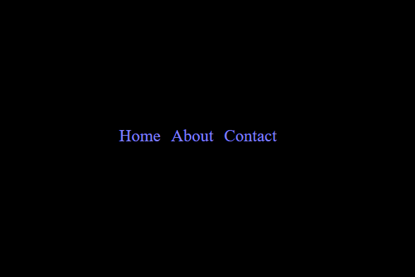
The same issue applies to anchor tags and the CSS text-decoration property. When the text-decoration property is set to none, it becomes difficult for users to distinguish between anchor tags and regular text in forced mode:
//html
 <a href="#" class="link">
    Home
 </a>
 <a href="#" class="link">
    About
 </a>
 <a href="#" class="link">
    Contact
 </a>
//css
.link{
    color: purple;
    font-size: 1.5rem;
    text-decoration: none;
}
We can address this issue by setting the anchor tag’s text-decoration-color property and the button’s border property to a value of transparent:
/*css*/
.link{
    color: purple;
    font-size: 1.5rem;
    text-decoration: transparent;
}

.btn{
    padding: 0.5em 1em;
    border: 2px solid transparent;
    background-color: purple;
    border-radius: 0.5em;
    font-size: 1.5rem;
    color: white;
}

Forced mode overwrites styling, but when it detects a border or outline property with a transparent value, it adds a visible border to the element. This makes transparency visible in forced mode.
You can employ the same approach to the outline property to produce highlights for an element’s focus state:
.btn:hover{
    outline: 2px solid transparent;
}
Handling scrollbar styling
Scrollbars are not usually a cause for concern with regard to forced mode, because they are rarely styled. In fact, it’s worth noting that styling a webpage’s scrollbar is not recommended if accessibility is a top priority. Even if you take steps to mitigate the issue, the end result may be suboptimal. If you decide to style your website’s scrollbar, despite this warning, there are a few important points you should at least keep in mind.
Styling a scrollbar typically involves adding a background color and possibly a box shadow. Unfortunately, these properties can cause the scrollbar to become invisible when viewed in forced, or high-contrast, mode.
To address this issue, you could use the border property with a transparent value as demonstrated previously. However, this may create another problem — the scrollbar thumb will have a hollow appearance which can confuse users. As a result, it’s important to carefully consider the implications of styling the scrollbar before making any changes.
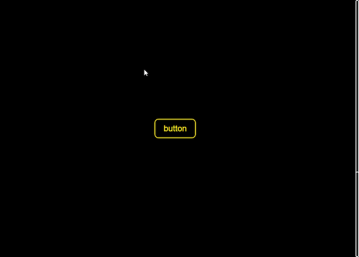
The below GIF illustrates how challenging it can be to keep track of the scrollbar thumb:
One solution is to increase the width of the track, which can create an illusion of depth on the thumb. However, this approach can negatively impact the aesthetics of the webpage in default mode. For this reason, it’s generally recommended to avoid styling the scrollbar altogether if accessibility is a top priority.
It’s also worth noting that the limitations of scrollbar customization vary between browsers. While Chromium-based browsers may have more flexibility, recent updates to Firefox have restricted the ways in which scrollbars can be customized.
In Firefox, we can only manipulate the width and color of the scrollbar using the scrollbar-color and scrollbar-width properties. Furthermore, even if the scrollbar is highly customized in default mode, Firefox will automatically adjust it to match the system color in forced mode, which is an important consideration for accessibility.
Using the forced-colors CSS media query
forced-colors is a CSS media query feature that is used to detect if the browser is in forced mode. It has two possible values: active and none. When active is used, the styles within the media query are only applied when the browser is in forced mode. Conversely, when the none value is used, the styles within the media query are only applied when the browser is not in forced mode.
Developers can use this media feature to apply high-contrast friendly styles for forced mode, as shown in this example:
.button {
    border: 0;
    padding: 10px;
    box-shadow: -2px -2px 5px gray, 2px 2px 5px gray;
}

@media (forced-colors: active) {
    .button {
        /* Use a border instead, since box-shadow is forced to 'none' in forced-colors mode */
        border: 2px transparent solid;
    }
}
The code above checks for forced mode in the browser and applies a media query to add transparent borders to the button element on the page.
Using the forced-adjust-colors CSS property
forced-adjust-colors is a CSS property that is used to prevent forced mode from overwriting the colors of an element or the entire webpage via the body selector. This property has two possible values:
auto: The default value; sets the color of the element or webpage to the color scheme specified by the operating system or browsernone: Allows the browser to disregard the color scheme of the system and instead use the style cascade
The forced-adjust-colors property is often used with the forced-colors media query, like so:
@media screen and (forced-colors: active) {
   .btn {
        Forced-color-adjust: none;
    }
}
The forced-adjust-colors CSS property can also be applied to individual elements to achieve the same effect on that specific element:
 .btn {
        ...
      Forced-color-adjust: none;
  }
This will force the browser to use the colors defined by the element’s style cascade, overriding the system colors set by the browser or OS:
The forced-adjust-colors property might appear to be a solution for enhancing the visual appearance of a website in forced mode, but its use should be limited to making essential adjustments that improve the contrast and readability of the site’s content. It is not intended for creating designs that could potentially undermine the accessibility of the site.
Browser compatibility
The forced-adjust-colors CSS property is a recently introduced property and currently has limited support on modern browsers. This feature is only available on Chrome 89+ and Edge 79+ browsers, so it’s important to check the browser compatibility before using it in your code:
Diagnosing website accessibility issues
Diagnosing a website for accessibility issues can be a challenging task, particularly for high-contrast mode, which requires frequent switching between default and forced mode. Fortunately, the browser’s developer toolset offers a range of tools to help test website accessibility.
One such tool is the Rendering tool — a component of Chrome DevTools that allows developers to debug and diagnose problems with the rendering of webpages. The Rendering tool provides a range of features for inspecting and modifying the visual layout of webpages, including the ability to view and edit the box model, examine and modify the CSS styles applied to elements, and diagnose issues with rendering performance.
To use the Rendering tool, open DevTools in your Chrome browser using Ctrl+Shift+I for a PC or Command+Shift+I for a Mac. Next, navigate to the Console drawer located below the DevTool pane and click the Rendering tab:
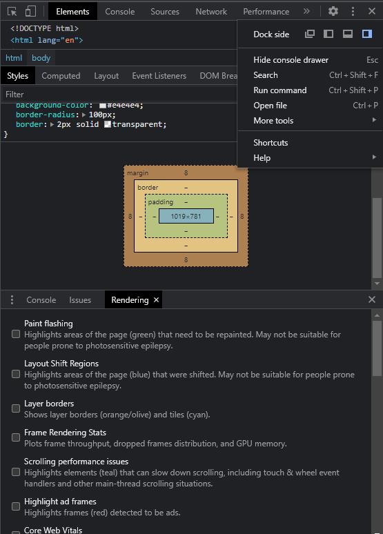
Here you can emulate various accessibility features directly within the browser:
Conclusion
There’s still a long way to go in terms of making the web accessible for everyone. In the meantime, it’s important that we all do our part by considering the needs of all users when designing or developing websites.
By implementing a high-contrast mode in your website, you can help ensure that users of all abilities have an enjoyable and productive experience when they visit and interact with your site.
Is your frontend hogging your users’ CPU?
As web frontends get increasingly complex, resource-greedy features demand more and more from the browser. If you’re interested in monitoring and tracking client-side CPU usage, memory usage, and more for all of your users in production, try LogRocket. https://logrocket.com/signup/
LogRocket is like a DVR for web and mobile apps, recording everything that happens in your web app, mobile app, or website. Instead of guessing why problems happen, you can aggregate and report on key frontend performance metrics, replay user sessions along with application state, log network requests, and automatically surface all errors.
Modernize how you debug web and mobile apps — Start monitoring for free.
Source link