With so many variables to manage, website design problems often creep in, resulting in a poor user experience and adverse effects on SEO (search engine optimization). Designers and engineers must collaborate to prevent these common web design problems so users can find content and complete tasks with minimal effort.
We’ve identified 8 common web design problems in 2023 and the steps designers and developers can take to reduce or solve these issues.
Design better website experiences with the world’s most advanced design tool. Improve cross-functional collaboration and reduce usability issues with UXPin. Sign up for a free trial to explore UXPin’s features.

Not Using Responsive Design
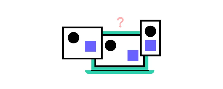
The problem
Responsive design is one of Google’s primary ranking factors. The tech giant even has a free Learn Responsive Design tutorial to educate designers and engineers. Why? Because Google wants to deliver the best user experience for every result, non-responsive websites are notoriously difficult for mobile users.
The solution
Designers and front-end developers must follow mobile-first web design principles and progressive enhancement to deliver a seamless user experience across the three primary screen sizes, mobile devices, tablets, and desktops.
Web Accessibility

The problem
Many websites still ignore web accessibility guidelines, resulting in poor user experiences, particularly for those with disabilities and challenges. Accessibility doesn’t only apply to disabilities. Users endure situational challenges, like slow internet, temporary injuries, or navigating the internet when someone only has one hand free.
Not every website must be accessible. There are projects where designers push creative and technological boundaries, but everyone must have access if your website aims to serve your target audience with helpful information and resources.
The solution
Designers can use a web accessibility checklist to ensure designs meet Web Content Accessibility Guidelines (WCAG). Some accessibility basics include:
- Color: using a color blindness simulator and contrast checker to ensure users with visual impairments can read and interpret content.
- Use plain language: content must be free of jargon and slang so users can fully comprehend information and instructions. The outcomes for links and CTAs (calls to action) must be obvious and never “trick” users–whether that’s intentional or not.
- Header tags: only one H1 title tag per web page. Nested headings must follow the conventional order of H1, H2, H3, H4, H5, and H6.
- Images: use descriptive alt text for every image and never use images to replace text because users with screen readers can’t see them.
- Forms: use the label HTML tag for every field and include helper text for additional instructions. Error messages must provide explicit instructions to fix an input issue.
Additional web accessibility resources:
Poor Website Usability
The problem
Usability is the foundation for user experience. It’s about getting the basics right so users can easily navigate your website and find features. Some common usability issues include:
- Broken links
- Poor navigation
- Too many steps to complete tasks
- Unfamiliar UX patterns–increases the website’s learning curve
- Poor website performance
- Inconsistent UI design
- Cluttered user interfaces with redundant UI elements
The solution
Designers must reduce and eliminate wherever possible. For example, simplifying and minimizing steps in user flows so users can get to the end goal faster.
Optimizing usability means designers must remove roadblocks and inefficiencies. For example, eliminate UI elements, animations, and content that distracts rather than serves.
Poor User Experience
The problem
Usability is one aspect of a website’s user experience. User experience considers how people might think and feel as they engage with a website and its features. UX also extends to the customer experience, which includes brand perception.
Organizations place a high emphasis on UX because if someone doesn’t enjoy a web experience, it’s likely they won’t convert or return.
The solution
Designers must understand users’ needs and priorities to optimize a website’s user experience. Human-centered design and design thinking principles help designers understand website visitors and how they can best solve their problems. For example, placing contact information in the header for a local small business or prioritizing the primary navigation menu to meet common browsing habits.
Poorly Executed Content Strategy
The problem
Most people visit websites to find answers to their questions. Designers have many ways to answer these questions using content, for example:
When designers assume what’s best for users, they often use incorrect content. For example, GOV.UK’s old bank holiday page was cluttered and difficult to read.
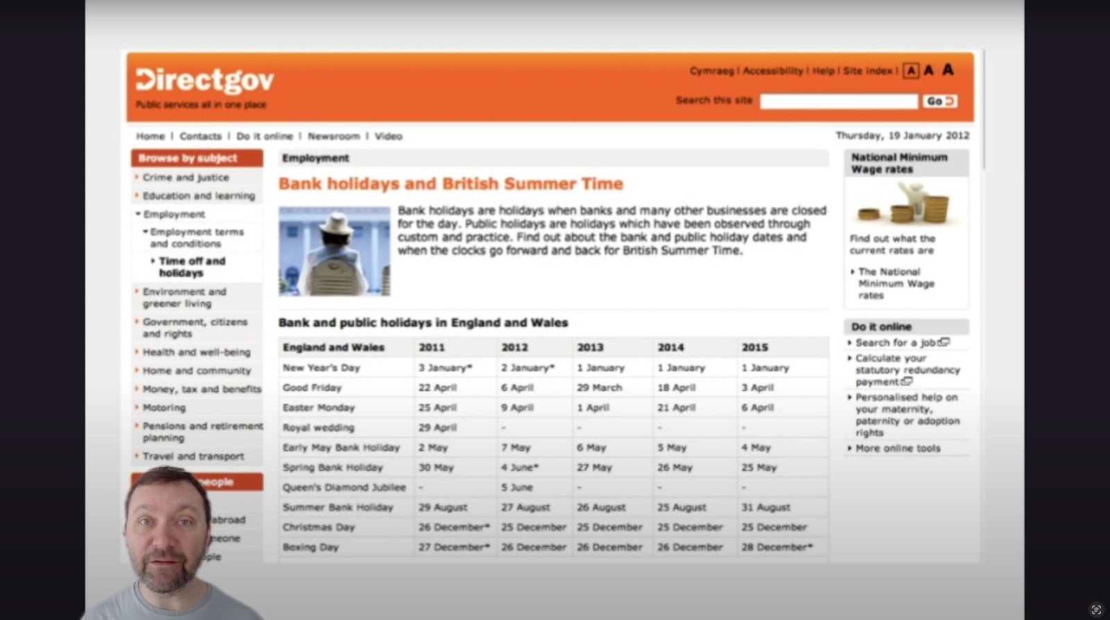
The content design team conducted user research to understand why people visit this page. They learned that most users wanted to know the date for the next bank holiday. The result was a significantly cleaner user interface with the next date in large highlighted text. The following dates were below this in sequential order.
The solution
Recognizing which content to serve requires a deep understanding of users and their needs.
- Why is someone visiting your website?
- What content will answer their question comprehensively and efficiently?
Your header and hero section (above-the-fold content) are prime real estate for serving content that meets user needs. Instead of an irrelevant hero image and CTA, deliver content that helps people find what they need fast. That might be a link to your contact page or your store’s hottest-selling product.
Outdated Content & Design
The problem
Using a web template or WordPress theme is a quick way to build your new website, but the result is often generic, with outdated features–like a feature-packed sidebar or performance-killing hero carousel. The biggest mistake is designing a website before researching the content.
Another related issue is outdated content which could damage your brand and user trust. For example, if your eCommerce site is still running winter promos on the homepage in summer, customers might think no one is managing the store and fear placing an order in case no one processes it.
The solution
Designers must design around content rather than fit content into a template or pre-made UI pattern. This approach will help eliminate redundant UI patterns while delivering exactly what users need in the appropriate format.
Regular UX audits ensure designers spot usability issues, outdated designs, and content so the website is always relevant while providing the best user experience.
Inconsistent Design Language
The problem
Design inconsistencies cause confusion, making navigating user interfaces and completing actions difficult. For example, using multiple colors for CTAs or applying different styling (fonts, sizing, colors, borders, etc.) to the same UI elements across separate pages.
These minor inconsistencies require a user’s brain to think and relearn a user interface whenever the components change.
Design inconsistencies also increase development times because engineers must create new components rather than reuse existing ones.
In short, design inconsistencies create problems for everyone, from users to designers, engineers, and stakeholders.
The solution
Design systems help eliminate design inconsistencies and drift. Reusing the same components, patterns, and templates means engineers can copy/paste existing code rather than designing from scratch.
Most website projects don’t have the resources to develop and maintain a design system. But there are tools designers can leverage to build a design system with minimal resources.
UXPin’s Design Systems feature allows designers to create UI libraries to share with other designers. They can create as many design systems as they like–one for each project if needed. The design system owner can set permissions to avoid unauthorized changes and maintain the library’s integrity.
When designers need to redesign a website, they simply apply new styling to the design system’s components in UXPin rather than starting from scratch.
Saving and reusing these components offers several key benefits:
- Less designing from scratch
- Less front-end web development
- Faster time to market
- Less drift and inconsistencies
- Fewer usability issues
- Enhanced brand and user experience
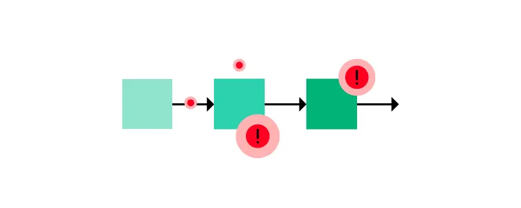
Unhelpful Errors and 404s
The problem
Errors are bound to happen on every website and digital product. Good UX anticipates these issues and provides solutions to solve them. Most 404 pages try to be comical with a short message, “Oops, looks like this page doesn’t exist,” with a link taking the user back to the homepage. If this is someone’s entry to your website via an external link, it’s a terrible first impression, and they’re almost certain to leave.
Forms are another area where errors often occur, causing frustration for users. When error messages don’t provide adequate assistance, users hit roadblocks, unable to complete tasks.
The solution
404s happen for various reasons, but the one that has the most detrimental effect on bounce rates is when you delete a webpage with no redirect. Users will find your 404 instead of the expected content if that page has external and internal backlinks.
It might seem counterintuitive, but when you delete a page, create a new one explaining that this page no longer exists with links to related content. For example, if you delete a t-shirt from your store, create a custom 404 explaining you no longer sell this product with links to related t-shirts or apparel. You can reuse this 404 for all your t-shirt products or create one for specific categories.
This strategy creates transparency with relevant solutions for users while increasing the likelihood they’ll stay on your website rather than exiting and finding a competitor.
Designers must also create helpful form error messages, including:
- Highlighting the field with the error
- Providing helper text with explicit instructions to fix the issue
Solve Common Problems and Reduce Errors With UXPin
UXPin’s sophisticated end-to-end design tool enables designers to build website prototypes with the same fidelity and functionality as developers. These advanced prototypes improve user testing, so designers solve more problems during the design process, resulting in better user experiences and fewer errors.
Solve common issues, enhance designer/developer collaboration, and deliver high-quality user experiences with UXPin. Sign up for a free trial to explore UXPin’s advanced features.
Source link