A website’s footer is often overlooked, but it can actually make a big difference in how easy it is for users to find what they need on your website.
So, what is a website footer, exactly? It’s the section that you see at the very bottom of a website page. It’s separated from the main content of the website and can contain all sorts of elements, like contact information, social media links, copyright notices, and links to other pages of the website.
Think of a website like a movie. The footer is like the credits at the end — it contains important information that isn’t necessarily part of the main content. For example, it might include the name of the person who owns the website or the copyright information, which tells you who’s responsible for the content on the site.
In this article, we’ll go over some tips and best practices for optimizing website footer UX, as well as considerations for mobile and responsive footers. By the end, you’ll have everything you need to know to create a footer to enhance the user experience of your website.
The footer can help users navigate your website and find the information that they need, whether it’s a link to your careers page or contact information for customer service, which can be really helpful if they’ve got questions or need some assistance.
A well-designed footer can encourage visitors to explore your website further, which means they’re more likely to take action, like making a purchase or subscribing to your newsletter. Plus, a great footer can even promote brand awareness by showcasing your brand’s logo, colors, and messaging.
The content of your footer can vary depending on the website’s purpose and design. However, there are some common elements that are often included in footers.
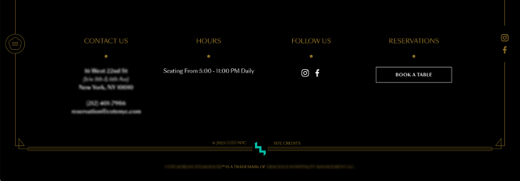
Contact information
Including your business’ contact information in the footer provides potential customers with a convenient way to reach out to you. Whether it’s an email address, physical address, phone number, or social media links, this can help you build stronger relationships with your customers and increase the likelihood of them doing business with you.
If users can’t easily find your contact information, they may feel frustrated and move on from your business. So make sure that your contact details are presented correctly or include an accessible link to a contact page.
A copyright notice is usually included in the footer to let users know who owns the content on the website and how it can be used.

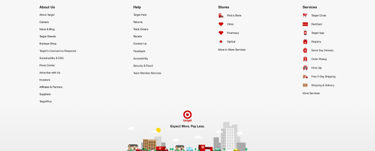
Navigation
Your footer can mimic the main navigation menu of the website, helping users find the information they need. Footers often include related external links, such as to a career page or a blog. Think about this section as a store directory in a mall. Users can come here to explore their options and find out where they want to go.
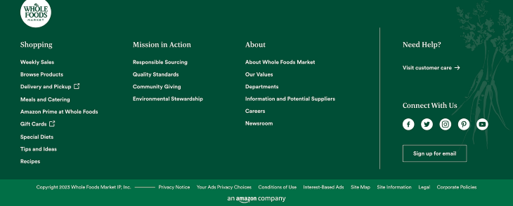
Call to action
A call to action (CTA) is a button or link that encourages users to take a specific action, such as signing up for a newsletter, downloading an app, or reserving a table. CTAs can be included in the footer to increase conversions in a sales funnel before users leave the website.
Make your CTA stand out by highlighting it in a different color or styling it differently so that users notice it and take action.
Legal information
If your website collects personal information from users, a link to the website’s privacy policy should also be included in the footer. Additional links in this section could include cookie preferences and terms of service.
These links are usually separated from the navigation and contact information, as they are provided mostly for legal purposes and the majority of users won’t be looking primarily for them.
Now that we’ve covered what goes into your footer, let’s talk about some design best practices to follow. These will help keep you on track to creating a website footer that is both functional and visually appealing to your users.
Brand awareness
Brand awareness is about how much people recognize and remember your brand. Think about how Coca-Cola’s advertisements make you feel happy. Their brand image is associated with feelings of happiness and joy.
Your website’s footer is a great place to showcase your brand and increase brand awareness. You can incorporate your brand’s logo, colors, and messaging in the footer to create a more cohesive look and feel throughout your website that helps your brand stand out.
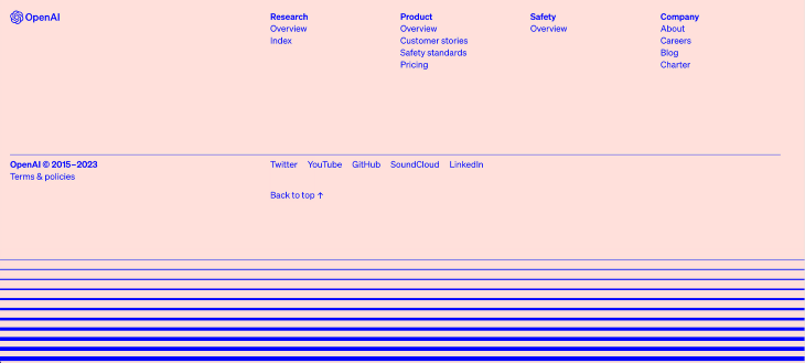
Grouping content
Grouping your content into columns can create a more organized footer that is easy for users to navigate. Headers should be used to label and divide your footer into different sections.
If you have a lot of links in your footer, conduct user research to understand if users can easily find them. Card sorting can be a useful activity to conduct in order to identify how users categorize the different links into groups and what labels they would use to identify them.
For example, you might have a column for navigation, a column for links to other pages on your website, or a column for social media links. This can help you fit more information into your footer without it becoming cluttered or overwhelming for users.
Remember, using a larger font size for the column headers will create a more distinct visual hierarchy and make it quicker for users to scan the footer.

White space
White space, also known as negative space, might seem like it is just an empty space between text and images, but it is actually an intentional design element. By using whitespace effectively, you can create a cleaner and more spacious design that is easier for users to read and navigate. In the footer, white space can be used to separate different sections and highlight important information.
However, avoid using too much white space because it can make your footer feel empty or unfinished. It also forces the user’s eyes to jump longer distances when scanning the page, making it harder for them to find what they’re looking for.
Contrasting colors
Contrasting colors can create an accessible and visually appealing footer that draws users’ attention to important information. Aim to use contrasting colors that pass WCAG level AA, which requires a color contrast ratio of at least 4.5:1 for normal text and 3:1 for large text.
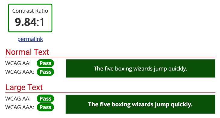
However, don’t use too many contrasting colors as your footer may look overwhelming and distract users from the important information you’re trying to convey.
Many users will access your website from their mobile devices, so it’s important that your website is designed responsively. Responsive design enables your website’s content to be displayed flexibly depending on the size and orientation of the mobile screen.
One of the biggest mobile design challenges is fitting all the content into a smaller space without making it too cluttered or hard to read. This can be particularly tricky if you have a lot of links and contact information in your footer.
Number of links
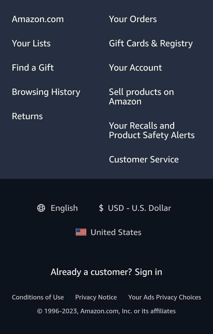
To make sure that your footer is easy to navigate on mobile devices, you may want to consider reducing the overall number of links displayed. Think about what your users are looking for as they use your website on a mobile device.
An example of this is Amazon’s mobile website, which greatly reduces the number of links provided in their footer, as opposed to their desktop site.
Responsive columns
A strategy for responsive mobile footer design is stacking your content vertically instead of using columns side-by-side. Users naturally scroll vertically through a webpage on mobile, so this way, users can easily navigate through the content easily.

Accordions
Another approach to responsive mobile footer design is to use accordions, which allow users to expand and collapse different sections of your footer content.
This is a great option if you have a lot of links that you need to include because it allows users to access this information without taking up too much screen space all at once.
As you design your footer, it’s important to keep in mind the size of the content on mobile devices. You’ll need to make sure that everything fits on the screen without being too small to read. This may mean that you need to edit down your content or use a smaller font size. But keep in mind accessibility guidelines and keep your minimum font size at least 16px for mobile websites.
A/B testing your footer can provide valuable insights into user behavior and help you identify opportunities for improving the user experience. By creating multiple versions of your footer and measuring engagement metrics, such as click-through rates, time on page, and bounce rates, you can determine which design and content elements are most effective.
To conduct an A/B test, start by identifying specific elements of your footer that you want to test. This might include the placement of links, the use of whitespace, or the inclusion of a CTA. Next, create two versions of your footer — one with the original design and one with the updated design — and randomly assign users to one of the two versions.
Once you’ve run your A/B test for a sufficient amount of time, analyze the engagement metrics to determine which version of the footer performed better. Based on your findings, make adjustments to your footer design and content to improve user engagement.
For example, if your A/B test reveals that users are more likely to click on links in a specific location, consider incorporating that layout into your final design. Similarly, if your test shows that users respond well to a particular CTA, try incorporating that language into other areas of your website to increase conversions.
By continually testing and refining your footer design, you can create an experience that is tailored to your users’ preferences and encourages greater engagement with your brand. Remember to keep your goals and objectives in mind throughout the testing process to ensure that you are creating a footer that aligns with your overall website strategy.
Conclusion
A website’s footer is often the last thing visitors see before they leave, which makes it key to designing a great user experience. An effective footer should include essential information, such as contact details, navigation links, and legal information. It should also be designed to catch visitors’ attention and encourage them to engage with the website further.
To create an engaging website footer, designers should follow best practices such as using white space, contrasting colors, and grouping content. It’s also important to ensure that the footer is responsive on mobile devices, which may involve scaling down the number of links, rearranging columns, and incorporating expandable and collapsible sections.
By creating a well-designed footer that enhances user experience and raises brand awareness, designers can significantly impact the success of a website. So, don’t overlook the importance of your website’s footer — give it the attention it deserves and watch your website thrive.
Header image source: IconScout
LogRocket: Analytics that give you UX insights without the need for interviews

LogRocket lets you replay users’ product experiences to visualize struggle, see issues affecting adoption, and combine qualitative and quantitative data so you can create amazing digital experiences.
See how design choices, interactions, and issues affect your users — try LogRocket today.
Source link