Data must be presented in an ordered and easy-to-digest manner so people can effortlessly find what they are looking for. One of the most powerful and useful ways to display a certain amount of data is to render it in a data grid layout.
Knowing how to display data in a grid is one of the most important skills a developer can have. In this tutorial, we’ll explore the best ways to do so when using Vue.js. We will cover:
Data grids vs. data tables
Before we start exploring Vue grid layout options, we need to make an important clarification.
It’s strange to me, but many developers use the terms “table” and “grid” interchangeably. For example, there are many Vue libraries for building complex data tables that contain the term “grid” in their names. This is technically incorrect. Let’s see why.
At first glance, a table and a grid may look pretty similar because they both have columns and rows. But if we take a closer look, we’ll see that the context and purpose in which they are used differ drastically.
The best way to understand the difference between both is to think about a data table like a good old HTML table, whereas a data grid is more like a CSS flexbox or CSS grid layout.
In a data table, a single row represents a whole unit of data — for example, a blog post. In such a case, the table’s columns would represent various parts of the post’s data, like its title, content, author, date, tags, categories, and other information.
Since the rows and columns are tightly coupled in a data table, we can’t move or reorder a single cell without destroying the data’s integrity. We can only safely move an entire row or column.
In a data grid, all cells are independent, and a single cell represents a whole unit of data, the same way a row from a table would. We can move or reorder the cells in our grid however we want, and the data will stay intact — only the layout will change.
Some real-world examples of data grids could include a blog listing or an image gallery.
Those of you who remember when HTML tables were used for building layouts will understand the above difference perfectly. The purpose of data tables is not to build layouts, but rather, to hold a certain amount of structured data, just like the tables in a database such as MySQL.
With this clarification in mind, let’s explore how we can build data grid layouts in Vue.
Exploring the best options for building data grid layouts in Vue
In the following sections, we’ll explore the best available options for building data grids with Vue. We’ll group them into the following three usage categories:
- Using a separate Vue data grid library
- Using a data grid component from a particular Vue component library
- Using a vanilla JS data grid library with Vue
Let’s explore these options and see when to use each.
Dedicated Vue data grid libraries
The first approach is to use a separate Vue library designed for building grid layouts. Use this option if your project is small or you want to enhance it with some data grid functionality.
We will explore three libraries you can use for this approach — Vue Grid Layout, Vue Grid Responsive, and Vue Layout System.
Vue Grid Layout
One of the best options in this group is the Vue Grid Layout library. It’s pretty flexible and offers the following features:
- Drag and resize widgets (table cells) interactively
- Widgets can be static
- RTL support
- Responsive grid
- Layout can be serialized and restored
- Supports Vue 2.2+
Note: For Vue 3 support, use the vue3-drr-grid-layout package.
The library provides two components — grid-layout and grid-item — for building grid layouts. Each one provides a variety of properties you can customize.
For example, in the grid-layout component, you can use isDraggable to make grid items draggable and isResizable to make them resizable. In the grid-item component, you can set an item to be static by using the static prop.
Take a look at the following example:
<div id="app">
  <grid-layout class="grid"
  :layout.sync="layout"
  :col-num="6"
  :row-height="30"
  :is-draggable="true"
  :is-resizable="true"
  :margin="[10, 10]">

    <grid-item v-for="item in layout"
    :x="item.x"
    :y="item.y"
    :w="item.w"
    :h="item.h"
    :i="item.i"
    :key="item.i">
    {{item.i}}
    </grid-item>

  </grid-layout>
</div>

<script>
  new Vue({
    el: "#app",
    data: {
      layout: [
        {"x":0,"y":0,"w":2,"h":2,"i":"1"},
        {"x":2,"y":0,"w":1,"h":2,"i":"2"},
        {"x":3,"y":0,"w":3,"h":2,"i":"3"},
        {"x":0,"y":0,"w":1,"h":3,"i":"4"},
        {"x":4,"y":0,"w":2,"h":3,"i":"5"},
      ],
    },
  })
</script>
The data for the grid is provided via the layout prop. We also set the number of columns and the height of rows, and added some space between cells via the margin prop.
Each item must have the following properties added in the data source:
xandy— initial horizontal and vertical position of the itemwandh— initial width and height of the itemi— unique identifier for the item
Here is how the above code will be rendered:
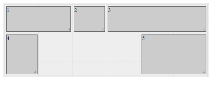
Note that for this example, I’ve used CSS — the code for which is not included here — to style and display grid lines. This styling is for the purposes of this tutorial only, so you can more easily distinguish individual columns and rows and see how much space each widget occupies.
Visit the Vue Grid Layout documentation for the full list of available props.
Vue Grid Layout is an excellent choice when you need an interactive grid for your app layout — for example, if you are building a dashboard grid with customizable widgets. Of course, it can be used for static grids too, but for such a case, the next option may be more appropriate.
Vue Grid Responsive
If you want just a plain static grid without extras, then Vue Grid Responsive is a great option. It offers a simple responsive grid system based on Bootstrap classes with support for Vue 2 and 3.
Vue Grid Responsive provides row, column, and hidden components you can use to build a grid. Here is a simple example:
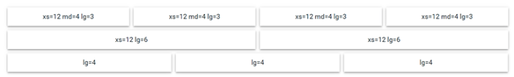
<row :gutter="12">
  <column :xs="12" :md="4" :lg="3">xs=12 md=4 lg=3</column>
  <column :xs="12" :md="4" :lg="3">xs=12 md=4 lg=3</column>
  <column :xs="12" :md="4" :lg="3">xs=12 md=4 lg=3</column>
  <column :xs="12" :md="4" :lg="3">xs=12 md=4 lg=3</column>
  <column :xs="12" :lg="6">xs=12 lg=6</column>
  <column :xs="12" :lg="6">xs=12 lg=6</column>
  <column :lg="4">lg=4</column>
  <column :lg="4">lg=4</column>
  <column :lg="4">lg=4</column>
</row>
The resulting Vue grid layout will look like so:
You can specify the size, breakpoints, and gutter of your columns, as well as set a column count and order.
This small library is ideal for building layouts for simple blogs, landing pages, and portfolios. But what if you need a more powerful and flexible layout-building solution? The next option may provide what you need.
Vue Layout System
If you have to build complex and tricky layouts, then the Vue Layout System library is the best choice. It provides eight main layout components for many different scenarios:
LayoutAbsolute— offers nine absolute positioning options for placing content in a relatively positioned elementLayoutAlign— for content alignmentLayoutColumns— for creating evenly spaced and ordered columnsLayoutFlexColumn— for setting a column’s top, bottom, and remaining spaceLayoutFlexRow— for setting a row’s left, right, and remaining spaceLayoutGrid— for more complex gridsLayoutList— for regular vertical listsLayoutListInline— for horizontal lists
By combining the above components, you can build almost any layout you can think of.
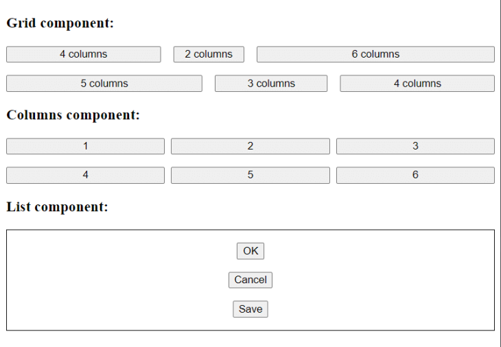
Let’s see some examples. We’ll start with the code for each. First, here is a simple grid:
<layout-grid
column-count="12"
gap-x="5"
gap-y="5">
  <layout-grid-cell span="4">
    <button>4 columns</button>
  </layout-grid-cell>
  <layout-grid-cell span="2">
    <button>2 columns</button>
  </layout-grid-cell>
  <layout-grid-cell span="6">
    <button>6 columns</button>
  </layout-grid-cell>
  <layout-grid-cell span="5">
    <button>5 columns</button>
  </layout-grid-cell>
  <layout-grid-cell span="3">
    <button>3 columns</button>
  </layout-grid-cell>
  <layout-grid-cell span="4">
    <button>4 columns</button>
  </layout-grid-cell>
</layout-grid>
Second, here is a grid made with the LayoutColumns component:
<layout-columns
column-count="3"
flow-direction="row"
vertical-align="center"
gap-x="3"
gap-y="5">
  <button>1</button>
  <button>2</button>
  <button>3</button>
  <button>4</button>
  <button>5</button>
  <button>6</button>
</layout-columns>
Last, here is a simple list:
<layout-list
padding-x="5"
padding-y="5"
gap="5"
horizontal-align="center"
style="border: 1px solid;">
  <button>OK</button>
  <button>Cancel</button>
  <button>Save</button>
</layout-list>
You can see what the examples look like below:
This library is great for things like news websites or online stores — in other words, use cases that demand complex and rich layouts.
There are many more Vue data grid libraries for building layouts, but most of them seem not to be actively maintained. If you want to check them out anyways, take a look at this comprehensive list.
Data grid components from Vue component libraries
The second approach to building a Vue grid layout is to use data grid components from a particular UI library. Use this option if your project is big or requires the use of a components library.
We will discuss data grid components available in three Vue component libraries — Quasar, Vuetify, and Bootstrap.
All of these libraries use similar principles and techniques for their grid components, but they differ in how exactly they implement those components. The right choice between them depends on your past experience and your project’s requirements.
For example, if you’ve used Bootstrap before, then BootstrapVue could be the easiest for you. But if your project is complex or cross-platform, you may need a more sophisticated library such as Quasar or Vuetify. With that in mind, let’s move on.
Quasar’s grid component
Quasar provides a grid component that leverages CSS flexbox classes — row, column, wrap, and others — for building grids.
You can leverage this grid component along with Quasar’s special QLayout component, which is for building simple base app layouts. QLayout provides the following main components:
q-layout— to wrap the layout section in a containerq-headerandq-footer— for adding headers and footersq-page-containerandq-page— for encapsulating pagesq-drawer— for sidebars and navigation
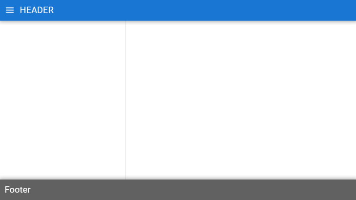
Here is an example of a simple layout:
<template>
  <q-layout view="hHh lpr fFf">

    <q-header elevated class="bg-primary text-white">
      <q-toolbar>
        <q-btn dense flat round icon="menu" @click="toggleLeftDrawer" />
        <q-toolbar-title>
          Header
        </q-toolbar-title>
      </q-toolbar>
    </q-header>

    <q-drawer v-model="leftDrawerOpen" side="left" overlay bordered>
      <!-- drawer content -->
    </q-drawer>

    <q-page-container>
      <q-page>
        <!-- page content -->
      </q-page>
    </q-page-container>

    <q-footer elevated class="bg-grey-8 text-white">
      <q-toolbar>
        <q-toolbar-title>
          <div>Footer</div>
        </q-toolbar-title>
      </q-toolbar>
    </q-footer>

  </q-layout>
</template>

<script>
import { ref } from 'vue'

export default {
  setup () {
    const leftDrawerOpen = ref(false)

    return {
      leftDrawerOpen,
      toggleLeftDrawer () {
        leftDrawerOpen.value = !leftDrawerOpen.value
      }
    }
  }
}
</script>
Here is how the layout created above should look:
Quasar is a great choice if you want to build cross-platform apps and you need a feature-rich library with a full set of components.
Vuetify’s grid component
Vuetify also provides a grid component with a 12-point, CSS flexbox-based grid system. It is built on a group of containers, rows, and columns used to lay out and align content. Here are the available components:
v-container— wraps the layout in a containerv-row— defines a rowv-col— defines a columnv-spacer— adds space
CSS flexbox classes are defined via props.
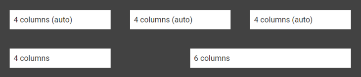
Here is an example of a simple grid:
<v-container class="bg-surface-variant">
  <v-row>
    <v-col>
      <v-sheet class="pa-2 ma-2">
        4 columns (auto)
      </v-sheet>
    </v-col>
    <v-col>
      <v-sheet class="pa-2 ma-2">
        4 columns (auto)
      </v-sheet>
    </v-col>
    <v-col>
      <v-sheet class="pa-2 ma-2">
        4 columns (auto)
      </v-sheet>
    </v-col>
  </v-row>

  <v-row>
    <v-col cols="4">
      <v-sheet class="pa-2 ma-2">
        4 columns
      </v-sheet>
    </v-col>

    <v-spacer></v-spacer>

    <v-col cols="6">
      <v-sheet class="pa-2 ma-2">
        6 columns
      </v-sheet>
    </v-col>
  </v-row>
</v-container>
Here is how the above grid should look when rendered:
As is the case with Quasar, Vuetify also supports cross-platform development and is feature-rich.
BootstrapVue’s grid component
For those who use and love the Bootstrap CSS framework, BootstrapVue’s grid component could be an ideal solution. It offers a 12-point, mobile-first grid system built using CSS flexbox and provides the following components:
b-container— wraps the grid in a containerb-row— defines a rowb-form-row— defines a row in a formb-col— defines a column
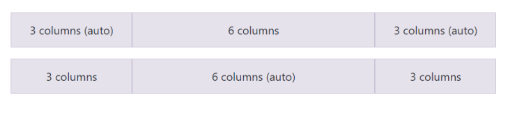
Let’s see an example:
<b-container class="bv-example-row">
  <b-row class="text-center">
    <b-col>3 columns (auto)</b-col>
    <b-col cols="6">6 columns</b-col>
    <b-col>3 columns (auto)</b-col>
  </b-row>

  <b-row class="text-center">
    <b-col cols="3">3 columns</b-col>
    <b-col>6 columns (auto)</b-col>
    <b-col cols="3">3 columns</b-col>
  </b-row>
</b-container>
Here is the rendered grid:
And that was the last library in this category. For more similar options, take a look at this list of Vue-based UI frameworks.
Gridstack — A vanilla JS data grid library with Vue support
The third approach is to use a vanilla JS library to build your Vue grid layout. Use this option if you want to make your project more flexible or if you want to port it to different libraries.
The only option we’ll explore here is GridstackJS. It’s pretty similar to Vue Grid Layout, but can be used with any frontend library.
GridstackJS is a powerful and flexible TypeScript-based library offering the following features:
- Mobile support
- Draggable and resizable items
- Responsive column-based layouts
- Ability to save and restore layout structure
- Support for dragging between multiple grids
- Nested grids
- Integration with popular UI frameworks like Angular, Vue, React, etc.
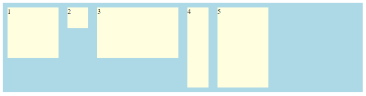
Here is a pretty simple example of Gridstack capabilities:
<style type="text/css">
  .grid-stack { background-color: lightblue; }
  .grid-stack-item-content { background-color: lightyellow; }
</style>

<div class="grid-stack"></div>

<script type="text/javascript">
 var items = [
    {x:0,y:0,w:2,h:2, content: "1"},
    {x:2,y:0, content: "2"},
    {x:3,y:0,w:3,h:2, content: "3"},
    {x:6,y:3,w:1,h:3, content: "4"},
    {x:7,y:0,w:2,h:3, content: "5"},
  ];

  var grid = GridStack.init();
  grid.load(items);
</script>
Here is the result of the above code:
This is a great library if you need to build complex interactive layouts. Additionally, Gridstack may be a good option if you work with two or more UI frameworks — Vue and React, for example — and want a universal data grid solution for all of them instead of using different solutions for each one.
Conclusion
Building layouts is an unavoidable task in a developer’s life. No matter what you are building — a website, a web app, or something else — you are bound to add some kind of layout at some point.
Luckily, in this tutorial, you learned the best ways to build data grids in Vue to display content, as well as how to choose the most appropriate option for your case.
We also discussed how data tables differ from data grids. Since developers often incorrectly use both terms interchangeably, this distinction is important to understand when you are searching for an appropriate layout library.
Now you’re ready to start building layouts with Vue.
Experience your Vue apps exactly how a user does
Debugging Vue.js applications can be difficult, especially when there are dozens, if not hundreds of mutations during a user session. If you’re interested in monitoring and tracking Vue mutations for all of your users in production, try LogRocket. 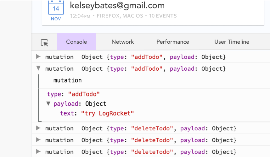 https://logrocket.com/signup/
LogRocket is like a DVR for web and mobile apps, recording literally everything that happens in your Vue apps including network requests, JavaScript errors, performance problems, and much more. Instead of guessing why problems happen, you can aggregate and report on what state your application was in when an issue occurred.
The LogRocket Vuex plugin logs Vuex mutations to the LogRocket console, giving you context around what led to an error, and what state the application was in when an issue occurred.
Modernize how you debug your Vue apps – Start monitoring for free.
Source link
