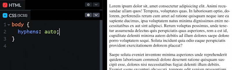
CSS hyphenation support is pretty good — just a -webkit- prefix left for Safari I’d love to see them yank off. Toss it on a parent, let it cascade, and you’ll see text hug the ragged edge a little closer and a little more consistently. You don’t have to use it, it’s a bit of an aesthetic choice.
I was thinking about this because I saw Hyphenopoly.js — a polyfill for hyphenation in JavaScript that’s come out in the last few months. I kinda don’t get it with the browser support being so good, but it does work in Node which might be interesting, and I suppose this would be extensible to written languages where hyphenation isn’t supported yet.
There is a ton more to the CSS art of controlling where words break through. One of the most comprehensive reads on the subject is Will Boyd’s Deep Dive into Text Wrapping and Word Breaking.

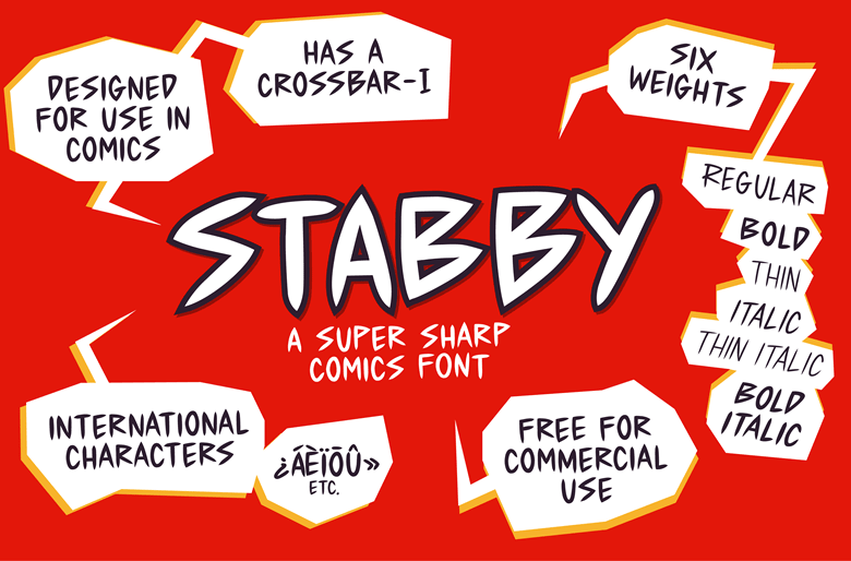
While we’re on type for a second, I do need you to know that Stabby exists:
More good news (in a sec). You know how the content of a page can shift around when a custom font loads after a fallback font has rendered? This is one of the great tradeoffs of display websites right now. Delay rendering until the custom font is ready means no layout shift (good!), but then you’re… delaying rendering (bad!). To my great surprise, the web has shifted toward not delaying rendering, largely thanks to CSS’ font-display: swap;
It is possible to have your cake and eat it too have non-shifting custom font loading without delayed rendering through CSS trickery. It involves using a font loader so that you know when the custom font loads and can adjust CSS to make sure none/little layout shift happens. The tricks were adjusting things like font-size, letter-spacing, and those classics.
The good news is that that old slightly hacky way of dealing with font fallbacks is out and a new school way of dealing with font fallbacks is in. Here’s Katie Hempenius’ recent article:
This article is a deep dive into font fallbacks and the
size-adjust,ascent-override,descent-override, andline-gap-overrideAPIs. These APIs make it possible to use local fonts to create fallback font faces that closely or exactly match the dimensions of a web font. This reduces or eliminates layout shifts caused by font swapping.
Four new things just for fallbacks! Wow. Say you’re loading a custom font called Poppins, it ends up looking like this:
body {
  font-family: Poppins, "fallback for poppins";
}

@font-face {
  font-family: "fallback for poppins";
  src: local("Times New Roman");
  ascent-override: 105%;
  descent-override: 35%;
  line-gap-override: 10%;
}
My brain immediately went uhmmmmm wouldn’t these metrics totally depend on the combination of the custom font and the fallback font? Apparently not though!
Because font metric overrides are calculated using measurements that come from the metadata of the web font (and not the fallback font), they stay the same regardless of which font is used as the fallback font.
That’s really great. So you can basically figure out (or look up) the overrides for your custom font, put them in place, and you’re straight up good to go. That’s a good API.
Welp I didn’t really intend for this whole issue to be about typography stuff, but here we are. You gotta see Adam Argyle’s Text Replace Transitions!

You could code any number of ways. But Adam did it using the new View Transitions API (so you’ll only be able to see the demo in Chrome Canary). It’s such a fun way to play with animating things because the API is so tidy: call document.startViewTransition, change the DOM, let it animate (control with CSS if you want). Hopefully, the CSS properties will be all that is needed entirely from cross-page View Transitions (I think that’s the case, I just haven’t seen it really work well yet).
The post Chris’ Corner: More Like Hypography appeared first on CodePen Blog.
Source link