As a developer, you build software that addresses real-world challenges and positively impacts people’s lives. Moreover, your work could attract significant interest from your peers and colleagues. And having a portfolio to showcase your skills and expertise would be exciting.
Knowing this, I built a simple portfolio website allowing visitors to get to know me and my work! And you can also use it to create a portfolio for yourself.
Building My Portfolio Site
The Outcome
First, let us take a look at the site that we are going to build. Currently, it is deployed in this URL.
The site has five main pages: Landing, Projects, Contact, About, and a Detailed Project page. These are shown below.
Selecting the Tech Stack and Architecture
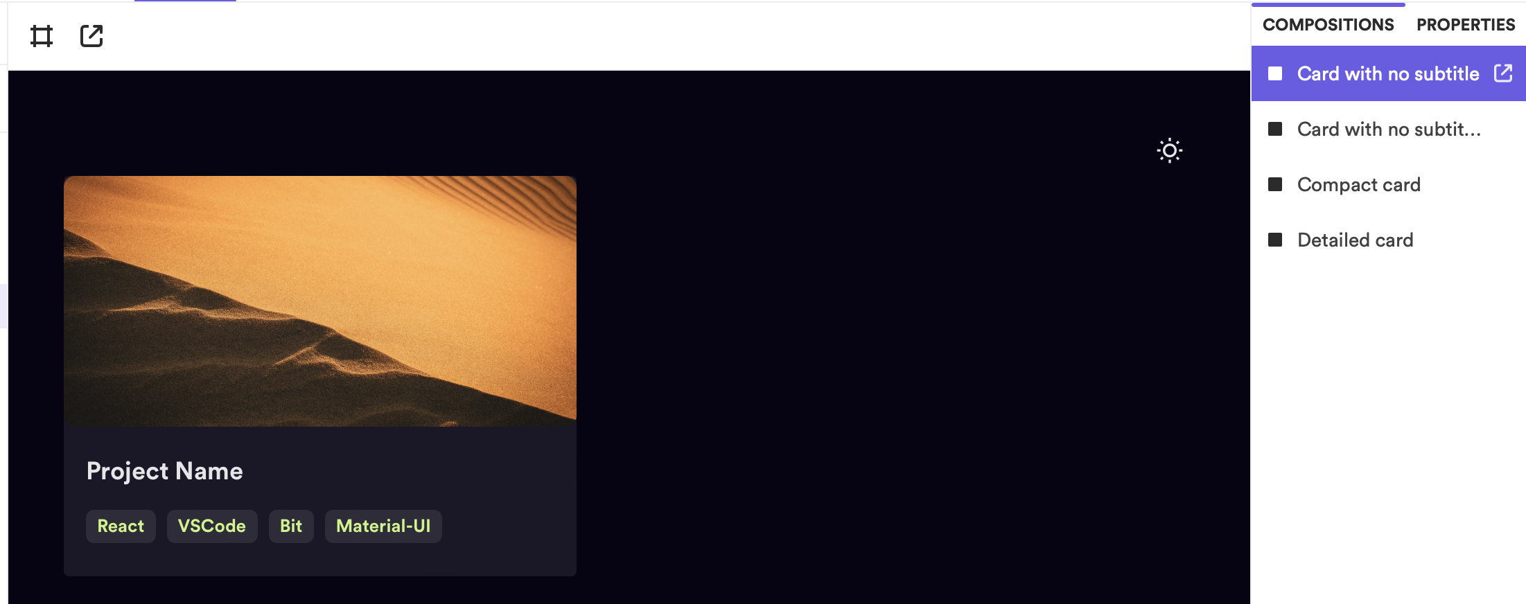
When I started building my site, I wanted to utilize a tech stack and an architecture that’s faster to develop, and anyone could customize to create their portfolio. Therefore, I used React for my front end, with Bit adopting a component-driven architecture.
Using Bit, I’ve split my portfolio application into five main scopes. Here, a scope is like a collaboration server for a collection of components.
- Design: The design scope holds the design system of the portfolio. It contains components such as the theming and generic elements combined to build feature components.
- Personal Portfolio: This scope contains the portfolio web application. It holds the application component that is deployed onto Netlify.
- Dev: The dev scope is created to maintain the development environment and configurations. For example, I’ve used a custom React 18 environment to ensure all components utilized React 18.
- Contact Me: The contact me scope was created to separate the contact me logic from the rest of the scopes. It’s connected with an API to support form submission.
- Starters: The starters scope holds the component responsible for building a boilerplate for others to reuse this portfolio.
In summary, the scopes are connected as shown below.
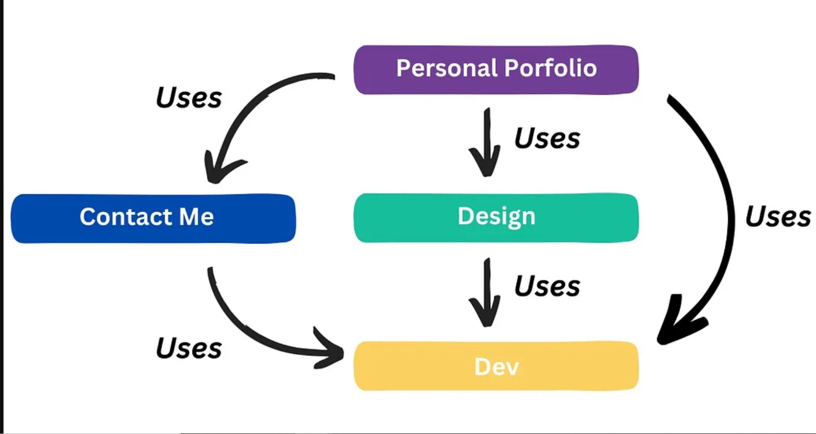
The high-level scope usage architecture
Building the Website: Step-by-Step Guide
While developing this application, I followed several best practices in creating Bit components. Let’s go through them one by one.
- Naming scopes: Initially, I used lengthy names such as
portfolio-site-design-systemas scope names. However, this limits me from reusing the design scope and components with other applications. Hence, I recommend using short, generic, and readable names likedesign. - Naming namespaces: Inside a scope, you’d include several namespaces. For example, I’ve included several namespaces in the
personal-portfolioscope, such aspages,appsandhooks. This makes your code organized and easy to maintain. And, it’s often a Bit best practice to use plural nouns as a namespace name. For example, don’t usepage. Instead, usepages. - Naming components: It’s essential to understand that you are building independent components which can be built in an isolated environment. Hence, your components should only be aware of each by composition. For example, if you were creating a
Buttoncomponent, ensure that you name the component asButtonand notLandingPageButton. - Selecting Props: Try to make your component properties as relevant to your component as possible. For example, don’t use
landingPageVariant. Instead, usevariantto toggle the Button variant. You should be able to customize a component without modifying its internal code (open-closed principle). Thus, use prop spreading to bring about complete customizability. One such implementation is shown here. - Don’t delete components: Do not delete a Bit component after you’ve exported it. This is because other components may depend on it. Therefore, it is an excellent practice to deprecate your component using
bit deprecate. - Start with failing test cases: With Bit, you can seamlessly integrate TDD into your development workflow. Every component has a test file that ensures you ship out thoroughly tested code. Therefore, always start developing your component by designing your test cases first. Start writing failing test cases (that reflect your actual output) and implement your component to ensure that your test cases pass. An excellent example of integrating TDD into your development workflow is shown here through the
Projectsentity component I’ve implemented.
Initializing the Workspace
Firstly, you will need a Bit workspace to develop your components. To do so, run the command shown below.
bit new react my-workspace --default-scope showoff.design
The snippet above will create a new React workspace titled my-workspace and will use a default scope named showoff. Note, you can change this to your preference. This means that out of the box, my components get exported to a scope named “design” in the “showoff” organization in Bit cloud.
Run bit start to launch the development server, and run bit create react my-component-name to create a new React component. Next, I can start building my design and application scopes.
Building the Design Scope
The entire application was built using MUI. Therefore, I’ve extended the MUI components and provided custom implementations where necessary. For example, I extended the MUI theme to create my own theme component as shown here.
import { alpha, Theme, ThemeOptions } from '@mui/material';
import { themeCreator } from '@showoff/design.theme.theme-creator';
import { baseTheme } from '@showoff/design.theme.base-theme';

/**
 * Function that returns a configured light theme
 * @param additionalConfigurations - Additional configurations to be applied to the theme
 * @returns Configured light theme
 */
export function lightTheme(additionalConfigurations?: ThemeOptions): Theme {
  return themeCreator(
    baseTheme(),
    {
      palette: {
        mode: 'light',
        primary: {
          main: '#6C5CE7',
        },
        background: {
          default: '#FFFFFF',
          paper: '#FFFFFF',
        },
        text: {
          primary: '#2B2B2B',
        },
        divider: '#BABEC9',
      },
      components: {
        MuiButton: {
          defaultProps: {
            disableRipple: true,
            disableElevation: true,
            variant: 'contained',
          },
          styleOverrides: {
            root: {
              textTransform: 'none',
              color: '#FFFFFF',
            },
            sizeSmall: {
              padding: '6px 16px',
            },
            sizeMedium: {
              padding: '8px 20px',
            },
            sizeLarge: {
              padding: '11px 24px',
            },
            textSizeSmall: {
              padding: '7px 12px',
            },
            textSizeMedium: {
              padding: '9px 16px',
            },
            textSizeLarge: {
              padding: '12px 16px',
            },
          },
        },
        MuiChip: {
          styleOverrides: {
            root: {
              color: '#6C5CE7',
              fontWeight: 700,
              height: '24px',
              borderRadius: '6px',
              padding: '4px 8px',
              verticalAlign: 'middle',
              alignItems: 'center',
            },
          },
        },
        MuiInputBase: {
          styleOverrides: {
            root: {
              borderRadius: '8px',
              borderColor: '#EDEDED',
            },
            input: {
              '&::placeholder': {
                color: '#707279',
              },
            },
          },
        },
        MuiInputLabel: {
          styleOverrides: {
            root: {
              color: '#707279',
            },
          },
        },
        MuiToggleButton: {
          styleOverrides: {
            root: {
              borderRadius: '8px',
              borderColor: '#EDEDED',
              transition: 'all 0.3s ease',
              textTransform: 'none',
              height: '40px',
              '&.Mui-selected': {
                backgroundColor: '#6C5CE7',
                color: '#EDEDED !important',
                '&:hover': {
                  backgroundColor: alpha('#6C5CE7', 0.8),
                },
                '& .MuiTypography-root': {
                  color: '#EDEDED',
                },
              },
            },
          },
        },
      },
      typography: {
        button: {
          fontWeight: 600,
        },
        allVariants: {
          color: '#2B2B2B',
        },
        fontFamily: 'CircularXX',
      },
    },
    { ...additionalConfigurations }
  );
}
Here, I’ve created a custom light theme component that utilizes a custom palette. Likewise, I extended the MUI design system to build my design elements, as shown below.
Design Scope
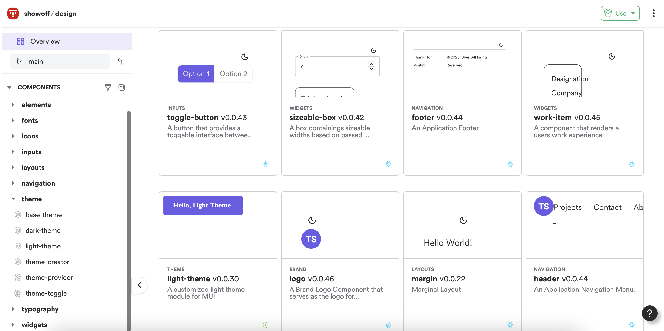
The design scope contains the design system used for the portfolio site. Next, I implemented the site’s navigation menus, layouts, inputs, and even a font family. I have designed these components as separate units, which enables them to be reusable and developed independently.
For example, here is the application’s main navigation menu that I implemented.
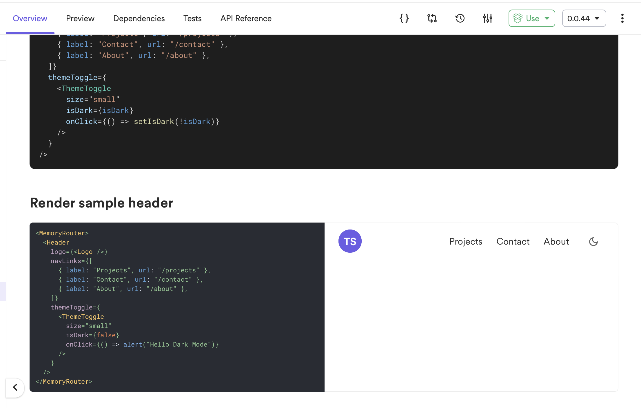
The application header
The figure above shows a header component that compiles the navigation menu for the application. The reusable and customizable header component allows you to change the links, theme toggle, and brand logo.
Building the Developer Scope
While developing the site, I noticed all my components had two main compositions: Light and Dark. These compositions utilized the Light and Dark theme in the design scope. By customizing the Bit developer environment tabs (Docs and Composition), I could use a single composition with a toggle button for theme selection.
For example, let’s look at the react-with-mui environment I developed.
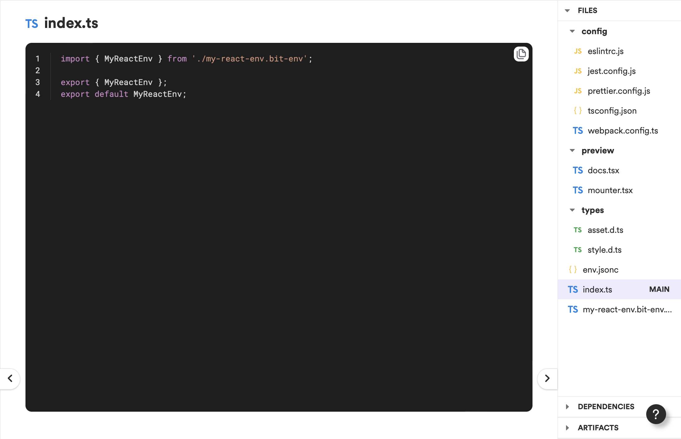
Exploring the custom environment
The environment component has four main files:
- docs.tsx – The file that allows you to provide a custom implementation for the Documentation view of Bit
- mounter.tsx – The file that allows you to provide a custom implementation for the Composition view of Bit
- env.jsonc – The file that lets you declare the dev, runtime, and peer dependencies that will be used by the components that use the environment
- my-react-env.bit-env.ts – The file that lets you mount the custom docs, composition implementations to a component
Here, I decided to update the docs.tsx and mounter.tsx file to utilize a ThemeToggle component to toggle between the Dark and Light themes for each component as shown below.
import React, { useState } from 'react';
import { createMounter } from '@teambit/react.mounter';
import { Box } from '@mui/material';
import { ThemeProvider } from '@showoff/design.theme.theme-provider';
import { ThemeToggle } from '@showoff/design.theme.theme-toggle';
import { darkPortfolioTheme } from '@showoff/personal-portfolio.theme.dark-portfolio-theme';
import { lightPortfolioTheme } from '@showoff/personal-portfolio.theme.light-portfolio-theme';

/**
 * use the mounter to inject and wrap your component previews
 * with common needs like [routing](), [theming]() and [data fetching]().
 */
// eslint-disable-next-line react/prop-types
export function MyReactProvider({ children }) {
  const [themeMode, setThemeMode] = useState<'light' | 'dark'>('light');
  return (
    <ThemeProvider
      theme={themeMode === 'dark' ? darkPortfolioTheme() : lightPortfolioTheme()}
    >
      <Box sx={{ p: 5 }}>
        <Box sx={{ display: 'flex', justifyContent: 'flex-end' }}>
          <ThemeToggle
            isDark={themeMode === 'dark'}
            onClick={() => setThemeMode(themeMode === 'dark' ? 'light' : 'dark')}
          />
        </Box>
        {children}
      </Box>
    </ThemeProvider>
  );
}

/**
 * to replace that mounter component for different purposes, just return a function
 * that uses ReactDOM to render a node to a div.
 */
// @ts-ignore
export default createMounter(MyReactProvider) as any;
The snippet shown above creates a custom implementation for the Composition view. It uses a Theme Toggle to allow Dark/Light toggling and applies the theme for the children that has been passed.
After designing my environment, I had to update my existing components with the new environment. To do so, I executed the command displayed below.
bit envs set <<COMPONENT-NAME>> <<ENV-NAME>>
Hereafter, I was able to directly utilize theme toggling within the component through the env as shown below.
This reduced the composition code in half, just having one composition allowing to toggle between the themes.
Building the Application
After building the design scope using the custom environments, I created an application component that is deployable to host the entire site.
The application component includes all the pages, and the Bit Netlify Deployer is used to deploy the application directly onto Netlify. The application is hosted on the URL linked at the beginning of this post.
const { Netlify } = require("@teambit/cloud-providers.deployers.netlify");

const {
  splitChunks,
  addSitemap,
} = require("@showoff/dev.transformers.portfolio-transformer");

const { prerenderRoutes } = require("./prerender-routes");

const netlifyConfig = {
  accessToken: process.env.NETLIFY_AUTH_TOKEN,
  stagingSiteName: "portfolio-showoff-staging",
  productionSiteName: "portfolio-showoff-production",
  team: "enlear",
  redirects: "_redirects",
  webpackTransformers: [
    splitChunks,
    (config, context) => addSitemap(config, context, [...prerenderRoutes]),
  ],
};

const PortfolioApp = {
  name: "portfolio",
  entry: [require.resolve("./portfolio.app-root")],
  prerender: {
    routes: ["https://feeds.dzone.com/"],
  },
  webpackTransformers: [
    splitChunks,
    (config, context) => addSitemap(config, context, [...prerenderRoutes]),
  ],
  deploy: Netlify.deploy(netlifyConfig),
};

module.exports.default = PortfolioApp;
App Component
This deployer runs whenever you tag your application component, thus simplifying the entire deployment process.
Wrapping Up
In this blog post, I’ve highlighted the most important aspects to consider when building your own. I’ve also created a Bit Starter, which helps you generate a boilerplate code of the portfolio website, which you can customize to build your portfolio in under 10 minutes. Open up a terminal and execute the command shown below.
bit new portfolio portfolio-workspace --aspect showoff.starters/portfolio
By doing so, Bit will create a new workspace with the components required to deploy a copy of the portfolio as your own! To explore the complete codebase, look at my GitHub repository or visit my Bit cloud account to inspect the five scopes.
I hope that you have found this article helpful. Thank you for reading!
Source link
