An accordion menu is a series of adjacent sections that can be expanded or collapsed to reveal or hide content by clicking on the section headers. A user is most likely to come across an accordion in a sidebar menu that has child items or in frequently asked questions pages. The primary purpose of accordions in these scenarios is to better organize information, such that a large amount of content can be easily navigated.
Users have to click on sections headers to reveal content; hence, the primary collapsed state of accordions is less overwhelming and results in a better user experience for users. It also enables users to prioritize which content they want to access, thus allowing them to find their desired relevant information faster.
Since the key benefit of accordions is to reduce cognitive load and to ease navigation, we can broadly generalize the use of accordions to just two use cases:
- We use accordions when we have a large amount of content that we need to simplify
- We use accordions to simplify the menu and group relevant pages together
That said, they can provide some challenges for your users. Let’s take a look at what accordion menus are and why they can be a problem for UX designers:
Best practices for accordion design
Even though accordions are quite common and we encounter them regularly, they can still be hard to identify by the user because their styling can vary a lot from one application to another. Therefore, in order to make accordions intuitive for users, we must ensure some basic anatomical characteristics, as follows:
- Each section of the accordion must have a clear and concise header. This header is the primary way the user will be informed on what the elaborate section contents might contain
- The section header must be clickable and there must be visual indication that suggests that the section header is clickable. This is typically achieved by including icons as the caret, plus, or arrow symbol on the header section and also changing the cursor to the hand icon on hover
- The content that’s revealed upon clicking the section header should be visually distinct, such that the user understands that it is the revealed content. The content should be directly relevant to the section header, and it should also be placed visually close to the section header as per the proximity rule of user interface design
- The sections throughout the accordion component should follow the same consistent styling. The font, color, background, icons should all be consistent. Therefore, all section headers will follow one singular styling and all revealed content will have one singular styling
- We must ensure there is sufficient visual feedback to communicate to the user which section is open and which section is closed. This can be achieved with visual cues such as a change in background color or symbol
- Good accordion design also ensures accessibility for users with disabilities. We ensure this by enabling keyboard navigation or ARIA attributes
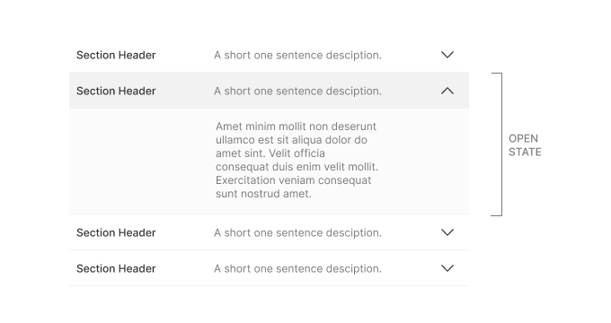
Even though the image above demonstrates section headers with both titles and descriptions, it is completely optional. Section headers can simply be one singular body of text, which is usually a short descriptive sentence or phrase.
The image above demonstrates the various different icons that could be used to signify that it is a clickable section header. Nielsen Norman Group conducted an elaborate study to identify which icon is the best, and their finding suggests that the caret icon is the most effective in matching user expectations.
However, they also mention that other symbols are also in use in many places and it will not be possible to match the mental models of all users. Their findings state that section headers with no symbol receive the majority of their taps on the text, while on others with icons, most users tended to click on the icon. This is because users have had a negative experience elsewhere where they clicked on a text and the accordion didn’t expand.
The study also found that the caret icon had the lowest expectation of being directed to a new page on click, and no icon had the highest expectation of being directed to a new page. Using new icons outside these common ones are likely to have the same effect as using no icon — i.e., users will most likely expect to be taken to a new page.
As per the study, using the caret symbol is better than using no symbol at all. Using the plus or arrow symbol is not better than having no icon at all. An assumption that was debunked via the study was that users don’t automatically expect to be taken to a new page by the arrow symbol, since the expectation is on par with the plus icon and no icon.
The study recommends not to use split buttons for accordions, since it can confuse users if text performs one action and the icon performs another. This recommendation is because the study found users to tap equally on both places with the expectation of performing the same task.
If accordions are used for menu items, they should either open a submenu or go directly to an overview page. In cases where it goes to a new page, don’t use a right-aligned icon.
The UX problem with accordions
The use of accordions can be particularly enriching because of aspects such as the minimization of the need for scrolling; the fact that the section headers act as a form of easily digestible information architecture; and that they are a good alternative to hyperlinks acting as on-page expand interactions (which can be confusing for users, since hyperlinks are associated with going to a new page). However, despite these advantages, accordions have several usability issues:
- If there are lots of sections that require expansion, then it is better not to use accordions. Miller’s Law states that the number of objects an average person can hold in working memory is about seven. If the number of clickable options goes well beyond seven, it can become daunting to users to decide which ones are relevant and require exploration. In such cases, it is much better to have all the content exposed at once and just let the user gradually scroll. Scrolling is not difficult for the user, and the user’s attention requires less switching
- The more clicks a user performs that doesn’t result in getting their desired content, the less likely they are to continue clicking to keep searching. Fruitless clicks lead to frustration and the need to wait for content to appear can also be perceived as time wastage
- Hiding content behind a collapsed accordion section makes it less discoverable to users. Users are less likely to discover hidden content, particularly if the click interaction is not enticing enough for the user
- For accessibility, accordions have to be programmed for access via keyword or ARIA attributes. However, plain text is accessibility ready and no extra effort is required
- In some cases, accordion content might be desirable print material but accordions are not readily optimized for printing. In such cases, a printer friendly version has to be made available as well
Nielsen Norman Group found that users do scroll long pages, as long as they have relevant content and are organized and formatted properly for easy scanning. The scroll interaction on mouse and trackpads is much easier than performing clicks on targets. The content simply needs to be structured and presented better.
From this, we can gather that the correct usage of accordions to ensure a smooth user experience can be generalized as follows:
- Accordions should be avoided when users need most of the content at once
- Accordions are most suitable when the user needs only a few key pieces of content
- On mobile screens, a long scroll can be a negative experience and an accordion interaction is more suitable
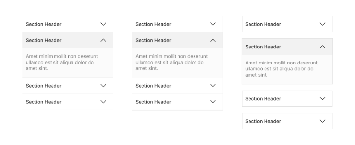
In our article so far, we’ve discussed accordions in the context of menus and collapsible on-page content. There are far more varied uses of accordions, such as in forms and filters. Therefore, when designing for the various use cases, an important consideration to have is whether to enable a single-active or multiple-active accordion. The image below demonstrates the two different accordion states.
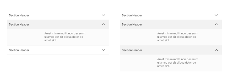
For instance, when using accordions in multistep form design, it might be desirable to use single-active accordions so that user focus and attention remains on the task at hand (i.e., the section of the form that the user is filling out). This reduces error and information overload. The final confirmation screen can summarize all the data at a glance before submission.
However, when designing accordions for filters, it may be desirable to have multiple active sections so that the user can mix and match choices. Putting child items inside parent filter options does reduce the number of options at first glance for the user, as opposed to having a long list of filter items.
The variation in accordion styling can be summarized by the image below. The accordion design is can be simple, more obvious and contained in a box, or with some separation to further convey a clickable button style interaction. We see the separated interaction particularly in single-active accordions to convey that toggling one open will collapse the other because they’re not directly related.
Some designers debate whether to have an accordion open or closed by default. The argument for open by default is to convey to users that it is an accordion and to surface important information. However, it should also be noted that important information that should be on the surface does not belong inside an accordion to begin with. As we’ve discussed earlier, users tend to miss content hiding inside accordions; hence, we should only use accordions where we can afford less discoverability for that content.
One of the most popular uses for accordions is in menus, but they are not suited for websites with a large number of subcategories. In such a case, there are better alternatives to accordions:
- Mega menus: In this type of menu system, all the subcategories are presented to the user at once and require no additional click interaction. The user can easily scan all the options and make the appropriate decision without having to go back and forth between options
- Tabs: A tab-segmented menu may not be any better than an accordion if there are too many tabs. However, if a few tabs can be used to simplify the menu without any other expand or collapse interactions, then it’s a superior solution to using several accordions. The goal is to minimize the clicks while still reducing cognitive load
Keeping the goals of click minimization and reduction of cognitive load in mind, we can apply similar interactions such as tabbed views in other scenarios as well, as alternatives to accordions.
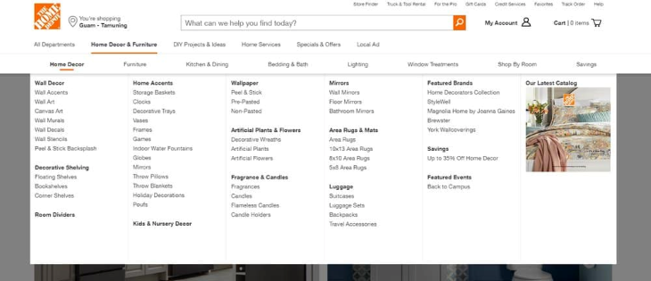
The most common place to see a mega menu is on an ecommerce website with several subcategories. The top parent categories are few, about seven or eight; and the subcategories are numerous, but they are all in plain sight and require no additional clicks.
The user can view all the options at a glance and make a comparative decision as to which one is the most appropriate for them. This is the perfect balance between minimization and organization. The subcategories are neatly arranged with titles for easy scannability even though they are all present all at once.
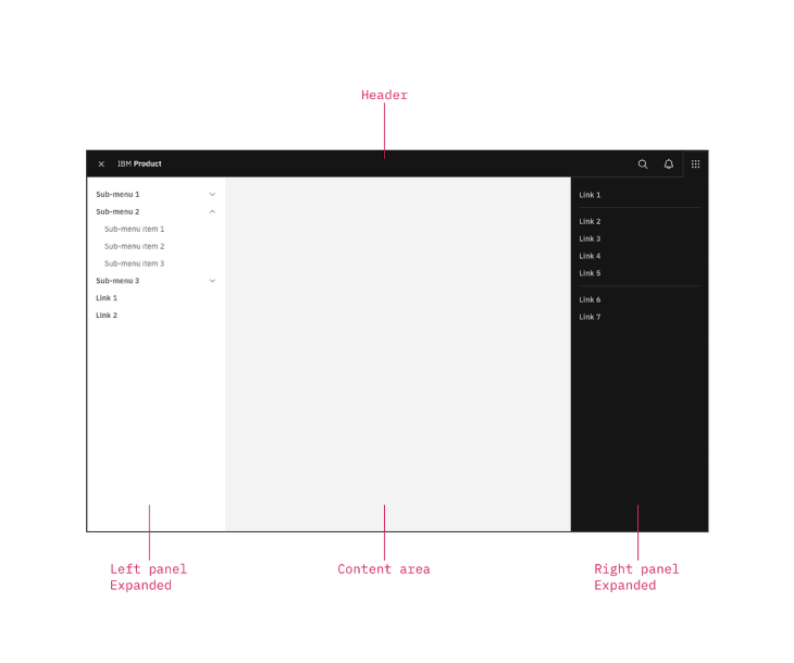
For circumstances other than menu design, we can replace accordions with blocking or nonblocking modals. A good example of a nonblocking modal is an expanding right panel. A blocking modal is the one that we traditionally identify as the one with the dark overlay hiding the body content in the background.
Good modal design is a subject that has to be studied on its own, but we should keep our goal of content organization and cognitive load reduction in mind. We should be pragmatic about whether putting the content inside a modal is a superior solution.
In many cases, just having all the content on the surface is enough; all that’s needed is proper structure, formatting and scannability.
Featured image source: IconScout
LogRocket: Analytics that give you UX insights without the need for interviews

LogRocket lets you replay users’ product experiences to visualize struggle, see issues affecting adoption, and combine qualitative and quantitative data so you can create amazing digital experiences.
See how design choices, interactions, and issues affect your users — try LogRocket today.
Source link