Having interesting, eye-catching visuals can go a long way towards making your site memorable to viewers. Nowadays, wavy backgrounds are a popular trend in web design, however, the wave is a notoriously difficult shape to implement. In this article, we’ll learn how to create a few kinds of simple waves using both CSS and SVG, then implement them into an actual UI.
Jump ahead:
Project overview
The basic idea behind creating a wave shape is to create a rectangle element with an oval above and below it:
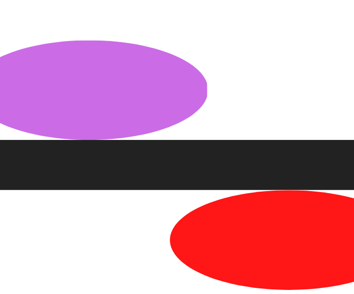
As seen in the image below, by overlapping the two ovals on top of the rectangle, we can create the shape of a wave:
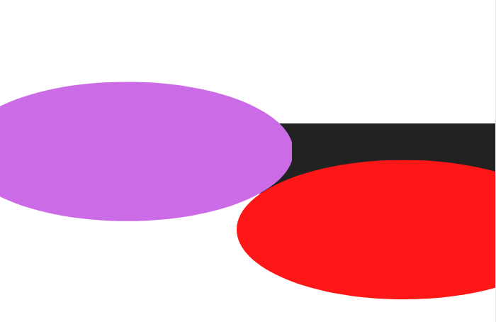
If we make the purple oval black and the red oval white, our wave will be done! We can remove the excess purple part on top of the rectangle by using clip-path, which we’ll discuss later:
Creating waves with CSS
To create this type of wave effect in CSS, first, we’ll create a wave div that will have a relative position and a fixed height and width. Then, we’ll create two pseudo classes for the purple and red ovals. We’ll give each an absolute position according to the image above, as well as a fixed height and width.
We’ll use the top property to move the ovals up and down and a border-radius to give them a circular shape:
<head>
    <style>
        body {
            overflow: hidden;
            margin: 0;
            padding: 0;
        }

        .wave {
            display: block;
            position: relative;
            height: 40px;
            width: 100%;
            background: rgb(57, 27, 112);
            transform: scale(1, 1);
        }

        .wave:before {
            content: "";
            display: block;
            position: absolute;
            border-radius: 100%;
            width: 100%;
            height: 300px;
            background-color: white;
            right: -25%;
            top: 20px
        }

        .wave:after {
            content: "";
            display: block;
            position: absolute;
            border-radius: 100%;
            width: 100%;
            height: 300px;
            background-color: rgb(57, 27, 112);
            left: -25%;
            top: -240px;
            clip-path: ellipse(100% 15% at -15% 100%);
        }
    </style>
</head>
<body>
    <div class="wave">
    </div>
</body>
There are a few important things to note here. For one, you don’t have to change any values within the code to manually adjust the height and width of the wave. Instead, we have a transform scale in the wave class that we can use to scale the wave up or down in the x and y directions.
We use the clip-path in the after element so the purple circle, as shown in the image above, does not exceed the rectangle’s height:
See the Pen
Pseudo Elements CSS Wave by Saleh-Mubashar (@saleh-mubashar)
on CodePen.
Creating waves with SVG
Creating shapes like waves and other similar complex designs is arguably easier to do with SVG than CSS. Let’s create the same wave from above in SVG.
To start off, we need a basic understanding of how SVG shapes work. The SVG path element will do most of the work for us. Below is a brief overview of the commands we’ll use:
M: Move to; takes twoxandyparametersL: Line to; takes twoxandyparameters, creating a line from the current position to the new positionC: Curve to; takes three sets of coordinates as parameters to create a Bézier curve
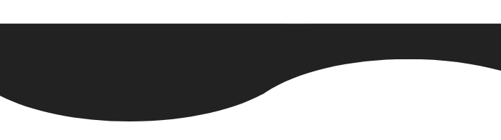
Now, let’s create a simple wave:
See the Pen
Simple SVG Wave by Saleh-Mubashar (@saleh-mubashar)
on CodePen.
In the HTML, you can see the simple, four line SVG code we used to create this wave. Let’s break it down.
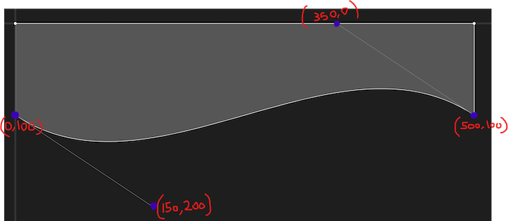
viewBox in the SVG element basically determines the width and height of the SVG as a whole. For the path, we first have an M command in the position 0,100. Basically, we are moving to the coordinate 0,100. 100 means 100 px down the y-axis.
Next, we have a Bezier Curve, C. We’ve given it three coordinates, which represent the maximum and minimum points of the wave. Lastly, L creates the straight lines to the right and left of the rectangle.
A great way to create a wave, visualize it, and work with SVGs in general is to use an SVG path editor. Take a look at the one below for our wave:
Example design
To wrap things up, we’ll create a simple web design using both the CSS and SVG waves. The design is very simple, consisting of a title, some text, and a dummy button, but you can build onto it as desired. For the layout, we’ll use display flex. We’ll implement the wave at the bottom of the blue background.
With the CSS approach, we simply add the div with class of wave after the container:
See the Pen
CSS Wave Design by Saleh-Mubashar (@saleh-mubashar)
on CodePen.
The SVG approach is similar, however, we add the SVG code directly after the container. The results will be identical:
See the Pen
SVG Wave Design by Saleh-Mubashar (@saleh-mubashar)
on CodePen.
Layered waves with SVG
Another common wave design involves using multiple waves to form a layered effect. To recreate this, we’ll make three similar waves with only slight differences in the amplitude and frequency. Below is the code for the first wave:
<svg viewBox="0 0 500 200">
  <path d="M 0 50 C 150 150 300 0 500 80 L 500 0 L 0 0" fill="rgb(57, 27, 112)"></path>
</svg>
It is similar to the one we discussed earlier, just smaller in height. For the second wave, we’ll create another similar wave with some minor differences:
<path d="M 0 50 C 150 150 330 -30 500 50 L 500 0 L 0 0" fill="#0E7452" opacity="0.8"></path>
Below is the path for the third wave:
<path d="M 0 50 C 215 150 250 0 500 100 L 500 0 L 0 0" fill="#0E7452" opacity="0.5"></path>
To make it look better, you can play around with the opacity and fill of each wave. To create the layered effect, we won’t create a separate SVG element for the second and third wave. Instead, we’ll add their paths to the SVG element created for the first wave.
Below is the combined code:
<svg viewBox="0 0 500 200">
  <path d="M 0 50 C 150 150 300 0 500 80 L 500 0 L 0 0" fill="rgb(57, 27, 112)"></path>
  <path d="M 0 50 C 150 150 330 -30 500 50 L 500 0 L 0 0" fill="#0E7452" opacity="0.8"></path>
 <path d="M 0 50 C 215 150 250 0 500 100 L 500 0 L 0 0" fill="#0E7452" opacity="0.5"></path>
</svg>
See the Pen
SVG Layered Waves by Saleh-Mubashar (@saleh-mubashar)
on CodePen.
There are several online tools available to help you with SVG wave creation. Some of these include:
- SVGPathEditor: You can create an SVG path, view it in real-time, and edit it using the graph, or you can create a new wave using the interface without having to write any code
- Get Waves: A useful random wave generator that gives output as SVG code
- SVG Wave: A useful wave creator that lets you layer waves and style them however you want without having the write the SVG
Conclusion
Waves are notoriously tricky to create. In this tutorial, we learned how to create a few different types of waves using both CSS and SVG. If you decide to use anything you learned in this tutorial in your project, leave a comment and let me know. Thanks for reading!
Is your frontend hogging your users’ CPU?
As web frontends get increasingly complex, resource-greedy features demand more and more from the browser. If you’re interested in monitoring and tracking client-side CPU usage, memory usage, and more for all of your users in production, try LogRocket. https://logrocket.com/signup/
LogRocket is like a DVR for web and mobile apps, recording everything that happens in your web app or site. Instead of guessing why problems happen, you can aggregate and report on key frontend performance metrics, replay user sessions along with application state, log network requests, and automatically surface all errors.
Modernize how you debug web and mobile apps — Start monitoring for free.
Source link
