
Modals, or dialog boxes, are commonly used in websites and web apps to show information without going to a different page. For instance, we can use a modal to update a user profile in a dashboard, ask the user for confirmation before triggering an action, or to create a multi-level form.
Modals are an essential part of web development, but the way we implement modals is equally important, especially when dealing with user interaction. This is because all user interactions are naturally asynchronous. This article will explain how to handle modals with JavaScript promises and then show how to implement modal dialogs using vue-modal-dialogs.
Jump ahead:
Handling modals asynchronously
One of the best ways to implement complex modals is by handling them asynchronously. To handle anything asynchronously in JavaScript, we need promises. Let’s create a promise-based modal with vanilla JavaScript to illustrate this further:
const addItem = (label) => {
  const ul = document.querySelector('ul');
  const li = document.createElement('li');
  li.textContent = label;
  ul.appendChild(li);
}
The addItem above is a helper function that adds the text “item” to a list.
const asyncConfirmModal = (text) => {
  return new Promise(resolve => {
    const okBtn = document.createElement('button');
    const cancelBtn = document.createElement('button');
    okBtn.textContent="Ok";
    cancelBtn.textContent="Cancel";

    popup.appendChild(okBtn);
    popup.appendChild(cancelBtn);

    const onClick = (pass) => {
      resolve(pass);
      popup.remove();
    };

    okBtn.addEventListener('click', onClick.bind(null, true));
    cancelBtn.addEventListener('click', onClick.bind(null, false));
  })
};
The asyncConfirmModal() function returns a promise that is resolved when the user clicks the okBtn.
Did you notice we created a modal by copying how basic promises work in JavaScript? We call resolve(...) when what we were doing asynchronously is successful (in this case, clicking okBtn to confirm adding an item) and call reject(...) when it fails.
const showModal = async () => {
  if (await asyncConfirmModal('Add Item?')) {
    addItem('💡New Item');
  }
}
By creating a promise with the showModal function, we can wait for the user to interact with the modal and then resolve the promise with the user’s response. This allows us to easily handle the user interaction results and continue with our code execution.
We have already covered the fundamentals of creating modals using pure JavaScript with promises. However, UI frameworks like Vue.js are used in most practical applications. When handling modals with Vue.js, the preferred method is to incorporate the modal into a component template and include show/hide logic in the component’s code.
Let’s go ahead and explore a more imperative method using promises.
Promises with Vue 2
As mentioned, using promises to implement complex modals is the best approach. Vue provides a third-party package called vue-modal-dialogs that can turn modals into promises.
What is vue-modal-dialogs?
This package provides a simple way to create modals with Vue 2 and handle them using promises. Incorporating promises allows us to handle complex modals with asynchronous user interactions. The package also provides several customizable options for styling and animations to enhance user experience.
The vue-modal-dialogs API has methods like ModalDialogs.create. This is a dialog function that returns a promise. You can give this function a VueComponent and a prop with the dialog component’s properties. Here is an example of how to use it:
const dialogFunction = create(SomeComponent, 'title', 'content')
dialogFunction('This is title', 'This is content')
This package also provides a dialog promise. A dialog promise is a promise with additional methods for controlling the dialog from outside. It has functions such as close(), error(), transition(), and getInstance(), each of which returns a promise.
Before we begin, you should know that this package won’t work on Vue 3-based projects. If you’re building with Vue 3, you’ll want to use vue3-promise-dialog to create your dialogs and work with them using promises.
Let’s go ahead and implement a modal with this package.
Prerequisites
- Knowledge of Vue.js and JavaScript
- Node.js ≥ v16
- Code editor (preferably VS code)
- vue-cli
- Yarn or npm
Getting started
Create a new Vue 2 project with this command:
vue create <project-name>

? Please pick a preset:
  Default ([Vue 3] babel, eslint)
❯ Default ([Vue 2] babel, eslint)
  Manually select features
Install the following dependencies:
yarn add element-ui vue-modal-dialogs
Navigate to src/main.js and update it with this code snippet:
import Vue from 'vue'
import App from './App.vue'
import ElementUI from 'element-ui';
import 'element-ui/lib/theme-chalk/index.css';
import * as ModalDialogs from 'vue-modal-dialogs'

Vue.use(ElementUI);
Vue.use(ModalDialogs)

Vue.config.productionTip = false

new Vue({
  render: h => h(App),
}).$mount('#app')
Here, we import ModalDialogs to be accessible throughout the Vue app. Navigate to src/App.vue and modify the existing code with these lines:
 <template>
  <div id="app">
    <nested-dialog-view></nested-dialog-view>
    <dialogs-wrapper transition-name="fade"></dialogs-wrapper>
  </div>
</template>

<script>
import NestedDialogView from "./components/NestedDialogView.vue";
import { DialogsWrapper } from "vue-modal-dialogs";
export default {
  name: "App",
  components: {
    NestedDialogView,
    DialogsWrapper,
  },
};
</script>
Create a components directory and these three .vue files:
MessageBox.vueNestedDialogComponent.vueNestedDialogView.vue
The MessageBox.vue will be the bare bones of the modal dialog. Add these lines of code:
<template>
  <div class="message-box dialog-mask" @click="$close">
    <div class="dialog-content">
      <div class="dialog-body">
        <p>{{ content }}</p>
      </div>
      <footer>
        <el-button type="text" size="mini" @click="$close">OK</el-button>
      </footer>
    </div>
  </div>
</template>

<script>
export default {
  name: "MessageBox",
};
</script>
The NestedDialogComponent.vue is also a modal wrapper component for the modal content.
<template>
  <div class="message-box dialog-mask" @click="$close(false)">
    <div class="dialog-content">
      <header>{{ title }}</header>
      <div class="dialog-body">
        <p>{{ content }}</p>
      </div>
      <footer>
        <el-button type="text" size="mini" @click="$close(true)">Yes</el-button>
        <el-button type="text" size="mini" @click="$close(false)">No</el-button>
      </footer>
    </div>
  </div>
</template>

<script>
export default {
  name: "NestedDialogComponent",
};
</script>
Note how $close is used in both components. This feature of <dialogs-wrapper> allows you to close the dialog and return your data by invoking a callback. This will resolve the dialog promise.
The NestedDialogView.vue is the presentational component.
<template>
<div>
<el-button type="primary" @click="ask">Ask something</el-button>
<el-button type="primary" @click="askTransition"
>Ask something else</el-button
>
</div>
</template>
<script>
import NestedDialogComponent from "./NestedDialogComponent.vue";
import MessageBox from "./MessageBox.vue";
import { create } from "vue-modal-dialogs";
const confirm = create(NestedDialogComponent, "title", "content");
const messageBox = create(MessageBox, "content");
export default {
name: "NestedDialogView",
methods: {
star() {
window.open("<https://github.com/hjkcai/vue-modal-dialogs>", "_blank");
},
noStar() {
messageBox("Feel free to do it later.");
},
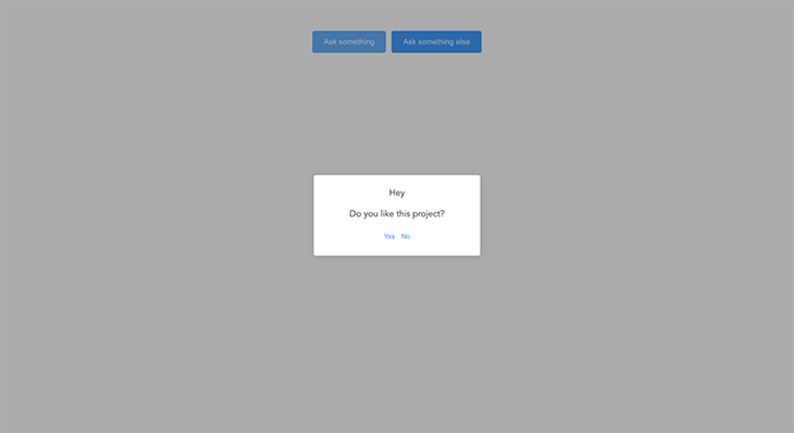
async ask() {
if (await confirm("Hey", "Do you like this project?")) {
if (
await confirm(
"Thanks!",
"Could you please star this project at Github now?"
)
) {
this.star();
} else this.noStar();
} else {
messageBox(
`Could you please tell me what's wrong?\nIssues and PRs are welcomed!`
);
}
},
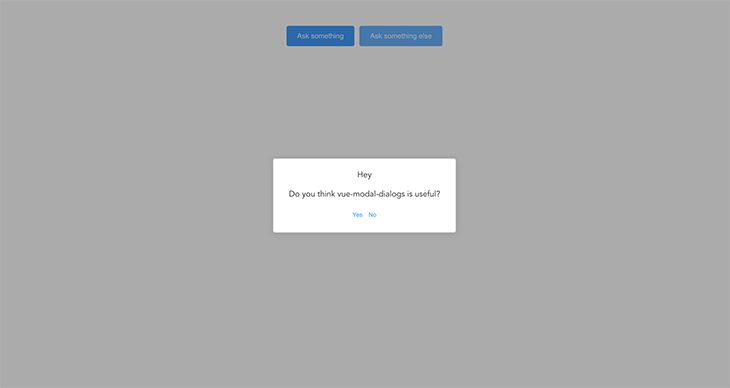
async askTransition() {
if (
await confirm(
"Hey",
"Do you think vue-modal-dialogs is useful?"
).transition()
) {
if (await confirm("Thanks!", "Why not give it a star!").transition())
this.star();
else this.noStar();
} else {
messageBox("Oops... I will do my best to improve it!");
}
},
},
};
</script>
To create promisified modals using vue-modal-dialogs, we use the create() method. The methods are asynchronous, which helps us handle complex modals in Vue 2.
Go ahead and run yarn serve to run the dev server. The app will be served at http://localhost:8080; you should have something like this in your browser:

Alternatives to vue-modal-dialogs for Vue 3
As we mentioned in the previous section, vue-modal-dialogs is only usable with Vue 2. If you’re working with or migrating to Vue 3, you’ll want to consider one of these other options.
vue-js-modal
A versatile and customizable modal library for Vue.js, vue-js-modal is not exclusively designed for promises but easily adaptable. By wrapping modal interactions with promises, the desired behavior can be achieved.
The ModalComponent:
<template>
  <modal name="my-modal" :click-to-close="false">
    <h1>{{ title }}</h1>
    <p>{{ message }}</p>
    <button @click="confirm">Confirm</button>
    <button @click="cancel">Cancel</button>
  </modal>
</template>

<script>
export default {
  props: ['title', 'message'],
  methods: {
    confirm() {
      this.$modal.hide('my-modal', { action: 'confirm' });
    },
    cancel() {
      this.$modal.hide('my-modal', { action: 'cancel' });
    },
  },
};
</script>
The ParentComponent:
<template>
  <div>
    <button @click="openModal">Open Modal</button>
    <my-modal></my-modal>
  </div>
</template>

<script>
import MyModal from '@/components/MyModal.vue';

export default {
  components: {
    MyModal,
  },
  methods: {
    openModal() {
      this.$modal.show(
        'my-modal',
        { title: 'Confirmation', message: 'Are you sure?' },
        {},
        {
          'before-close': (event, data) => {
            if (data.action === 'confirm') {
              this.modalConfirmed();
            } else {
              this.modalCancelled();
            }
          },
        }
      );
    },
    modalConfirmed() {
      return new Promise((resolve) => {
        console.log('Modal confirmed');
        resolve();
      });
    },
    modalCancelled() {
      return new Promise((resolve) => {
        console.log('Modal cancelled');
        resolve();
      });
    },
  },
};
</script>
The modal will appear when you click the Open Modal button. Clicking Confirm or Cancel will hide the modal and execute the promise-based methods modalConfirmed() or modalCancelled(), respectively.
vue-sweetalert2
This is a Vue.js wrapper for the popular SweetAlert2 library, offering promise-based interactions for elegant and customizable alert dialogs.
<template>
  <div>
    <button @click="openDialog">Open Dialog</button>
  </div>
</template>

<script>
export default {
  methods: {
    async openDialog() {
      try {
        const result = await this.$swal({
          title: 'Confirmation',
          text: 'Are you sure?',
          icon: 'warning',
          showCancelButton: true,
          confirmButtonColor: '#3085d6',
          cancelButtonColor: '#d33',
          confirmButtonText: 'Yes',
        });

        if (result.value) {
          this.dialogConfirmed();
        } else {
          this.dialogCancelled();
        }
      } catch (error) {
        this.dialogCancelled();
      }
    },
    dialogConfirmed() {
      return new Promise((resolve) => {
        console.log('Dialog confirmed');
        resolve();
      });
    },
    dialogCancelled() {
      return new Promise((resolve) => {
        console.log('Dialog cancelled');
        resolve();
      });
    },
  },
};
</script>
When you click the Open Dialog button, the SweetAlert2 dialog will appear. Clicking Yes or the Cancel button will resolve or reject the promise and execute the corresponding methods dialogConfirmed() or dialogCancelled(), respectively.
Vuetify dialog loader
Vuetify’s dialog loader is a Vue.js plugin providing a promise-based interface compatible with Vuetify’s dialogs. This plugin simplifies the creation and management of dialogs within Vue applications.
The ConfirmDialog.vue file:
<template>
  <div>
    <h1>{{ title }}</h1>
    <p>{{ message }}</p>
    <v-btn @click="$dialog.ok(true)">Confirm</v-btn>
    <v-btn @click="$dialog.cancel(false)">Cancel</v-btn>
  </div>
</template>

<script>
export default {
  props: {
    title: String,
    message: String,
  },
};
</script>
The ParentComponent.vue file:
<template>
  <div>
    <v-btn @click="openDialog">Open Dialog</v-btn>
  </div>
</template>

<script>
import ConfirmDialog from '@/components/ConfirmDialog.vue';

export default {
  components: {
    ConfirmDialog,
  },
  methods: {
    async openDialog() {
      try {
        const result = await this.$dialog(
          ConfirmDialog,
          {
            title: 'Confirmation',
            message: 'Are you sure?',
          },
          {
            width: 500,
          }
        );

        if (result) {
          this.dialogConfirmed();
        } else {
          this.dialogCancelled();
        }
      } catch (error) {
        this.dialogCancelled();
      }
    },
    dialogConfirmed() {
      return new Promise((resolve) => {
        console.log('Dialog confirmed');
        resolve();
      });
    },
    dialogCancelled() {
      return new Promise((resolve) => {
        console.log('Dialog cancelled');
        resolve();
      });
    },
  },
};
</script>
When you click the Open Dialog button, the Vuetify dialog loader will display the dialog. Clicking Confirm or Cancel will resolve or reject the promise, respectively, and execute the corresponding methods, either dialogConfirmed() or dialogCancelled().
Building a custom dialog component
Alternatively, you can create a tailor-made dialog component that leverages promises, uses Vue’s event handling, and $emit for communication between parent and dialog components, giving you full control over appearance and functionality.
Create a custom dialog using the following code snippet:
The CustomDialog.vue file:
<!-- CustomDialog.vue -->
<template>
  <div v-if="visible" class="dialog-overlay">
    <div class="dialog">
      <h1>{{ title }}</h1>
      <p>{{ message }}</p>
      <button @click="confirm">Confirm</button>
      <button @click="cancel">Cancel</button>
    </div>
  </div>
</template>

<script>
export default {
  props: ['title', 'message'],
  data() {
    return {
      visible: false,
    };
  },
  methods: {
    open() {
      this.visible = true;
    },
    close() {
      this.visible = false;
    },
    confirm() {
      this.close();
      this.$emit('dialog-result', { action: 'confirm' });
    },
    cancel() {
      this.close();
      this.$emit('dialog-result', { action: 'cancel' });
    },
  },
};
</script>

<style>
.dialog-overlay {
  position: fixed;
  top: 0;
  left: 0;
  right: 0;
  bottom: 0;
  background-color: rgba(0, 0, 0, 0.5);
  display: flex;
  justify-content: center;
  align-items: center;
}

.dialog {
  background-color: white;
  padding: 1rem;
  border-radius: 0.5rem;
  width: 50%;
}
</style>
This component renders a custom dialog box with a title, message, and two buttons for confirmation and cancellation.
The component has two data properties:
visible, which is initially set tofalseand controls whether the dialog is visible or notmessage, which is set through a prop passed down from the parent component
The template consists of a div that only renders when visible is set to true. This div acts as an overlay that covers the entire screen with a semi-transparent black background color.
Within this div, there is another div that represents the dialog box. The title and message are displayed within the dialog box, along with two buttons that trigger the confirm and cancel methods when clicked. (This might sound familiar!)
The open method sets visible to true, showing the dialog box. The close method sets visible to false, hiding the dialog box. The confirm method is called when the user clicks the Confirm button, sets visible to false, and emits an event called dialog-result with an object containing an action property set to confirm.
Similarly, the cancel method sets visible to false and emits an event called dialog-result with an object containing an action property set to cancel.
Finally, there is some basic styling defined for the overlay and dialog box.
The ParentComponent.vue file:
<!-- ParentComponent.vue -->
<template>
  <div>
    <button @click="openDialog">Open Dialog</button>
    <custom-dialog ref="customDialog" @dialog-result="handleDialogResult" title="Confirmation" message="Are you sure?"></custom-dialog>
  </div>
</template>

<script>
import CustomDialog from '@/components/CustomDialog.vue';

export default {
  components: {
    CustomDialog,
  },
  methods: {
    openDialog() {
      this.$refs.customDialog.open();
    },
    handleDialogResult(result) {
      if (result.action === 'confirm') {
        this.dialogConfirmed();
      } else {
        this.dialogCancelled();
      }
    },
    dialogConfirmed() {
      return new Promise((resolve) => {
        console.log('Dialog confirmed');
        resolve();
      });
    },
    dialogCancelled() {
      return new Promise((resolve) => {
        console.log('Dialog cancelled');
        resolve();
      });
    },
  },
};
</script>
This component renders a button and a custom dialog component. The button has a click event listener that triggers the openDialog method when clicked. The custom dialog component is defined as a child component and is passed a title and a message as props. It also emits a dialog-result event with an object containing an action property that indicates whether the user confirmed or canceled the dialog.
The openDialog method accesses the custom dialog component using the $refs property and calls its open method to display the dialog.
The handleDialogResult method receives the result emitted by the custom dialog component and determines whether the user confirmed or canceled the dialog. If the user confirmed the dialog, the dialogConfirmed method is called, otherwise, the dialogCancelled method is called.
The dialogConfirmed and dialogCancelled methods each return a promise that resolves after logging a message to the console.
You can choose the option that best aligns with your project’s needs and requirements, and consult each library’s documentation for implementation guidance.
Handling modals with the Composition API and vue3-promise-dialog
vue3-promise-dialog is the Vue 3 alternative to vue-modal-dialogs. However, unlike vue-modal-dialogs, this package does not have inbuilt modal components. Instead, it provides helper methods such as openDialog() and closeDialog().
As the name implies, openDialog() is used to open a dialog. On the other hand, closeDialog() is used to close the currently opened dialog. It resolves the promise with the return value of the dialog or with the given data, if any.
This gives us the freedom to write custom dialog methods like this:
//dialogs.js
import {openDialog} from "vue3-promise-dialog";
import ConfirmDialog from "../components/ConfirmDialog.vue";

export async function confirm(text) {
    return await openDialog(ConfirmDialog, {text});
}
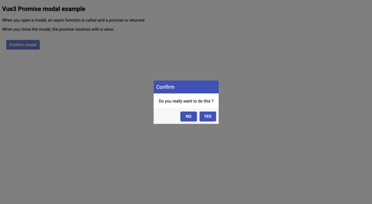
The code snippet below is a typical example of how to create promise-based dialogs with Vue 3. We can use this method in a presentational component using the Vue 3 Composition API, like this:
<template>
<DialogWrapper :transition-attrs="{name: 'dialog'}"/>
</template>
import {defineComponent, reactive} from "vue";
import DialogWrapper from "vue3-promise-dialog";
import {confirm} from "./dialogs";
export default defineComponent({
components: {DialogWrapper},
props: {},
setup(props, context) {
const items = reactive([]);
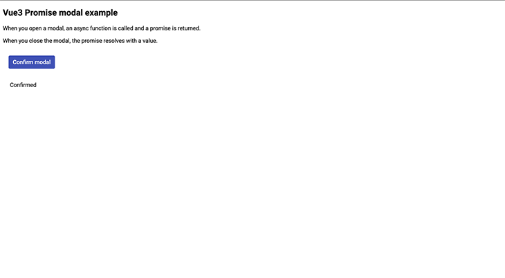
async function onTestConfirm() {
if (await confirm('Do you really want to do this ?')) {
items.push("Confirmed")
} else {
items.push("Not confirmed");
}
}
return {
onTestConfirm,
items
}
}
})
</script>
The DialogWrapper component is a container for the dialog UI. You should have something like this:
If you run into this error (Module not found: Error: Can't resolve 'sass-loader') as you follow along, the following command will resolve it:
npm install -D [email protected]^10 sass
The complete codebase for this example is on GitHub.
Conclusion
In this article, we learned how to create modals/dialogs with JavaScript and then explored implementing promise-based modals with Vue.js packages.
There are a few reasons why the inline component approach of handling user interaction using modals is not recommended, including:
- Everywhere you need to use the modal, you need to tweak logic in the parent component
- A modal/dialog can only be opened from a parent Vue component
- If a parent component requires several other modals, more often than usual, the codebase gets messy
Promise-based dialogs solve these issues. It is not just a good code design choice but also the best way to handle user interactions in JavaScript, as user interactions are asynchronous.
Experience your Vue apps exactly how a user does
Debugging Vue.js applications can be difficult, especially when there are dozens, if not hundreds of mutations during a user session. If you’re interested in monitoring and tracking Vue mutations for all of your users in production, try LogRocket. 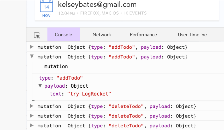 https://logrocket.com/signup/
LogRocket is like a DVR for web and mobile apps, recording literally everything that happens in your Vue apps including network requests, JavaScript errors, performance problems, and much more. Instead of guessing why problems happen, you can aggregate and report on what state your application was in when an issue occurred.
The LogRocket Vuex plugin logs Vuex mutations to the LogRocket console, giving you context around what led to an error, and what state the application was in when an issue occurred.
Modernize how you debug your Vue apps – Start monitoring for free.
Source link
