From our sponsor: Connect Design and Development to Deliver Better Customer Experiences with Applitools Centra.
The other day I stumbled upon the website of Evervault made by Nev Flynn and the hover effect on their customer grid immediately caught my attention! What a cool effect! I was wondering how they did it and after inspecting and playing around with it, I figured that it would be a really interesting thing to share the underlying code with you and recreate this. This effect combines a fun typography animation with a moving gradient mask.
So let’s get started! First thing, check out the hover effect on their website. Here’s a video that will make this future-proof 😉
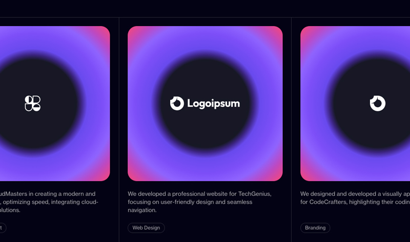
We’ll begin by creating a grid structure. Each item in the grid will contain a logo and some description, exactly like in Evervault’s customer grid. The element that will contain the changing code letters will be a division with the class grid__item-img-deco. This element will also contain our spotlight.
<div class="grid">
	<div class="grid__item">
		<a class="grid__item-img">
			<div class="grid__item-img-deco"></div>
			<svg width="40" height="40" viewBox="0 0 40 40" fill="none"><!-- SVG logo --></svg>
		</a>
		<p class="grid__item-label">We designed and developed a visually appealing website for CodeCrafters, highlighting their coding expertise.</p>
		<span class="grid__item-tag">Branding</span>
	</div>
	<div class="grid__item">
		<!-- ... -->
	</div>
	<div class="grid__item">
		<!-- ... -->
	</div>
	<!-- ... -->
</div>
Where is the element that will contain the juicy colors, you ask? Well, that will be a pseudo-element!
The cool thing about this effect is how it uses a smart trick to move the spotlight, which is by changing CSS variable values! But first, let’s have a look at how to styles all this.
Let’s have a look at the grid styles. We’ll make a grid with 3 columns (for bigger screens) and add a border between the items by setting a gap of 1px between the grid items:
.grid {
	display: grid;
	margin: 10vh 0;
	grid-template-columns: 1fr;
	border: 1px solid #2a2b3a;
	background: #2a2b3a;
	gap: 1px;
}

@media screen and (min-width: 33em) {
	.grid {
		grid-template-columns: repeat(2,1fr);
	}
}

@media screen and (min-width: 53em) {
	.grid {
		grid-template-columns: repeat(3,1fr);
	}
}
The grid items have the same background color as the whole page:
.grid__item {
	padding: 1.5rem 1.5rem 2rem;
	display: grid;
	gap: 1.5rem;
	background: var(--color-bg);
	align-content: start;
	grid-template-rows: auto 1fr auto;
}
All totally irrelevant to the effect, so let’s get to the interesting bits!
The image area of the grid item is our element of interest. Let’s style it. This element will be home to our variables that will determine the position of the mask aka spotlight for our effect:
.grid__item-img {
	width: 100%;
	aspect-ratio: 1;
	border-radius: 1.6rem;
	position: relative;
	overflow: hidden;
	display: grid;
	place-items: center;
	--x: 0px;
	--y: 0px;
}
Here we are! The –x and –y variable will be responsible for the position of our mask. But where is the style for our mask? Well, wait, let’s first define the colorful gradient that will overlay everything using a blend mode:
.grid__item-img::after {
	content: '';
	position: absolute;
	top: 0;
	left: 0;
	width: 100%;
	height: 100%;
	background: radial-gradient(rgb(23, 24, 37) 40%, rgb(102, 51, 238) 50%, rgb(142, 100, 255), rgb(249, 38, 114));
	mix-blend-mode: darken;
}
If you remove the blend mode, you see how the gradient looks:
And now to the fascinating part of the code letters. So this element will be filled with lots of letters using JavaScript. They are styled in the following way:
.grid__item-img-deco {
	position: absolute;
	top: 0;
	left: 0;
	height: 100%;
	width: 100%;
	font-family: "input-mono", monospace;
	font-size: 0.85rem;
	word-wrap: break-word;
	line-height: 1.15;
	color: #fff;
	opacity: 0;
	-webkit-mask-image: radial-gradient(300px circle at var(--x) var(--y), black 20%, rgba(0,0,0,0.25), transparent);
	mask-image: radial-gradient(300px circle at var(--x) var(--y), black 20%, rgba(0,0,0,0.25), transparent);
}
By default, this element will be invisible. We’ll show it once we hover using JavaScript. Let’s have a closer look at that mask image which is a radial gradient:
radial-gradient(
	300px
	circle at var(--x) var(--y),
	black 20%,
	rgba(0,0,0,0.25),
	transparent
	)
You can see it better when removing the pseudo element with the gradient:
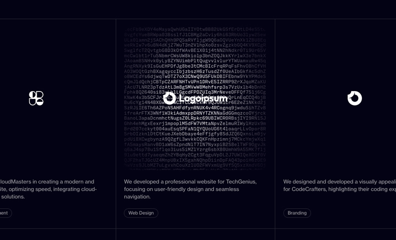
As explained in the CSS reference entry, the first pixel value is an explicit size for the gradient which is 300 pixels in this case. Unfortunately, percentage values can’t be used here. Then the position of the circle origin is determined. The black starts at 20% and then we’ll add another stop that is semi-transparent. The last stop is completely transparent. These values will make sure that the focal point of the spotlight is not too wide but fits nicely to highlight the logo!
It’s time to set those variables dynamically!
I don’t like to break down the code so I’ll use the comments for explaining what we are doing!
import { lerp, getMousePos, getRandomString } from './utils.js';

// Initialize mouse position object
let mousepos = {x: 0, y: 0};

// Listen for mousemove events and update
// 'mousepos' with the current mouse position
window.addEventListener('mousemove', ev => {
    // Save the mouse position
    mousepos = getMousePos(ev);
});

// Class representing a DOM element
// with some interactive behavior
export class Item {
    // Initialize DOM and style related properties
    DOM = {
        // main DOM element
        el: null,
        // decoration sub-element
        deco: null,
    };
    // tracks the x and y coordinates for animations
    renderedStyles = {
        x: {previous: 0, current: 0, amt: 0.1},
        y: {previous: 0, current: 0, amt: 0.1}
    };
    // random string of 2000 chars
    randomString = getRandomString(2000);
    // tracks scroll position
    scrollVal;
    // tracks size and position of the DOM element
    rect;

    constructor(DOM_el) {
        this.DOM.el = DOM_el;
        this.DOM.deco = this.DOM.el.querySelector('.grid__item-img-deco');
        // calculates initial size and position
        this.calculateSizePosition();
        // sets up event listeners
        this.initEvents();
    }

    // Calculate and store the current scroll
    // position and size/position of the DOM element
    calculateSizePosition() {
        // current scroll
        this.scrollVal = {x: window.scrollX, y: window.scrollY};
        // size/position
        this.rect = this.DOM.el.getBoundingClientRect();
    }

    // Register event listeners for resize, mousemove,
    // mouseenter and mouseleave
    initEvents() {
        // On resize, recalculate the size and position
        window.addEventListener('resize', () => this.calculateSizePosition());

        // On mousemove over the element, generate a
        // new random string
        this.DOM.el.addEventListener('mousemove', () => {
            // Get a new random string
            this.randomString = getRandomString(2000);
        });

        // On mouseenter, fade in the deco element and
        // start the animation loop
        this.DOM.el.addEventListener('mouseenter', () => {
            gsap.to(this.DOM.deco, {
                duration: .5,
                ease: 'power3',
                opacity: 1
            });
            const isFirstTick = true;
            this.loopRender(isFirstTick);
        });

        // On mouseleave, stop the animation loop and
        // fade out the deco element
        this.DOM.el.addEventListener('mouseleave', () => {
            this.stopRendering();

            gsap.to(this.DOM.deco, {
                duration: .5,
                ease: 'power3',
                opacity: 0
            });
        });
    }

    // Request a new animation frame to start or
    // continue the render loop
    loopRender(isFirstTick = false) {
        if ( !this.requestId ) {
            this.requestId = requestAnimationFrame(() => this.render(isFirstTick));
        }
    }

    // Cancel any ongoing render loop
    stopRendering() {
        if ( this.requestId ) {
            window.cancelAnimationFrame(this.requestId);
            this.requestId = undefined;
        }
    }

    // Render the current frame
    render(isFirstTick) {
        // Clear requestId for the next frame
        this.requestId = undefined;

        // Calculate the difference between the current
        // scroll position and the stored one
        const scrollDiff = {
            x: this.scrollVal.x - window.scrollX,
            y: this.scrollVal.y - window.scrollY
        };

        // Calculate the new translation values based on
        // the mouse position, scroll difference and
        // the element's position
        this.renderedStyles['x'].current = (mousepos.x - (scrollDiff.x + this.rect.left));
        this.renderedStyles['y'].current = (mousepos.y - (scrollDiff.y + this.rect.top));

        // If it's the first animation tick, set the
        // previous values to be the same as the current ones
        if ( isFirstTick ) {
            this.renderedStyles['x'].previous = this.renderedStyles['x'].current;
            this.renderedStyles['y'].previous = this.renderedStyles['y'].current;
        }

        // Update the previous value to be a linear
        // interpolation between the previous and current values
        for (const key in this.renderedStyles ) {
            this.renderedStyles[key].previous = lerp(this.renderedStyles[key].previous, this.renderedStyles[key].current, this.renderedStyles[key].amt);
        }

        // Apply the new styles to the DOM element
        // using CSS variables
        gsap.set(this.DOM.el, {
            '--x': this.renderedStyles['x'].previous,
            '--y': this.renderedStyles['y'].previous
        });

        // Set the deco element's innerHTML to the random string
        this.DOM.deco.innerHTML = this.randomString;

        // Request the next frame
        this.loopRender();
    }
}
So basically, when we hover the grid item image, we fade in the deco element and set the variables on the parent. We need to take into account scroll position of the page together with the mouse position
We also change the string with every little bit we move.
In our utils.js file we add some helpers, like creating the deco element string:
// Linear interpolation
const lerp = (a, b, n) => (1 - n) * a + n * b;

// Gets the mouse position
const getMousePos = e => {
    return {
        x : e.clientX,
        y : e.clientY
    };
};

// This function generates a random string of a given length
const getRandomString = length => {
    let result = '';
    let characters = 'ABCDEFGHIJKLMNOPQRSTUVWXYZabcdefghijklmnopqrstuvwxyz0123456789';
    for (let i = 0; i < length; i++) {
        result += characters.charAt(Math.floor(Math.random() * characters.length));
    }
    return result;
};

export {
    lerp,
    getMousePos,
    getRandomString,
};
And that’s the effect! I really hope you enjoyed this tutorial and gained some insight into how to create a dynamic mask effect using CSS and JavaScript!