The Apple Watch has what could generously be called a “left-handed” option. If you wear your watch on your right wrist — as you are most likely to do if you’re left-handed like me — you can tell the watch on which wrist it is being worn, and on which side you decide to have the digital crown.
Depending on this setting, I’m not sure at what it does exactly except telling the watch what is “up” and what is “down,” and where to display hints for what button to press for doing specific things, like how to pay with a card in the Apple Wallet app.
I believe Apple should work on more details of their UI to accommodate lefties using the Apple Watch, and maybe on other one-handed devices too, like the iPhone. Here’s why.
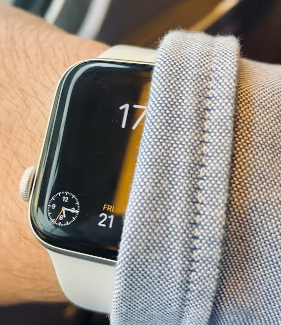
Exhibit A, when a notification pops up on the screen or during like a workout, the digital clock — as you can seen in the screenshots below — is displayed on the right side of the screen, as if it was right-aligned on an imaginary menu bar, like it is on the iPhone and the Mac. This is not an issue per se, but we’ll see in a moment how it can become a slightly worse experience for those who wear watches on their right arm.
Exhibit B, some watch faces align the clock on the right side of the screen, for some reason. Why not the left side? Why not let the user chose? For the “toolbar” clock that appears during “pop-up” screens,” I understand the design choices. But for watch faces? It’s a mystery.
 In the voice of Morris Day: “What time is it?”
Why does it matter?
In both cases, if you wear your watch on the left arm — as most righties, and therefore most people in the world, do — it means the clocks are more likely to be displayed on the screen area that is closest to your hand, on the right side of the watch. It means the part of the screen where the clock is displayed is the part peaking out of a sleeve first.
Maybe it’s just a thing Apple thought looked better, or more consistent with their other OSes, not an “optimised for righties” detail. Hard to know. In the case of watch faces, maybe the clock is right-aligned to give more gravitas to the time? Or maybe it is genuinely more ergonomic when the watch is worn on the left arm and that’s why Apple did it like this?
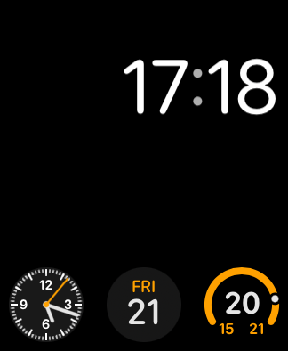 My “Modular” watch face
This little detail can be incredibly valuable if, for instance, you are wearing a long-sleeve shirt and holding heavy bags with both hands. Let me explain.
Let’s say you’re holding two heavy weekender bags, wearing a jacket, and are walking fast on the street, because you don’t want to miss your train or something. If you just want to glance at the time quickly, without having to lift a bag all the way up for a proper look at your watch, a solution may be twisting your arm and wrist to somehow get your sleeve to uncover the watch. Most of the time, only a small part of the display becomes visible, as the annoying sleeve won’t slide down fully and “sticks” to the screen, hiding the time behind it.
If you’re wearing watches on your right arm, then the clock is displayed on the worst location, the part that is the furthest away from your hand, the part of the screen that is most likely to remain hidden under the sleeve.
When I am in this situation, like I was this week actually, even when my watch displays the “home screen” and not a notification screen, sometimes I can’t see the time.
As you can see in the previous picture, I’ve even added a little analog clock complication in the bottom left corner just to avoid situations like this. But if I have a pop-up screen on, like the ones displayed in the first image of this post, like a “Start workout reminder” notification (which I have now disabled for this very reason), I truly have a worst experience of the Apple Watch than someone wearing the watch on their left arm. It feels unfair, and why doesn’t the watch also switch the time alignment from right to left by itself when using the “which wrist setting”?
Look, most of the times everything is perfectly fine, either the sleeve is not in the way, or you are able to just use the other hand to uncover the screen, but on the very rare occasions when you don’t succeed, this becomes a very, very frustrating situation. A situation to which right-handed users — wearing the watch on the left arm — seem less exposed.
Why do I say all this?
Because this kind of issue, let’s call them “right-handed-bias annoyances” can be easily fixed in software, for instance in the accessibility settings, if someone actually gave a damn.
This kind of “same but slightly worst for lefties” experience is already well known and pretty much unavoidable for hardware. Like the iPhone power button being arguably more practical to press while holding the phone with the right hand, but for software?
More or less 10% of the world population is left-handed and adapting all the time to a world designed for righties. Maybe it is just expected from them to adapt all the time, but for software it just feels lazy. I believe software companies should maybe give them a little more consideration and challenge a little more their UI design habits, especially Apple which shines not only at accessibility, but at design details that are truly delightful for their users. Just a little more delightful if these users are right-handed I guess.
Please Apple, at least do something for watch faces.
Let me know if you have identified other examples of right-handed bias in software and user interfaces.
Source link