
With the release of Vue 3, a Storybook alternative named Histoire has gained some traction. In this blog post, we’ll explore how to create interactive documentation of UI components for Vue 3 projects. As with Storybook, Histoire is designed for making your life much easier to create living style-guides and component showcases.
In contrast to the previous LogRocket article that gave an overview of Histoire’s concepts and features (e.g., Histoire’s stories or variants), the focus here is on the development of Histoire’s UI controls (e.g., HstText as a text input field or HstCheckbox as a checkbox field) as you can see on the right side of the below screenshot. You can consider this article as a sequel to my earlier LogRocket article on Storybook controls for React projects.
This article will not provide a complete guide to Histoire controls, especially because Histoire is a very young project and more controls may be available at the time of this article’s publication. However, we will discuss:
Our companion project
You can follow along with a companion project that features an implementation of todomvc with Vue 3 and TypeScript. We use Histoire to illustrate different development patterns, such as how to initialize the Pinia store for a Histoire story that relies on it.
After you clone the GitHub repo, install the npm dependencies, and then start the Vue 3 demo app:
$ npm i
$ npm run dev
To open Histoire, which runs on port 3100 by default, execute the following command:
$ npm run dev:stories
Histoire’s UI controls
Histoire is a tool that allows you to document and test UI components by providing a way to interact with them. This is where controls come into play. The controls shown in the controls panel are form fields that enable users to interact with UI components rendered in the preview canvas.
As an example, in our companion project, we use a HstSlider component that represents a slider control, allowing the user to adjust a value by sliding a handle along a track. It can be used to adjust numerical values in a range. Thereby, the values of the previewed UI components get updated. See the below gif:
HstSlider componentHere is a list of the inbuilt controls that we’ll discuss in this article:
HstText: Allows you to interact with text input fieldsHstNumber: LikeHstText, but for number fieldsHstSlider: LikeHstNumber, but with a slider componentHstSelect: Allows you to interact with dropdown componentsHstCheckbox: Allows you to interact with checkboxesHstRadio: Allows you to interact with radio buttonsHstButtonGroup: Allows you to interact with a button groupHstJson: Allows you to provide data as a JSON object
This list is not exhaustive, and by the time you read this article, more controls may be available as Histoire matures.
Structure of Histoire stories
This article uses the Vue 3 composition API with the <script setup> option and TypeScript. The following code snippet shows how controls can be used:
<script setup lang="ts">
import MyHeadline from "@/MyHeadline.vue";
const initState = () => ({
  text: "my initial value"
});
</script>
<template>
  <Story title="components/MyHeadline">
    <Variant title="number field" :init-state="initState">
      <template #default="{ state }">
        <MyHeadline :label="state.text" />
      </template>
      <template #controls="{ state }">
        <HstText v-model="state.text" title="text of headline" />
      </template>
    </Variant>
    <Variant title="..." :init-state="initState">
      <!-- ... -->
    </Variant>
  </Story>
</template>
Let’s break this down. In the script section, we import the UI component we want to showcase (MyHeadline). We can provide an initial state to populate our controls on initialization, i.e., we bind the control state to the props passed to our component. Then, we create a function (initState) that returns the state object we pass to init-state of Variant tags.
Within a Variant tag, we use two slots: default and controls. Both allow access to the state object initialized by the initState function. By binding the prop state.text via v-model to the text field control (HstText), we connect our UI component and the control.
Now, let’s move on and see a concrete example.
Using text and number fields
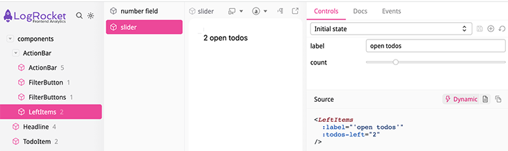
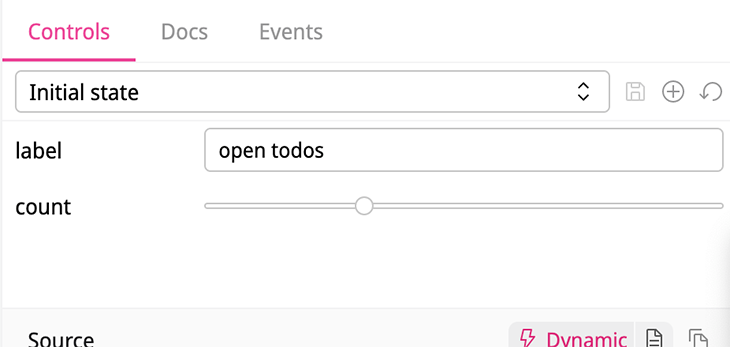
Let’s look at the component below, which shows how many open to-do items are left (LeftItems-number-field.vue):
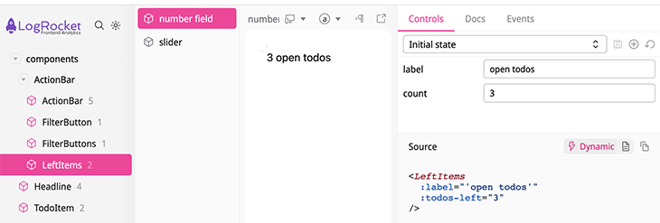
LeftItems componentAs you can also see in the lower right part of the screenshot, this component accepts a string (label) and a number (todos-left) prop.
The code below contains the Variant titled number field, demonstrating how this works:
<script setup lang="ts">
import LeftItems from "@/components/LeftItems.vue";
const initState = () => ({
  label: "open todos",
  leftItems: 3,
});
</script>
<template>
  <Story title="components/ActionBar/LeftItems">
    <Variant title="number field" :init-state="initState" auto-props-disabled>
      <template #default="{ state }">
        <LeftItems :label="state.label" :todos-left="state.leftItems" />
      </template>
      <template #controls="{ state }">
        <HstText v-model="state.label" title="label" />
        <HstNumber v-model="state.leftItems" :step="1" title="count" />
      </template>
    </Variant>
    <Variant title="slider" :init-state="initState" auto-props-disabled>
      <!-- ... -->
    </Variant
  </Story>
</template>
In the script section, we import the LeftItems component. Then, we provide a state initialization function (initState) that we pass to the init-state prop of the Variant (:init-state="initState"). With this in place, we can make use of the slots (#default and #controls), which give us access to the state object returned by initState.
Within the default slot (<template #default="{ state }">), we render our LeftItems component by passing the state values to the props.
The actual controls are defined within the controls slot. Here, we pass the state values to the v-model directive. HstText renders a text input field and accepts a title prop to define a custom label, in the same way renders HstNumber a number field with an additional step prop.
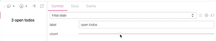
Using the slider component with Histoire
Let’s use a stepper control instead of a number field for the todos-left prop of LeftItems component.
LeftItems componentAs you can see, most of the code is identical to the previous Variant, except we are using the HstSlider control.
<Story title="components/ActionBar/LeftItems">
  <!-- ... -->
  <Variant title="slider" :init-state="initState" auto-props-disabled>
      <template #default="{ state }">
        <LeftItems :label="state.label" :todos-left="state.leftItems" />
      </template>
      <template #controls="{ state }">
        <HstText v-model="state.label" title="label" />
        <HstSlider
          :model-value="state.leftItems"
          :step="1"
          :min="0"
          :max="10"
          title="count"
          @update:model-value="state.leftItems = $event"
        />
      </template>
  </Variant>
<Story>
Most of the code is pretty intuitive, except @update:model-value, but this code is required to make things work.
Fine-tuning which controls are displayed
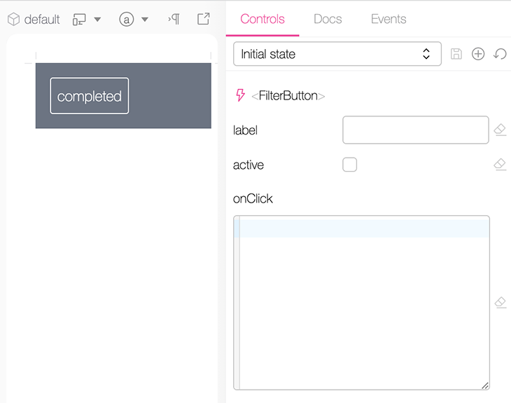
Histoire will show you all props of a given UI component without the need for any code. Consider the code of FilterButton.story.vue:
<Story title="components/ActionBar/FilterButton">
  <div class="story-wrapper">
    <FilterButton label="completed" :active="true" :on-click="onClick" />
  </div>
</Story>
The FilterButton component accepts the props label, active, and on-click. The control panel looks like this:
To prevent this behavior, we can use the auto-props-disabled of stories and variants.
With <Story title="components/ActionBar/FilterButton" auto-props-disabled>, the props are omitted from the view.
After disabling this implicit mechanism, let’s see how we can add our own controls with LeftItems.story.vue:
 <Story title="components/ActionBar/LeftItems">
    <!-- ... -->
    <Variant title="slider" :init-state="initState">
      <template #default="{ state }">
        <LeftItems :label="state.label" :todos-left="state.leftItems" />
      </template>
      <template #controls="{ state }">
        <HstText v-model="state.label" title="label" />
        <HstSlider
          <!-- ... -->
        />
      </template>
    </Variant>
</Story>
With this code in place, the controls panel looks like this:
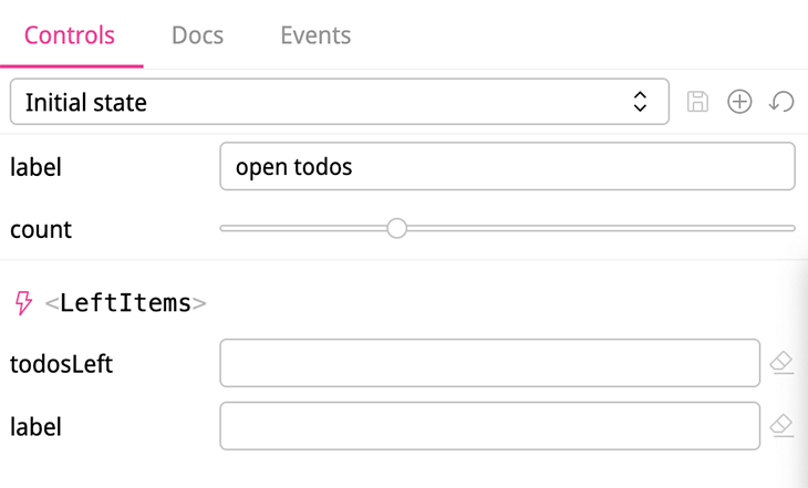
The first two controls are provided by our code. Besides having our desired label, the count control uses a stepper instead of the implicitly generated todosLeft control.
If we add auto-props-disabled to the Variant (<Variant title="slider" :init-state="initState" auto-props-disabled>), we get the desired result:
LeftItems storyUsing dropdowns, radio buttons, and button groups
The Headline.story.vue file illustrates how to leverage controls to select values from a list. The first example shows the use of a dropdown control:
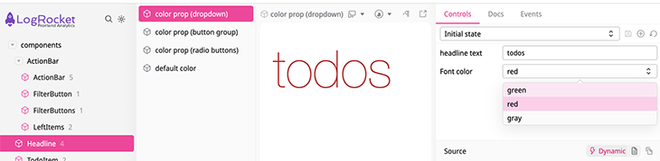
Again, you have to bind the state via HstSelect‘s v-model directive. The options prop requires an object where the property values are used as labels for the dropdown items.
<script lang="ts" setup>
import type { HeadlineColor } from "@/components/Headline.vue";
import Headline from "@/components/Headline.vue";
const initState = (): { text: string; fontColor: HeadlineColor } => ({
  text: "todos",
  fontColor: "red",
});
</script>
<template>
  <Story title="components/Headline">
    <Variant
      title="color prop (dropdown)"
      :init-state="initState"
      auto-props-disabled
    >
      <template #default="{ state }">
        <Headline :text="state.text" :font-color="state.fontColor" />
      </template>
      <template #controls="{ state }">
        <HstText v-model="state.text" title="headline text" />
        <HstSelect
          v-model="state.fontColor"
          title="Font color"
          :options="{
            green: 'green',
            red: 'red',
            gray: 'gray',
          }"
        />
      </template>
    </Variant>
    <!-- ... -->
</Story>
Every property name has to match a property of the state.fontSize object. TypeScript helps to make this more explicit. The type of fontSize is HeadlineColor, as you can see in the next snippet:
// Headline.vue
<script lang="ts" setup>
  // ...
  export type HeadlineColor = "green" | "red" | "gray";
  const prop = defineProps({
    fontColor: {
      type: String as PropType<HeadlineColor>,
      default: "red",
    },
    text: {
      type: String,
      required: true,
    },
  });
  // ...
</script>
Using HstButtonGroup is more intuitive:
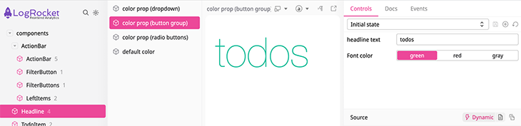
You just have to pass a list of objects with label and value properties to the options attribute.
Next up is the HstRadio control, which has the identical usage as HstButtonGroup:
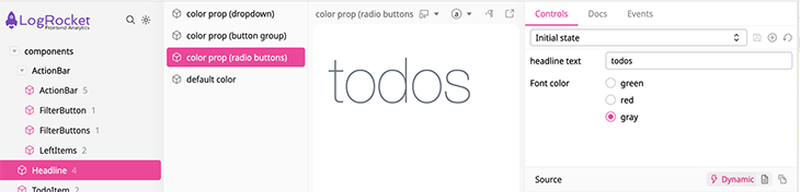
You have to pass the exact same list to the options prop of HstRadio:
<!-- ... -->
<Variant
  title="color prop (radio buttons)"
  :init-state="initState"
  auto-props-disabled
>
  <template #default="{ state }">
    <Headline :text="state.text" :font-color="state.fontColor" />
  </template>
  <template #controls="{ state }">
    <HstText v-model="state.text" title="headline text" />
    <HstRadio
      v-model="state.fontColor"
      title="Font color"
      :options="[
        {
          label: 'green',
          value: 'green',
        },
        {
          label: 'red',
          value: 'red',
        },
        {
          label: 'gray',
          value: 'gray',
        },
      ]"
    />
  </template>
</Variant>
<!-- ... -->
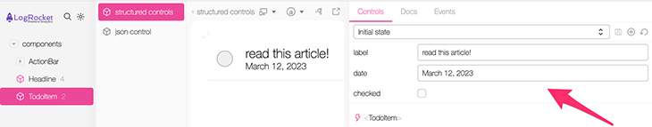
Using a checkbox control with Histoire
If you need to toggle a control, you can use HstCheckbox:
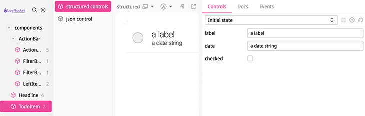
To use this control, just pass a boolean state variable to its v-model directive:
<template>
  <Story title="components/TodoItem" auto-props-disabled>
    <Variant title="structured controls" :init-state="initState">
      <template #default="{ state }">
        <TodoItem :todo="state.todo" />
      </template>
      <template #controls="{ state }">
        <HstText v-model="state.todo.label" title="label" />
        <HstText v-model="state.todo.date" title="date" />
        <HstCheckbox v-model="state.todo.checked" title="checked" />
      </template>
    </Variant>
    <!-- ... -->
  </Story>
</template>
<script setup lang="ts">
import TodoItem from "@/components/TodoItem.vue";
import type { Todo } from "@/stores/todos";
type TodoItemState = {
  todo: Todo;
};
const initState = (): TodoItemState => ({
  todo: {
    id: 3,
    label: "a label",
    date: "a date string",
    checked: false,
  },
});
</script>
As you can see in the script tag, initialState returns an object containing a todo object of type Todo. Every to-do object contains a checked property of type boolean.
Using JSON controls
Besides using multiple structured controls, it is also possible to provide data with a single JSON control:
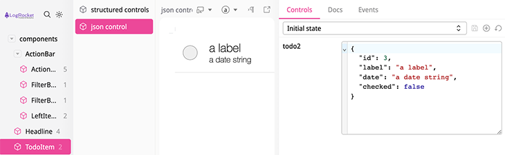
You can see in the next snippet that HstJson is easy to use. Just pass your object to the v-model:
<Story>
  <!-- ... -->
  <Variant title="json control" :init-state="initState">
    <template #default="{ state }">
      <TodoItem :todo="state.todo" />
    </template>
    <template #controls="{ state }">
      <HstJson v-model="state.todo" title="todo2" />
    </template>
  </Variant>
</Story>
Initializing the Pinia store to start a Vue app
So far, our examples have focused on using simple Vue components that don’t rely on a global state. This section illustrates how to use the setup-app directive to initialize your Vue app. In our case, we‘ll use it to initialize our Pinia store.
In FilterButtons.story.vue, we get a handle to the toggleDarkMode action from the store (useTodosStore) to invoke the function once before the story gets rendered:
<script setup lang="ts">
import FilterButtons from "@/components/FilterButtons.vue";
import { useTodosStore } from "@/stores/todos";
const setupApp = () => {
  const { toggleDarkMode } = useTodosStore();
  toggleDarkMode();
};
</script>
<template>
  <Story title="components/ActionBar/FilterButtons" :setup-app="setupApp">
    <FilterButtons />
  </Story>
</template>
ActionBar.story.vue shows another example that uses the passed variant prop of setup-app to initialize the different variants.
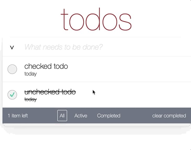
Let’s look at the variant named items left more closely. Initially, the global store contains two to-dos with one to-do left. However, as you see in the screenshot, the example shows that two to-dos are left:
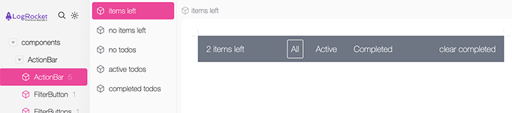
The code below reveals how we can add another unchecked to-do item before the story gets rendered. We retrieve the addTodo action and add another unchecked to-do to the store.
<script lang="ts" setup>
import ActionBar from "@/components/ActionBar.vue";
import { useTodosStore } from "@/stores/todos";
type AppSetup = {
  variant: {
    title: string;
  };
};
const appSetup = (appSetup: AppSetup) => {
  const variant = appSetup.variant.title;
  if (variant === "items left") {
    const { addTodo } = useTodosStore();
    addTodo({
      id: Date.now(),
      date: new Date(Date.now()).toDateString(),
      label: "hello world",
      checked: false,
    });
  }
  // ...
};
</script>
<template>
  <Story title="components/ActionBar/ActionBar" :setup-app="appSetup">
    <Variant title="items left">
      <ActionBar />
    </Variant>
   <!-- ... -->
  </Story>
</template>
The setup-app directive provides a variant object with a title property. We can check its value to use addTodo for the desired variant.
Conclusion
Although Histoire’s feature set and the number of controls are not as extensive as Storybook’s at the moment, an advantage of Histoire is its simplicity. It doesn’t take much code to link the controls to the UI component.
This article builds the foundation to use different types of Histoire’s controls to create interactive and usable interactive documentation of UI components. If you’re looking for more on Histoire, check out our previous post on Histoire.
Experience your Vue apps exactly how a user does
Debugging Vue.js applications can be difficult, especially when there are dozens, if not hundreds of mutations during a user session. If you’re interested in monitoring and tracking Vue mutations for all of your users in production, try LogRocket. 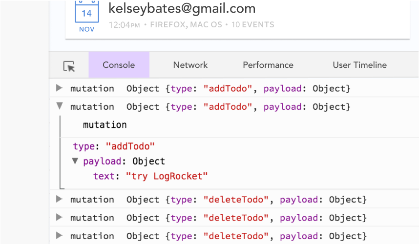 https://logrocket.com/signup/
LogRocket is like a DVR for web and mobile apps, recording literally everything that happens in your Vue apps including network requests, JavaScript errors, performance problems, and much more. Instead of guessing why problems happen, you can aggregate and report on what state your application was in when an issue occurred.
The LogRocket Vuex plugin logs Vuex mutations to the LogRocket console, giving you context around what led to an error, and what state the application was in when an issue occurred.
Modernize how you debug your Vue apps – Start monitoring for free.
Source link
