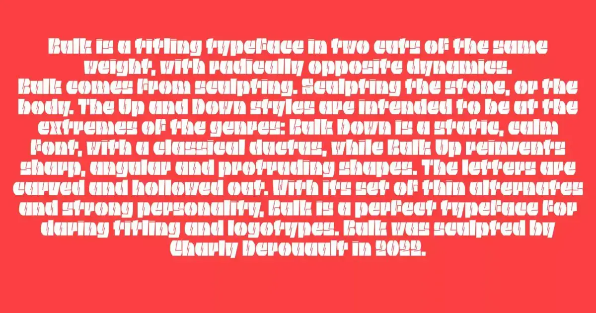
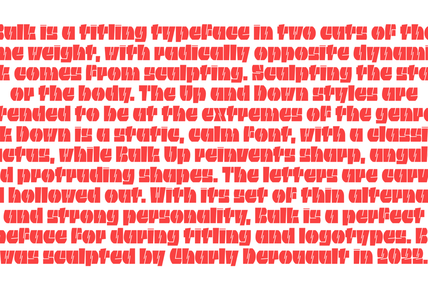
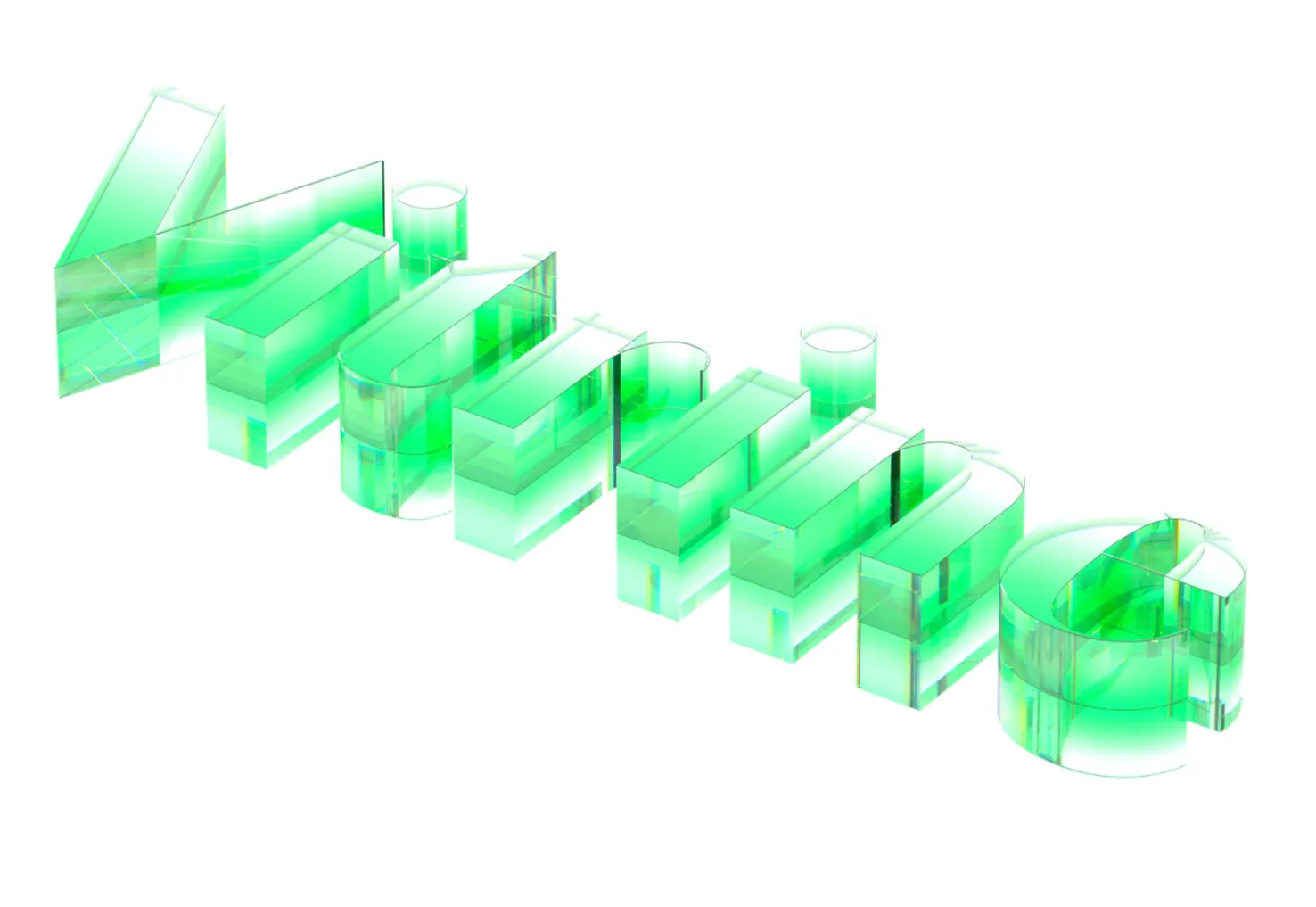
Bulk
Bulk is an awesome typeface that challenges how letters are constructed. Bulk uses heavy, block-shaped outlines and delicate linear ‘cuts’ to form its letters. It’s an excellent choice for posters, giant typography, and branding.
AW Conqueror Stincilla
We’ve featured AW Conqueror before, and AW Conqueror Stincilla is a delightful stencil variation on the form. It produces some beautiful shapes and is ideal for luxury branding, editorial work, and even as a display face.
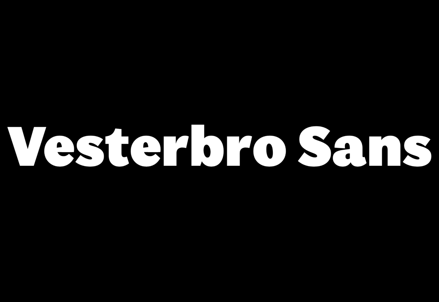
Vesterbro Sans
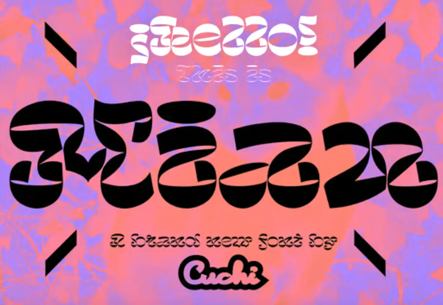
Miau
Miau is an awesomely over-the-top that is barely legible. The ribbon-like letterforms are packed with energy. It works best when used in small doses.
Rikna
Rikna is a workhorse of a slab serif that works well at body font sizes and has enough detail to be interesting at display sizes. It’s a solid all-around choice for a project that’s serious but needs a touch of human warmth.
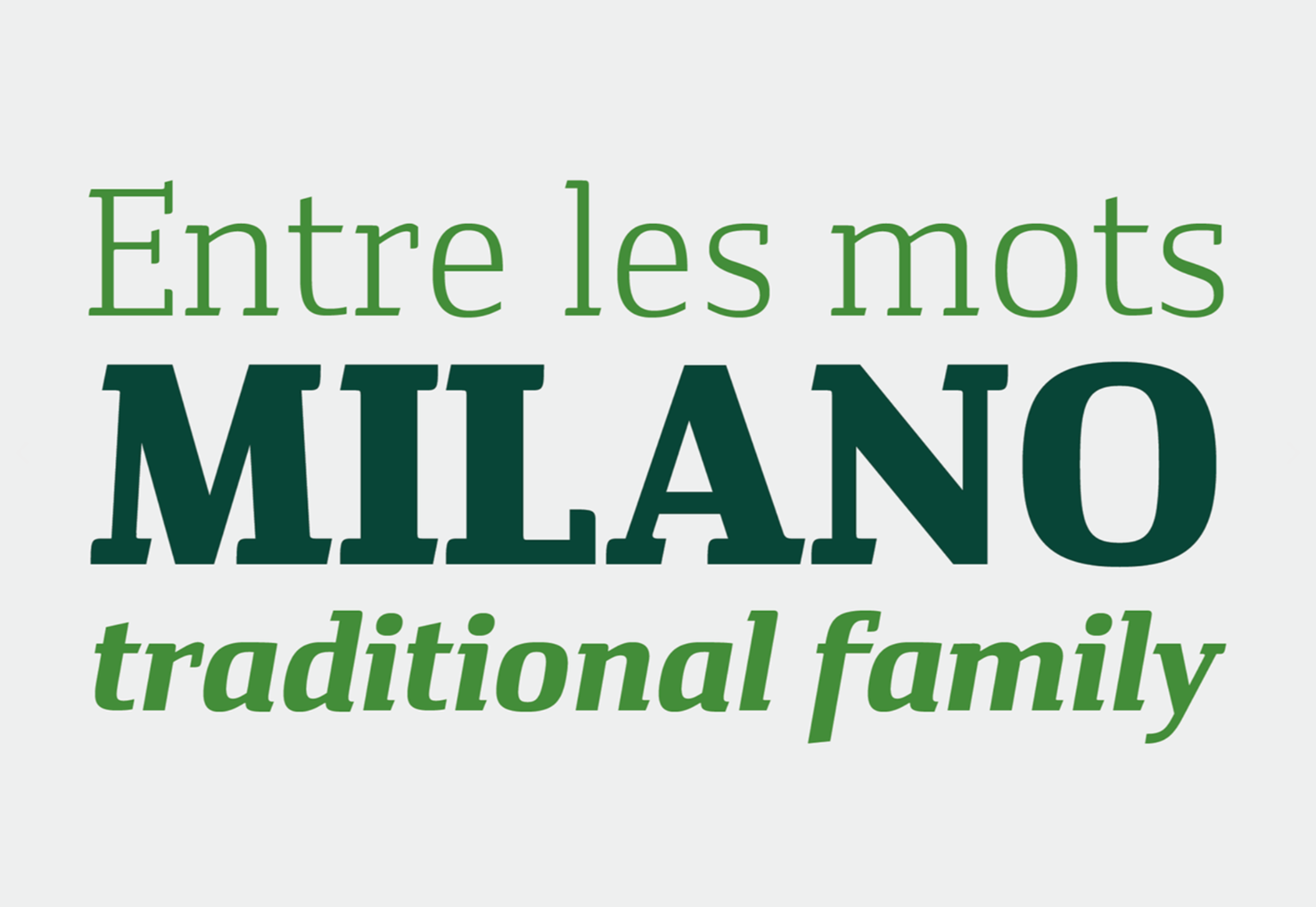
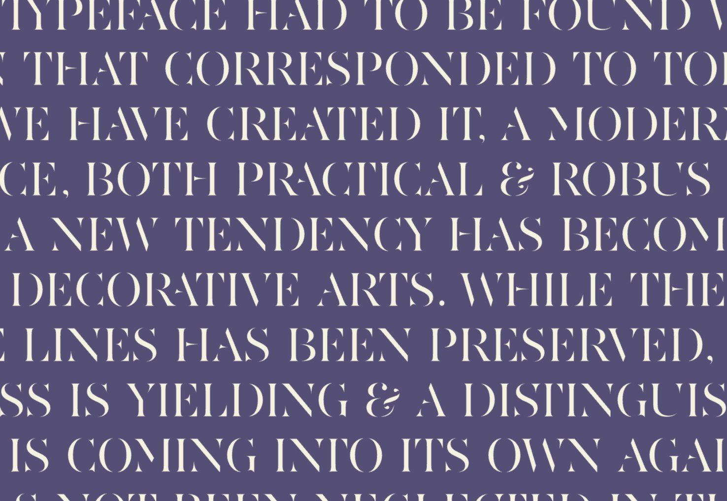
Austerlitz
Austerlitz is a family of pseudo-didone typefaces. It’s a flexible and highly usable family that works well for serious publications, digital, and print. The refined rhythm means that Austerlitz will work well in some branding projects.
Gramma
Gramma is a modern-looking sans-serif. Gramma has a distinctive style of terminal that creates visual interest at larger sizes and helps the letterforms keep a clean outline on screen at smaller sizes. It would make a great brand font.
Miracle Fairway
Miracle Fairway is a thick-stroked display typeface with tapered serifs that give the overall design a sense of motion. It’s a great option for logo design.

Vitrine
Vitrine is a high-contrast sans-serif that’s great a large sizes. It comes in nine weights, but the semi-bold, bold, and black have the highest contrast and, as a result, the most character. It works well as a display face and for logos.
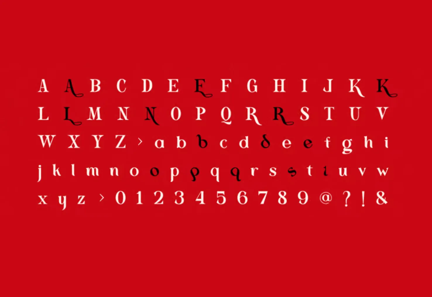
Kelyon
Kelyon is a graceful display face with medieval and Art Nouveau influences. It has numerous alternates. It works best at display sizes and is a good choice for editorial design.
Fit Devanagari
Fit Devanagari is a highly stylized typeface, designed as a companion for the Latin typeface Fit, that can be used at any size. If you need to fill a particular sized space, then Fit allows you to do so elegantly.
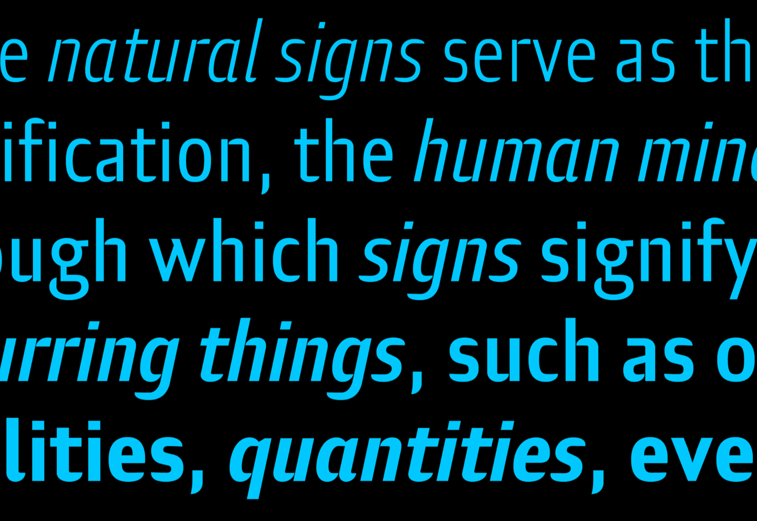
Precise Sans
Precise Sans is a tech-feeling sans-serif with a range of weights and (eventually) two italics. It’s an excellent choice for UI design, where clarity trumps character, but you still want a little personality. It’s still in beta so expect changes.
Mistont
Mistont is a beautiful serif font with elegant curves and graceful ligatures. It’s an ideal choice for branding lifestyle products.
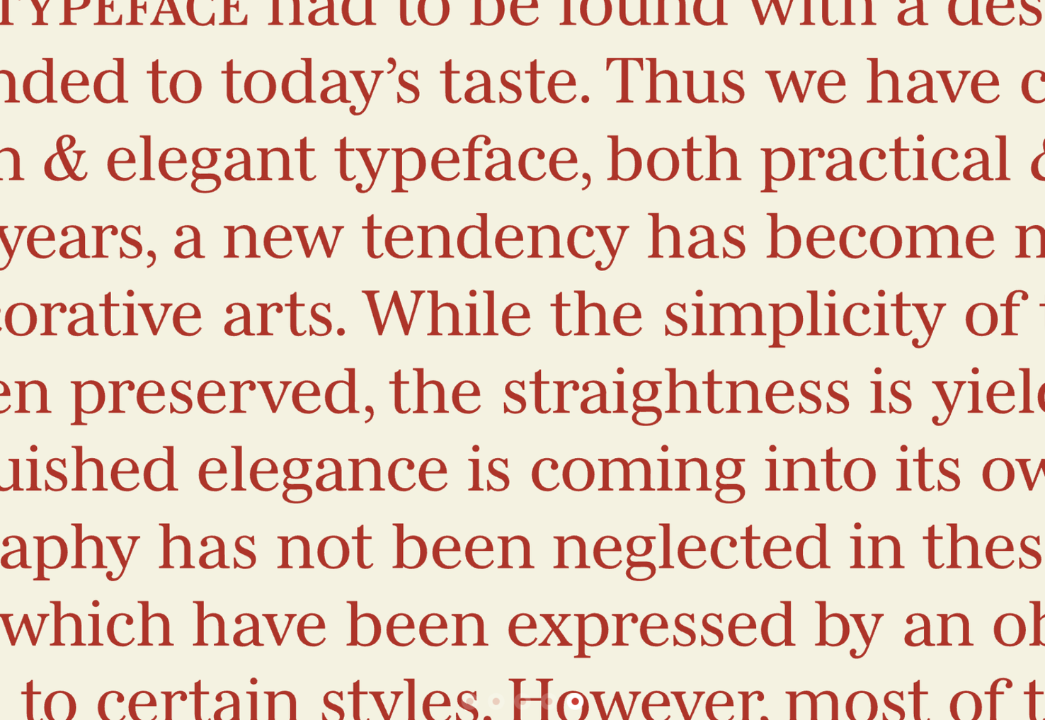
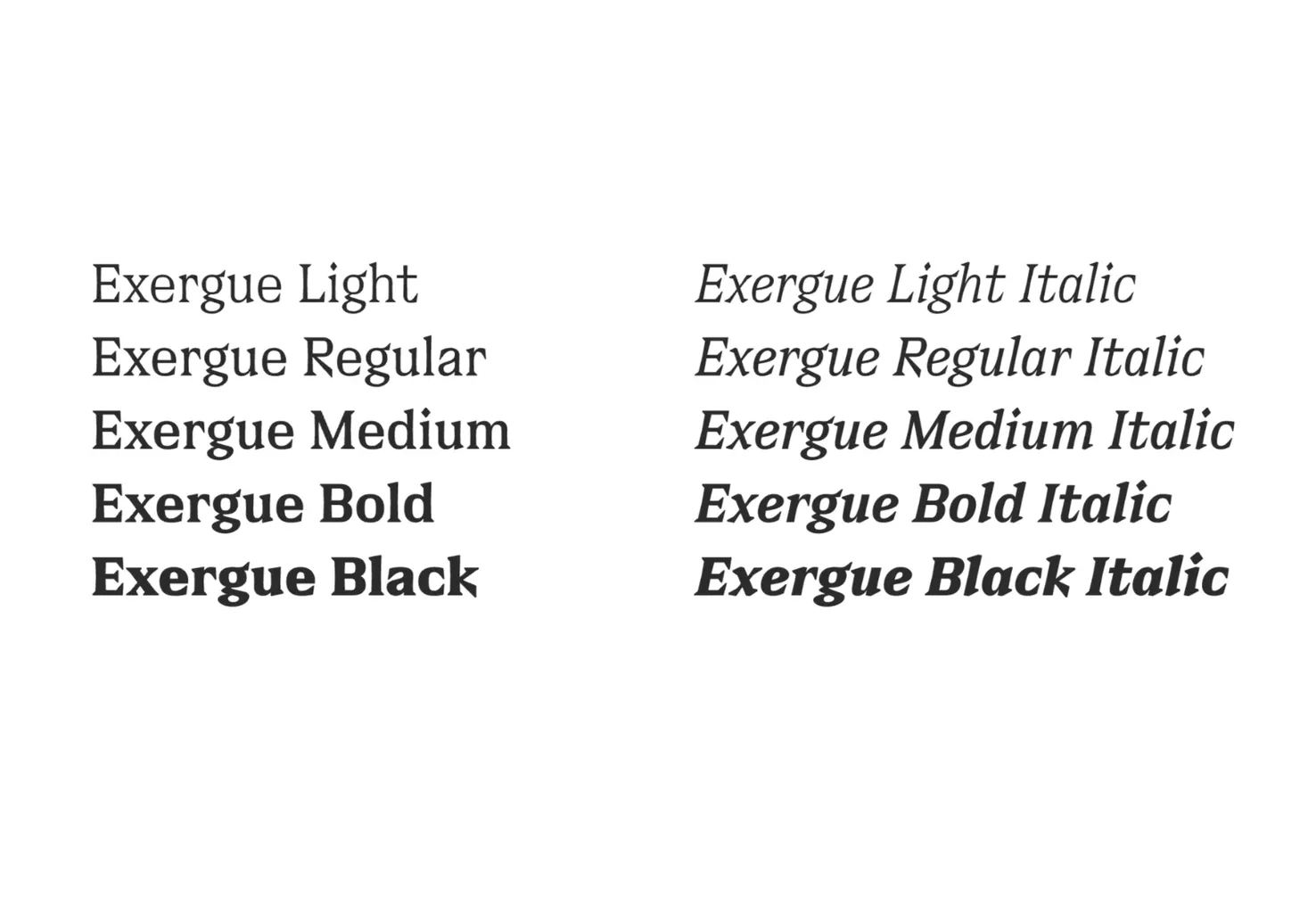
Exergue
Exergue is a stunning serif typeface that uses flared terminals to match its serifs. The result is blocks of text that feel unexpected and familiar at the same time. Exergue is an excellent choice for extended text passages where it adds character while maintaining readability.
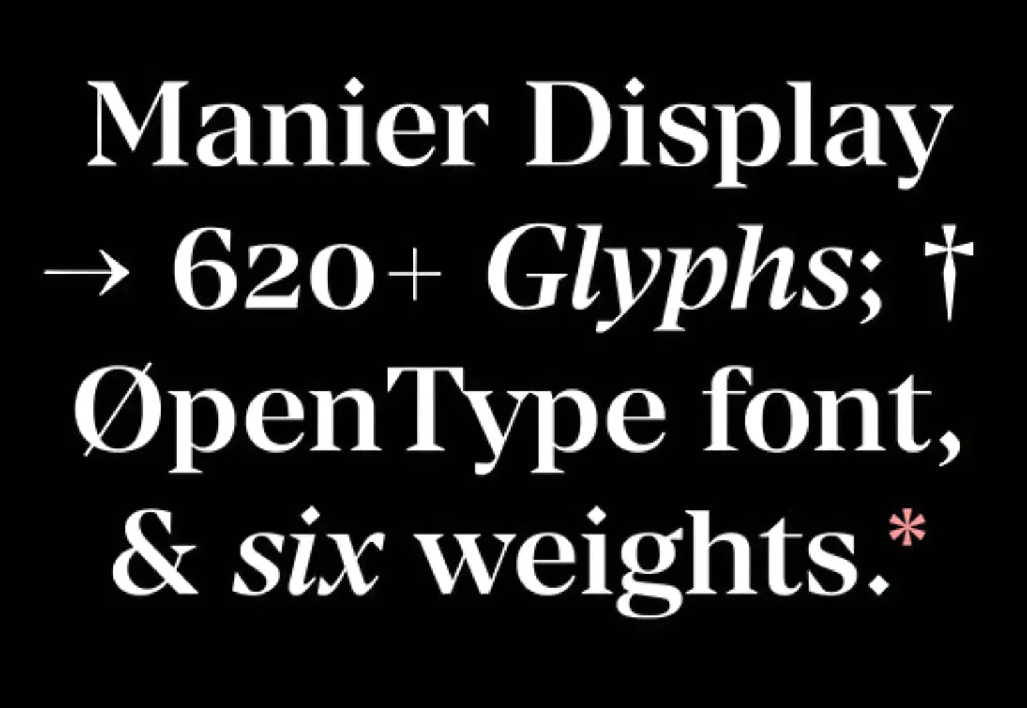
Manier
Manier is a very usable typeface with angular wedges and generous, modern proportions. It comes in six weights with matching italics. It’s ideal if you’re looking to infuse your design with some confidence.
Ben Moss
Ben Moss is Senior Editor at WebdesignerDepot. He’s designed and coded work for award-winning startups, and global names including IBM, UBS, and the FBI. One of these days he’ll run a sub-4hr marathon. Say hi on Twitter.
