According to the 2022 Design Tools Survey, Figma is the most popular and highest rated tool for creating design systems (UI design and basic prototyping, too!). While it isn’t a complete design system management solution (since, most notably, it doesn’t really have any documentation features), its integrations and extensive plugin library can help to fill in the blanks.
In this article, we’ll look at the 8 best Figma plugins and integrations for design system management.
1. zeroheight
zeroheight is a design system documentation tool that helps product teams document design systems more efficiently than generic documentation tools.
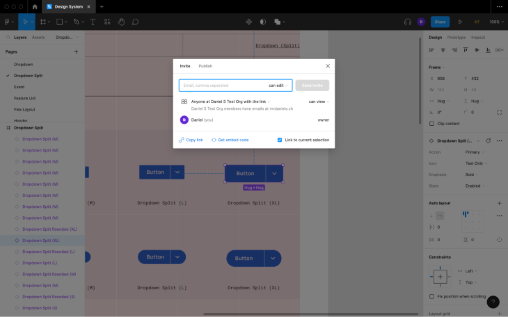
To embed a Figma design system style or component into a generic documentation tool such as Notion, you’d need to click on the Share button in the horizontal toolbar, check the Link to current selection checkbox, and then click on Copy link before pasting the link into the document. This workflow is inefficient because you’d need to run it for every design system style and component.
zeroheight, however, would have direct (read-only) access to your design system via an integration, so its styles and components would already be available in zeroheight for insertion — you wouldn’t need to copy their links from Figma. Plus, component variants can be extracted automatically, saving even more time.
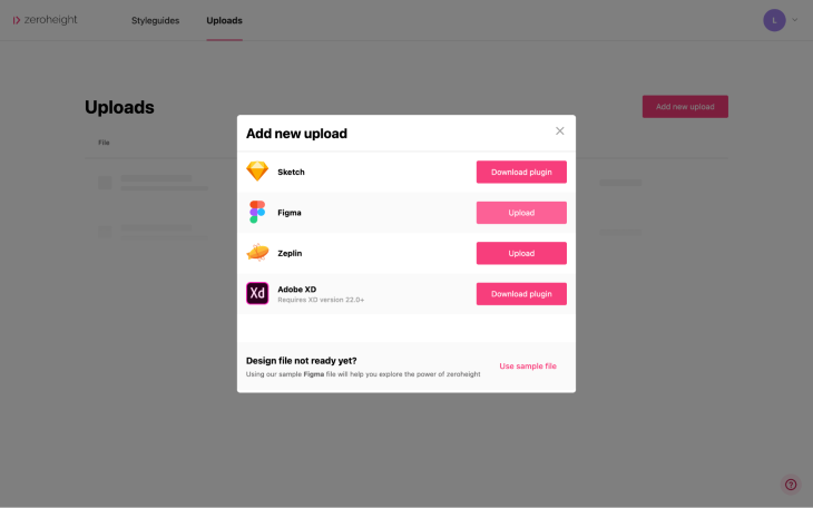
To set up the integration, navigate to Uploads > Add new upload in zeroheight and then follow the instructions.
During the setup, zeroheight will ask for your design system’s link, which you can find by navigating to Share > Copy link in Figma (as shown earlier).
zeroheight will sync any design system changes automatically so that you won’t have to do it manually using a plugin. However, this means that to avoid unfinished work being synced to zeroheight, you’ll need to leverage branching in Figma.
zeroheight is considered to be the best design system documentation tool of all the mainstream options.
2. Storybook
Compared to zeroheight, Storybook is more developer friendly.
You wouldn’t be able to embed Figma styles and components into Storybook documents (called “stories”) seamlessly; instead, you’d have to copy every style and component’s link into the relevant story manually (just as you’d have to using a generic documentation tool such as Notion). The trade-off is that developers would be able to contribute rendered code snippets, which would be interactive and self-contained.
zeroheight supports code blocks too, but it doesn’t render them. Instead, Storybook stories (or CodeSandbox “sandboxes”) can be embedded into zeroheight documents, but this means paying for two subscriptions and somewhat maintaining two versions of the design system (not fun), so if you want your design system to include rendered code snippets, Storybook is the best option.
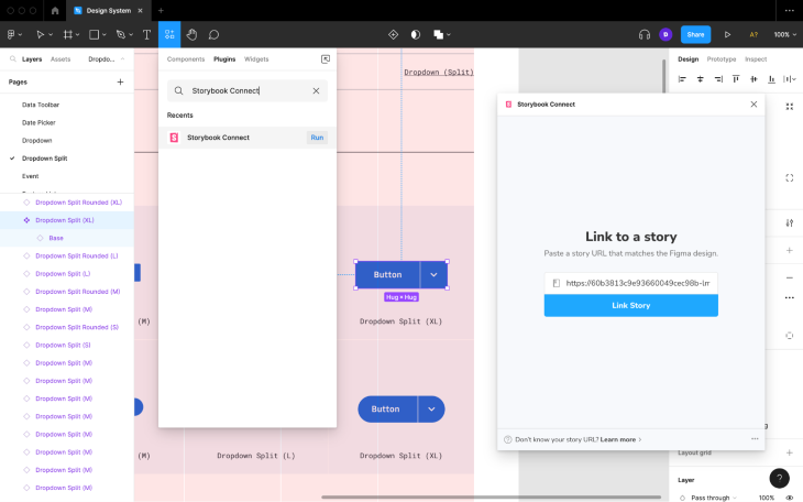
You’re probably wondering though: “What does the Storybook plugin for Figma do if not sync Figma design systems to Storybook?” Well, it enables you to link design system styles and components in Figma to their relevant stories in Storybook. You’d even be able to preview the interactive story from within Figma, which is useful for ensuring that designs translate to code well (if they don’t, then designers and developers can collaborate to resolve any problems).
To link a style or component to a story, select it, navigate to Resources (shift + I) > Plugins from the horizontal toolbar, search for Storybook Connect, click the Run button, follow the setup instructions, and then paste the relevant story’s URL into the input field before clicking on the Link Story button.
Overall, I prefer Storybook to zeroheight because it enables designers and developers to work closely — with zeroheight, designers and developers are working almost independently. That being said, zeroheight integrates with Figma seamlessly and it’s a huge letdown that Storybook doesn’t.
3. Supernova
Supernova is rated a little higher than zeroheight and Storybook, but it’s newer and thus less popular, so you might find the community and resources lacking. Putting that aside though, it provides a fantastic design system management solution for both designers and developers. It has the seamless feel of zeroheight and the developer-friendliness of Storybook.
Its standout feature (called “blueprints”) automatically converts design system styles and components to code. Plus, developers that aren’t keen on overzealous design-to-code tools can build their own “exporters” so that the generated code looks exactly how they want it to look (and if the design changes, the exporter simply regenerates the code, truly keeping design and code in sync).
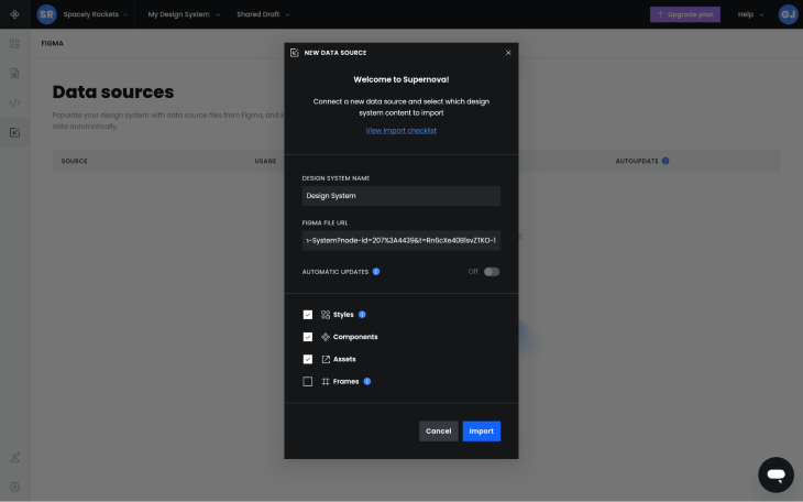
As mentioned before, Supernova integrates with Figma just like zeroheight does, so to provide Supernova with your design system’s link, click on the Data Sources icon from the left toolbar, click on the + New data source button, and then provide the necessary information before clicking on the Import button.
After doing this, you’ll be able to document your design system in Supernova similarly to how you would do so in zeroheight.
That being said, it’s worth pointing out that Automatic updates can be disabled (see the image above), so you wouldn’t necessarily need to utilize branching (like with zeroheight) to have your design system be the single source of truth.
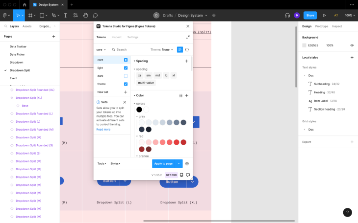
4. Tokens Studio
Tokens Studio helps product teams convert common styles into design tokens. This works with Figma styles (e.g., Text Styles and Color Styles); however, you’ll also be able to convert other properties such as border radii values.
After that, you’d be able to reuse the design tokens throughout the design to maintain consistency and developers would be able to import the tokens into their codebase for use as well. As the design changes, so would the tokens, and developers can either re-import them with ease or set up two-way sync.
Most design system documentation tools include design token features, however, for solo makers and small product teams who don’t particularly need a complete design system management solution (i.e., components and long-form documentation), Tokens Studio can ensure that design and development maintains at least a little bit of syncronicity.
But that’s not all — there are some other features too.
Product teams can categorize design tokens into different “sets” for easier management or to be able to mix and match them. They can also create different themes (e.g., light/dark).
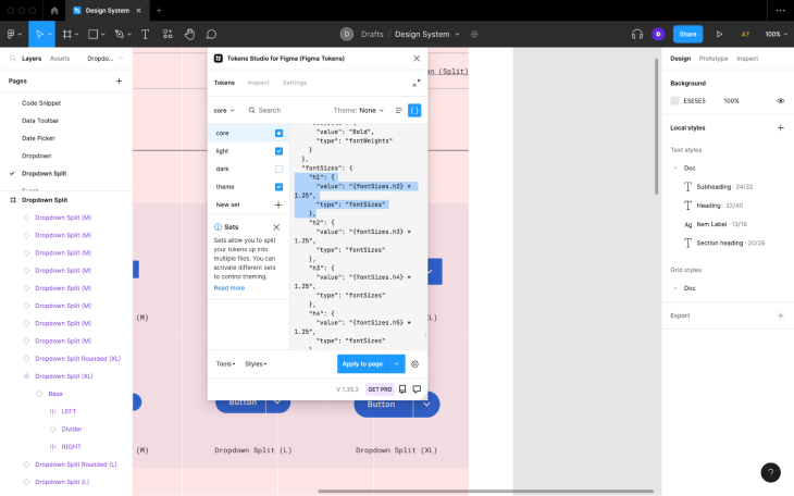
Also, developers and code-savvy designers would be able to reference other tokens as token values (e.g., color-brand could equal #000000 and then color-button could equal color-brand), which is ideal for product teams that prefer to take an atomic approach to design systems.
And finally, token values can include math equations, a feature that you could utilize to create, for example, type scales.
5. Sticky Notes
Tokens Studio doesn’t cover the documentation side of things; however, you could combine Tokens Studio with the Sticky Notes Figma plugin, essentially building a complete design system management solution consisting of multiple free plugins.
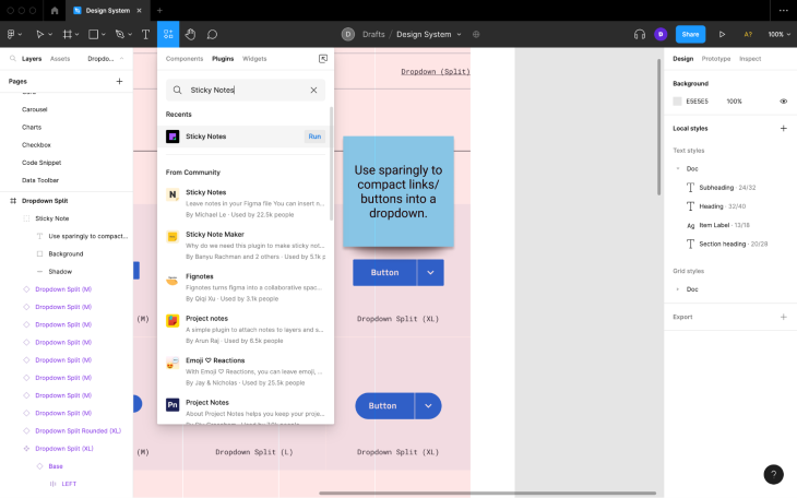
However, having sticky notes everywhere would make your design system look messier and more convoluted, so you’d need to carefully consider whether taking this approach is worth it.
If you’re not sure how complex your design system will end up, you can always use Tokens Studio and Sticky Notes and then upgrade to a dedicated design system documentation tool later.
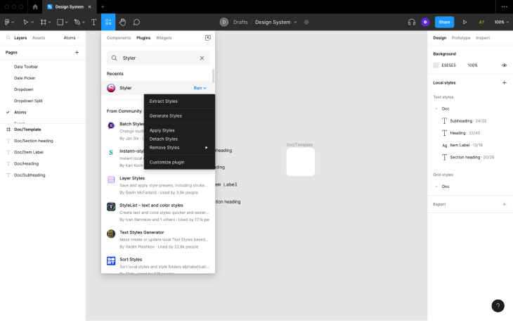
6. Styler
Creating, applying, and maintaining Figma styles is easy if you’re doing so along the way. However, many product teams end up starting design systems late in the process, by which time there are often a lot of visual inconsistencies.
Luckily, the Styler Figma plugin makes it easy for designers to organize their designs in Figma. It’s extremely to use — simply run the plugin and then choose the task you want to accomplish:
- Extract Styles: places every text style and color style in a Figma library on the canvas (this is ideal for situations where you have a design system in theory, but it’s not currently being presented)
- Generate Styles: generates text styles and color styles from currently selected layers
- Apply Styles: applies styles to layers
- Detach Styles: removes styles from layers without removing the actual properties (this is ideal for situations where a design system needs to be simplified)
- Remove Styles: removes styles from layers with a given property value (e.g., all styles with the same fill as the currently selected layer)
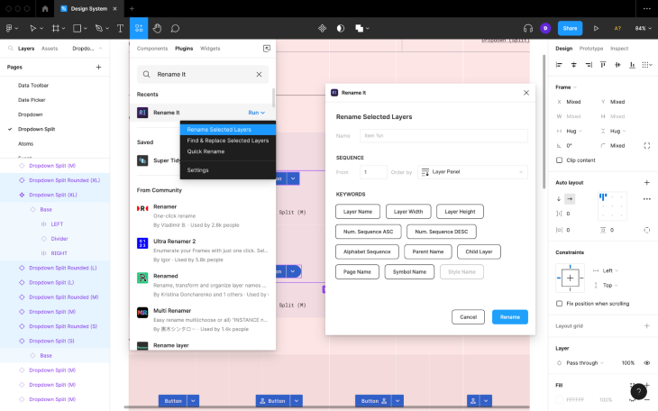
7. Rename It
It’s important that design systems have coherent and consistent naming conventions. However, even simple design systems can be made up of hundreds of layers, which makes renaming very time consuming.
The Rename It Figma plugin enables designers to rename layers more efficiently and intelligently. It provides many different options, so I encourage you to play around with it.
8. Similayer
The Similayer Figma plugin makes it easy for you to select layers that are similar to other layers based on certain properties. This is handy prior to using Styler, Rename It, and other Figma plugins where you might need to select multiple layers.
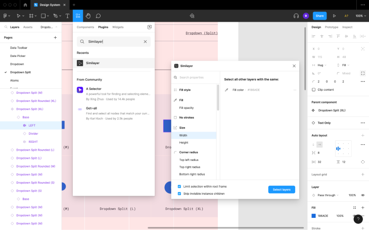
You can also use Similayer to see which layers are/aren’t using certain properties and ensure that all layers that should have a style applied.
Closing thoughts
I think it’s safe to say that design systems and design system tools have now reached maturity, the main indicator being that stakeholders of all types (not just designers) use them. In fact, there are now more developers than designers using Figma, which’ll likely mean more design-to-code features in the future.
In 2022, Figma shipped widgets, which are basically plugins except that they’re accessible to anyone with access to the Figma file that they’re installed on — like a shared workspace. They’re still pretty new and their use cases are somewhat generic, but there are a few that can be used to help product teams manage design systems:
- Navigate (you can use this to create easy-access/on-canvas links to external documentation)
- lil notes (for on-canvas documentation)
- Notes (for “better” notes with the noter’s name, date, status, and the ability to tag teammates)
- lil todo (for design system checklists)
Hopefully we’ll see some useful design system-specific widgets in the future, as well as more Figma plugins for design system management and integrations in general.
Thanks for reading!
LogRocket: Analytics that give you UX insights without the need for interviews

LogRocket lets you replay users’ product experiences to visualize struggle, see issues affecting adoption, and combine qualitative and quantitative data so you can create amazing digital experiences.
See how design choices, interactions, and issues affect your users — try LogRocket today.
Source link