Yuan Chuan with a funny blog post opener commenting about how much they liked their friend’s photos:
I was attracted by their slight blur and the subtle glowing effects, and wondered what kind of filter function was used. But then she told me it’s just because the camera lens wasn’t wiped clean.
Turns out you can get that same kind of “dreamy” effect with some fancy dancing with filters.

Semantic HTML? Pffffft. Why bother? Unicode is all you really need.

Terence Eden says he is very sorry for this.
I probably should have just copied the unicode above into this email rather than screenshotting it, but it made me too nervous for some reason. Partially because I’d worry it looks like spam to some email servers.
Here’s a nice walkthrough of 3D in CSS by Brad Woods.

One of the demos has you grabbing the corner of an element with regular text in it, and as you drag it folds back in space, with, you guessed it 3D in CSS.
Seeing text in 3D is somehow extra satisfying for me, perhaps because it’s more rare to see. And hey, that reminds me of Codrops recent On-Scroll Typography Animations which are very very cool. Make sure to scroll far enough to see the “Unfolding” one which is my favorite.
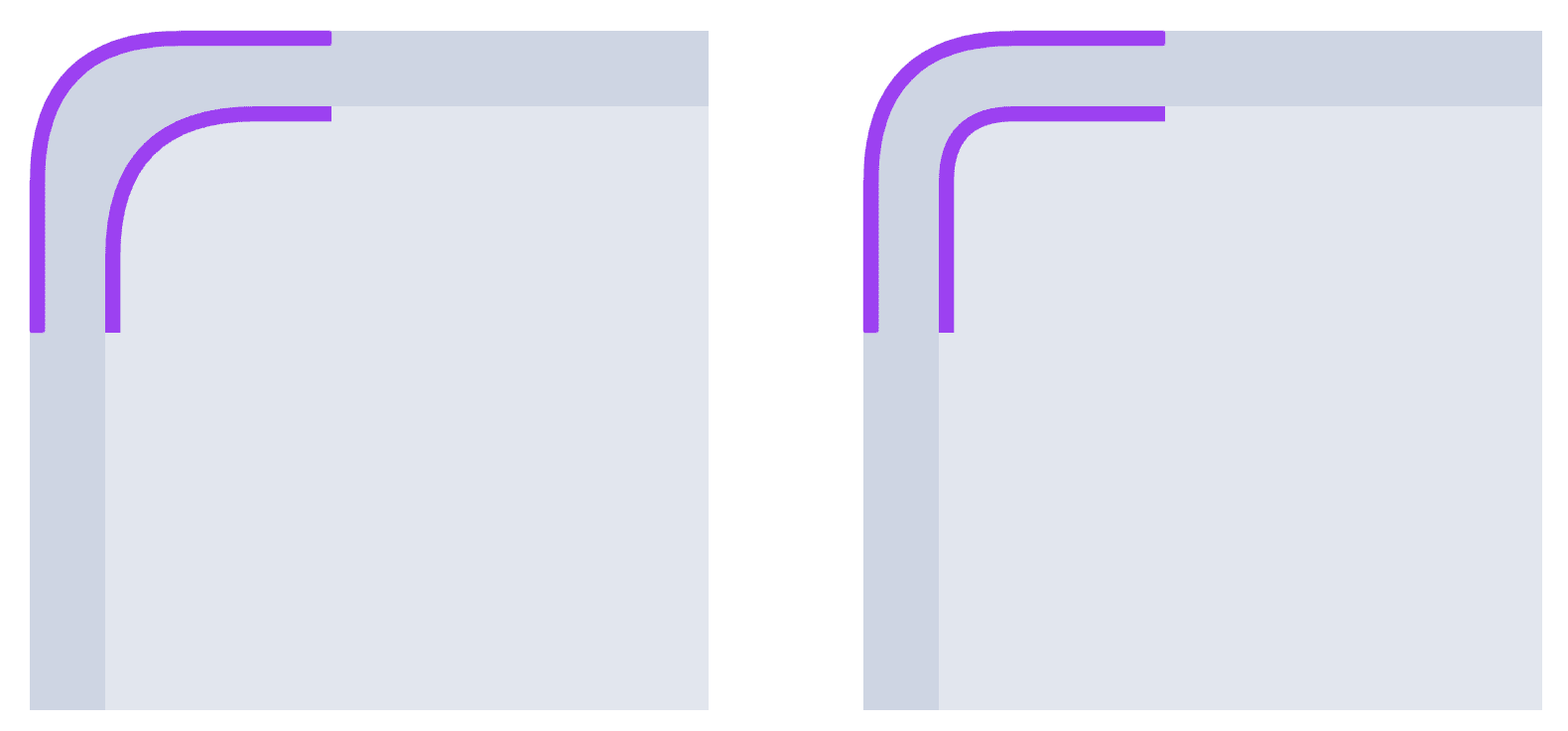
I always though that the math behind calculating the perfect nested border-radius would be complex somehow. But Paul Hebert has it figured out for us:
outerRadius - gap = innerRadiusGotta get this right folks! See how awkward it can be on the left vs. fixed on the right.
The post Chris’ Corner: Dreamy, Folded, Bendy CSS appeared first on CodePen Blog.
Source link