
Checkboxes are a common element used in forms and surveys. Whether they are part of a form for booking flight reservations, to accept user inputs, or to accept feedback during an online product survey, checkboxes are an easy way to accept multiple choices from the user. The HTML input element checkbox is used to render a checkbox on a webpage.
It is imperative that web designers and developers make ample use of the styling features offered by CSS to ensure the user has a good visual experience. Similar to other HTML elements, checkboxes can also be styled to make them more appealing.
CSS properties such as color, font, border, width, and height are not applicable to checkboxes. In this post, we’ll discuss the CSS properties you can apply to checkboxes and the scenarios where they make useful additions to your UI/UX.
Jump ahead:
Using CSS pseudo selectors
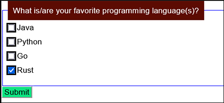
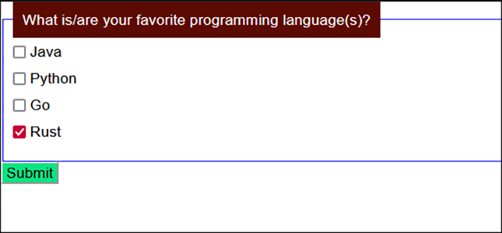
One of the simplest and common ways of styling checkboxes is to make use of input[type=checkbox]or pseudo selectors to set style with CSS properties based on specific state.
Consider the below example. Here, we styled the outline of all checkboxes regardless of their state to a black color with a width of 3px.
<fieldset>
  <legend>What is/are your favorite programming language(s)?</legend>
  <div>
    <input type="checkbox" id="lang1" name="lang1" value="Java">
    <label for="lang1">Java</label>
  </div>
  <div>
  <input type="checkbox" id="lang2" name="lang2" value="Python">
  <label for="lang2"> Python</label>
  </div>
  <div>
  <input type="checkbox" id="lang3" name="lang3" value="Go">
  <label for="lang3">Go</label>
  </div>
  <div>
  <input type="checkbox" id="lang4" name="lang4" value="Rust" checked>
  <label for="lang4">Rust</label>
  </div>
     </legend>
</fieldset>
<div>
<input type="submit" value="Submit" id="btnSubmit">
</div>
div {
  margin-bottom: 10px;
}

fieldset {
  border: 1px solid blue;
}

legend {
  padding: 10px;
  background:  #5c0b02;
  color: white;
}

input[type="submit"]{
  background: #0de281;
}

input[type="checkbox"] {
    outline: 3px solid black;
}
Try out the code on CodePen/a>.
Setting specific styles based on state
We can also set a specific style for the checkbox when it is checked. This is done by using the input:checked pseudo selector.
The HTML markup is retained from the previous example and the CSS style is tweaked to add this in place of the earlier input[type="checkbox"].
input:checked {
    outline: 2px solid yellow;
}
Observe the yellow tints around the selected checkboxes: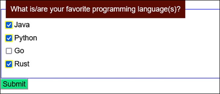
Try out the code on CodePen.
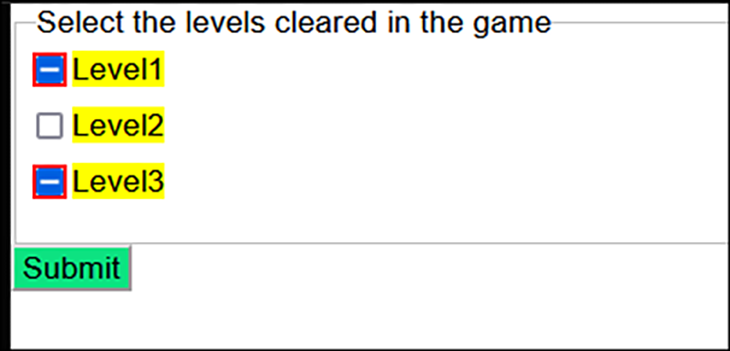
Setting styles for indeterminate states
Besides the checked and unchecked states for checkboxes, a third state is possible – the indeterminate state. In this state, it is impossible to determine whether the item is checked or not.
This state can only be set via JavaScript and cannot be set using an HTML attribute. In JavaScript, the indeterminate property of an HTML input element can be set to true to enable this state.
In the indeterminate state, a checkbox has a horizontal line in the box instead of a check/tick in most browsers.
Let’s say you are asking the user to select the number of levels they’ve cleared in a game.
When you check or uncheck a level’s checkbox, a JavaScript function checks the total number of checked levels for the following:
- If none are checked, the level name’s checkbox is set to
unchecked - If one or two are checked, the level name’s checkbox is set to
indeterminate - If all three are checked, the level name’s checkbox is set to
checked
In this case, the indeterminate state is used to indicate that the user has started collecting the levels, but hasn’t completed all of them yet.
Suppose you want to style the odd numbered indeterminate levels. You can do so like this:
<fieldset>
  <legend>Select the levels cleared in the game</legend>
  <div>
    <input type="checkbox" id="level1" name="level1" value="Level1">
    <label for="level1">Level1</label>
  </div>
  <div>
  <input type="checkbox" id="level2" name="level2" value="Level2">
  <label for="level2"> Level2</label>
  </div>
  <div>
  <input type="checkbox" id="level3" name="level3" value="Level3">
  <label for="level3">Level3</label>
  </div>
     </legend>
</fieldset>
<div>
<input type="submit" value="Submit" id="btnSubmit">
</div>
div {
  margin-bottom: 10px;
}

input[type="submit"]{
  background: #0de281;
}

input:indeterminate {
  background: yellow;
  outline: 2px solid red;
}
label {
  background: yellow;
}

const inputs = document.getElementsByTagName("input");
for (let i = 0; i < inputs.length; i++) {
  if(i%2==0)
  inputs[i].indeterminate = true;
}
See the code on CodePen.
Using the accent-color property on checkboxes
Since 2021, a new style feature/CSS property, accent-color, has available for HTML input elements, including checkboxes.
Most of the recent versions of popular browsers support accent-color, as can be seen in this figure from CanIUse:
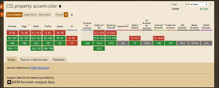
accent-color. Image from CanIUse.com.When applied to checkboxes, accent-color enables developers to customize the checkmark color and override the default color. When done right, this can greatly improve accessibility.
At render time, browsers can also automatically arrive at the best suited color for the checkmark, ensuring sufficient color contrast by making use of their internal algorithms.
<fieldset>
  <legend>What is/are your favorite programming language(s)?</legend>
  <div>
    <input type="checkbox" id="lang1" name="lang1" value="Java">
    <label for="lang1">Java</label>
  </div>
  <div>
  <input type="checkbox" id="lang2" name="lang2" value="Python">
  <label for="lang2"> Python</label>
  </div>
  <div>
  <input type="checkbox" id="lang3" name="lang3" value="Go">
  <label for="lang3">Go</label>
  </div>
  <div>
  <input type="checkbox" id="lang4" name="lang4" value="Rust" checked>
  <label for="lang4">Rust</label>
  </div>
     </legend>
</fieldset>
<div>
<input type="submit" value="Submit" id="btnSubmit">
</div>

<p class="info">Your browser does not support the <code>accent-color</code> property.</p>
div {
  margin-bottom: 10px;
}

fieldset {
  border: 1px solid blue;
}

legend {
  padding: 10px;
  background:  #5c0b02;
  color: white;
}

input[type="submit"]{
  background: #0de281;
}

input[type=checkbox]{
  accent-color:  #C70039;
  }
.info {
  background: #fff9c4;
  border-radius: 6px;
  padding: 0.5rem;
  text-align: center;
  width: clamp(300px, 60%, 850px);
}

@supports (accent-color: #fff) {
  .info {
    display: none;
  }
}
See the code on CodePen.
This property can be useful if you have two or more forms or fieldsets on a page and you want to style checkboxes in different colors in each form/fieldset.
Overriding default checkbox behavior
Developers and web designers sometimes customize their checkboxes to override the default behavior. For example, if you wanted to completely override the default UI of a checkbox and not just the checkmark associated with the element, you can either:
- Write lengthy custom CSS code to render it, or
- If you wanted to have a cool feature like a toggle button, but use an HTML checkbox
A simple example is shown with custom dimensions, color, and font size for the checkbox and its checkmark:
What would you prefer to have?
 <br>
<div class="checkbox">
  <input id="check1" type="checkbox" name="check" value="check1">
  <label for="check1">Breakfast</label>
  <br>
  <input id="check2" type="checkbox" name="check" value="check2">
  <label for="check2">Lunch</label>
  <br>
  <input id="check3" type="checkbox" name="check" value="check3">
  <label for="check3">Dinner</label>
</div>
label {
  display: inline-block;
  cursor: pointer;
  position: relative;
  padding-left: 25px;
  margin-right: 15px;
  font-size: 11px;
}

label:before {
  content: "";
  display: inline-block;


  width: 16px;
  height: 16px;


  margin-right: 10px;
  position: absolute;
  left: 0;
  bottom: 1px;
  background-color: pink;
  box-shadow: inset 0px 2px 3px 0px rgba(0, 0, 0, .3), 0px 1px 0px 0px rgba(255, 255, 255, .8);
}

input[type=checkbox] {
  display: none;
}
.checkbox label:before {
  border-radius: 3px;
}

input[type=checkbox]:checked + label:before {
  content: "2713";
  text-shadow: 1px 1px 1px rgba(0, 0, 0, .2);
  font-size: 12px;
  color: #fff;
  text-align: center;
    line-height: 12px;
}
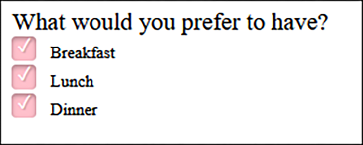
See the code on CodePen.
Conclusion
Instead of using a bare bones HTML checkbox input element, you can apply various CSS styles to it and render it in a visually attractive manner. In this post, we discussed how CSS styles can be applied to customize and override the default UI look and feel of checkboxes. By using a combination of different styling features with checkboxes, developers and web designers can provide users a rich visual experience!
Is your frontend hogging your users’ CPU?
As web frontends get increasingly complex, resource-greedy features demand more and more from the browser. If you’re interested in monitoring and tracking client-side CPU usage, memory usage, and more for all of your users in production, try LogRocket. https://logrocket.com/signup/
LogRocket is like a DVR for web and mobile apps, recording everything that happens in your web app or site. Instead of guessing why problems happen, you can aggregate and report on key frontend performance metrics, replay user sessions along with application state, log network requests, and automatically surface all errors.
Modernize how you debug web and mobile apps — Start monitoring for free.
Source link
