True collaboration to create or maintain a design system is really important to making superb product design, but working with other humans is always tricky. The collaborative nature of a design system can have a lot of pitfalls. In its best form, it is the product of close alignment between developers and designers, but it doesn’t always happen that way.
Some painful memories:
- A brilliant designer I worked with made a gorgeous new set of elements and examples for the company to use, but the other designers in the company ran into many situations where it was more expedient to just copy and remake (i.e., detach) the component. The design system was used less and less since contributing to it was always a lower priority than working on a product opportunity.
- A developer I worked with built the design system components such that the padding in every text input, button, and so on always had to be the same in every layout, leading to awkward results when (for example) a button included double-byte characters, only icons, or just longer labels.
- I did a lot of work on variations of nested components (button bar, toggle buttons, segmented controls) that were designed to use the same style properties as base components (like a button), but the developers I was working with made brand new components for each that didn’t. So, I had to document and specify the many, many identical sets of style values for many, many sets of slightly different components.
The list goes on. I’m sure you have your own examples.
Getting Aligned
I’ve worked in many kinds of teams, in large companies and start-ups, where these collaboration issues kept getting in the way, even (or especially) with very talented and smart individual contributors. Getting aligned with my teammates doesn’t happen automatically or just because we go to lots of meetings. In fact, it’s very easy to start a project together and get pretty far into it before finding out we all had very different ideas about what we were doing. When it comes to complex questions of re-using an existing component vs. making something new or how to stay on the same page without blocking each other, alignment takes practice for any team.
The method for making design systems I’ll talk about probably works best in environments where you are a sole designer (or among a small number of designers) on a cross-functional team, including front-end or full-stack developers, led by a product owner. You might collaborate with other designers in other teams, but this is your “first team.” In this context, you have a lot of freedom but also a lot of responsibility.
You need an idea for nurturing the design system that doesn’t depend on organizational mandates or a specific “process” and one you can apply yourself. After all, a design system is a product with users, and we know how to balance the user’s needs with product opportunities, right? (Yes!)
The approach described below is not common or widely used, but in my experience, it has solved many team collaboration problems, including:
- Eliminating the “hand-off” step: a truly perverse mini-waterfall built into many relationships between designers and developers.
- Ensuring that all designers and developers contribute to the design system as a part of regular product work.
- Connecting design systems to product impact: measurably speeding things up by making more reusable elements and modules in design and development.
A New Use For An Old Idea
What has worked for me in these kinds of teams is a twist on an old idea: design patterns. Elsewhere, design patterns are described as “a toolkit of solutions to common problems” (Refactoring.Guru) or “description or template for how to solve a problem that can be used in many different situations” (SourceMaking). My favorite definition of the concept is from The Timeless Way of Building:
“Even the most complicated, sophisticated things are defined by a small number of composable patterns.”
— Christopher Alexander
You probably don’t think of your own design activities as a “pattern-making” practice, but the idea has a lot of very useful overlap with the practice of making a design system. The trick is to collaborate with your team to find the design patterns in your own product design, the parts that repeat in different variations that you can reuse. Once you find them, they are a powerful tool for making design systems work with a team.
Design Patterns For Design Systems
To see how, first, let’s get specific about the definition of “design pattern” in our product design context. Let’s call a “design element” a small isolated component like a “button,” “chip,” or “card,” and let’s describe a design pattern as a reusable combination of elements for a purpose, a larger module that can do some product experience work on its own.

The elements are the focus of the design systems in most companies I have worked at, and creating them is important and a lot of work. I am sorry to say, however,
For this reason (and the availability of great existing elements from Tailwind, Bulma, Skeleton, or of course, MUI) I have de-emphasized them in my own work, often just restyling elements created by others. The elements are important, and you do need a set that everyone uses, but they don’t do the work of implementing a feature or valuable experience.
You might be thinking that many of these systems do come with combinations of elements, like the “pre-built components” that MUI ships with for a “Data Grid” or the “blueprints” in the Salesforce Lightning Web system for a “List Builder.” Are these the patterns that can help us?
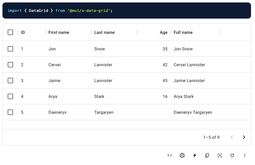
Unfortunately, they are not. These are patterns for sure, but they probably aren’t useful as-is for you. Your product has its own needs. You can use them as a starting point, but in my experience, it takes longer to rework them into something that solves the problem.
To be useful for you, a design pattern has to come out of and express some reusable part of your particular product experience — those parts of the design you find yourself making again and again.
Here are some examples of these useful, product-specific design patterns in products:
- A tile in a TV app, which people use to browse things to watch in lists. This is sort of a “card” pattern, but not really! Every streaming service has its own particular kind of tile and includes different content and controls that suit that product best.

- A dashboard meter in a data-visualization app like Google Analytics. Again, this is sort of a “panel” pattern, but not really! Each part of the dashboard might have different kinds of meters, with titles, category labels, “big numbers,” charts, text snippets, or filtering controls, and the number of elements in a meter varies by app.
- A tree view in a social genealogy app that lets users see relationships between people in a way that adapts for display on small devices. Some products focus on researching your family, others on visualizing relationships.

In each of these cases, designers and developers made their own product-specific patterns. Those patterns are valuable because once a team has defined them, the next project that the team does gets easier. They develop and grow a kit of parts that save them time (and that they can polish and refine). The patterns, not the elements, are the heart of this (better) kind of design system.
Taking this a step further, I would say that a lesson from these patterns is that
Pattern work can be a fully integrated part of both getting some immediate work done and maintaining a design system.
Design Patterns For Collaboration
This kind of design pattern activity can be a direct path for designers and developers to collaborate, to align the way things are designed with the way they are built, and vice-versa. For that purpose, a pattern does not have to be a polished design. It can be a rough outline or wireframe that designers and developers make together. It needs no special skills and can be started and iterated on by all. And collaborating on this form of a design pattern makes it possible for designers and developers to work in parallel.
That’s all pretty abstract. It’s easier just to try an example.
A Design Pattern Story
Let’s say that we’re on a team together, working on an app called “WeTrip.”
The product opportunity comes from the reality we have all probably dealt with: when a group of people or a family travels together, they usually have a lot of trouble deciding what to do or where to eat.
This app makes group travel easier by giving people an easy way to propose and vote on the plan for each day. Instead of having to have long conversations that feature such sentences as “I dunno, what do you want to do?” travelers have a tool so people can have less trouble with the logistics of a vacation or a trip.
The app has some seed funding, but in order to survive needs some “minimum viable” version of itself to prove that it’s something needed and valuable. Everyone on the team wants to get going! Nobody wants to be waiting for a design.
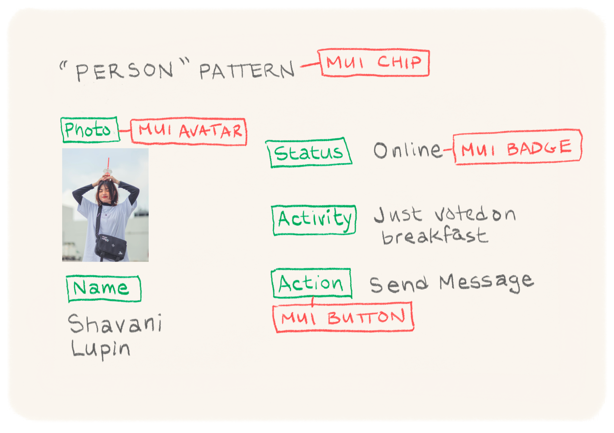
The designers, engineers, and product people all meet and pick the names of some basic objects and their properties. They start with a “Person,” someone on the trip who votes on places to go together for a meal or sightseeing. They sketch things out on a whiteboard.

This is their first pattern.
They move on, describing things like a “Place,” a location someone wants to visit.

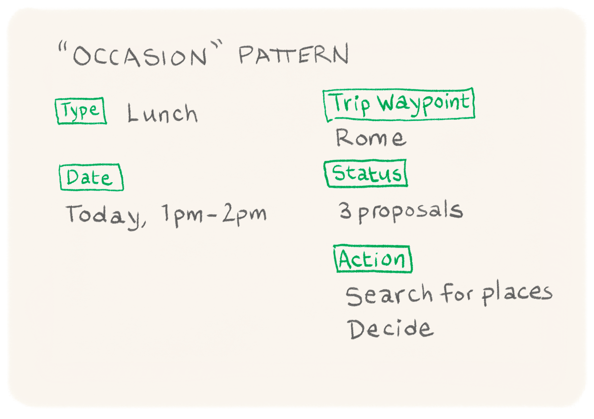
And an “Occasion” pattern, a time the group will do things together like eat, and so on.
The process can work with a physical whiteboard, shared document, collaboration app, or whatever. All that is important is that everyone participates so they are aligned and get the details they need to start work.
With this rough outline, they can see that some of the parts of these patterns are elements they can pull from existing design systems.
They decided to use some restyled MUI elements. Those have defined properties (named attributes of a component, like “color” or “content”) already and will be a nice shortcut. They pull them into Figma (their design tool of choice) and development (a React web app with the MUI library as a dependency). They add some of these MUI elements and their standard properties to each pattern.
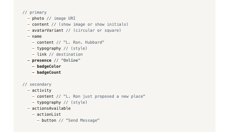
For each pattern, they create a page in a shared Notion document that everyone can edit and update. They start by adding properties from the MUI elements they’ve chosen.

The team combines the properties from the MUI elements with others they’ve sketched out and flattens the properties a bit. They group the properties so that it’s clear what is most important and secondary.

The Figma component will have a different variant for each important property (like activity or actionsAvalable). And each of the element properties will become part of the component in development, of course. In this way, the design and development are aligned — not necessarily completely the same in every detail, but in the ways that matter, moving in the same direction.
The team talks about more ideas for each pattern. Adding properties doesn’t mean they will appear in the final design, just that an idea could be part of the experience, so it’s a low-stakes conversation where final decisions don’t need to be made.

After going through the same process for the “Place” and “Occasion” patterns, the designers and developers have a lot of what they need to make progress. They have agreed on the names of things and what the important properties are. The patterns are defined in a form that the whole team can see and edit, and they start work.
An engineer might stub out a “Person” component like the one below while a designer is sketching it out in Figma with no bottlenecks.


Of course, the engineers figure out that there are some properties they need that they missed at first, like a presence property for a user (after all, in order to know how to show a user notification, it helps to know if that user is using the app right now or a notification would be better). They add that to the document and message the rest of the team.
At the same time, the designers are fleshing out the patterns, using the MUI Figma library where possible, and adding new components where needed. When the team sees the addition of a presence property to the Person pattern, they decide to make a presence indicator and group it with the primary elements. As long as they are keeping the simple pattern document up to date, there is no handoff or waiting around.
Sometimes there are big questions to resolve about the experience. But that is the occasion for the next meeting about what the primary views in the app should be.
The team meets again and comes up with a “People” view (a list of people on the trip, with their status), a “Schedule” view (with a list of occasions and the plan for each day), and a “Proposals” view (to see and propose places to go) — more design patterns. For this pattern documentation, one of the product owners wants to use a wireframing tool instead of an outline (as in the previous example). That’s fine. Pretty much anything works to describe patterns as long as it shows elements and groups (and it’s what a team likes using).
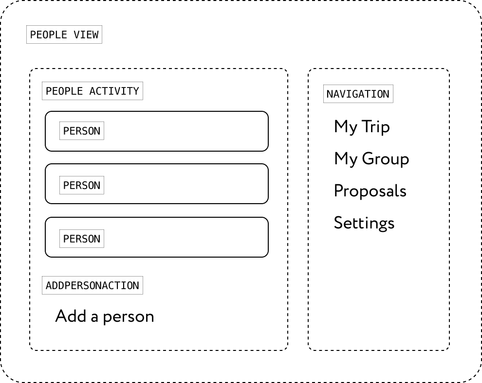


In these patterns, lists of Person, Occasion, and Place patterns are nested inside of each view. It becomes clear that there will have to be two versions of a Person pattern in the app, so the property is added to that pattern.
As they work, if an engineer gets a little ahead of whatever design work exists, they can either use standard MUI components or add a proposal to the patterns document. And designers can add new components if the design starts to need them. All parties are able to make changes without blocking each other.
Organizational Needs
Now, I should pause here to note that there are plenty of teams where this kind of pattern definition is not the primary product definition activity and where other stakeholders (engineering managers and so on) have a say in how the design system is built. Not all teams are small and have as much ownership. Even in larger companies, however, I believe design patterns can be very useful and help make a case for development work (since they show how the design system is helping teams get things done). But in those contexts, design patterns may be small parts of other organizational processes and not as important overall.
In this small team, the struggle to justify time on a design system is for a different reason: there’s a great temptation to put it off because everyone wants very badly to ship something sooner, and it feels “extra.” But every member of the team also knows that the minute they want to iterate on their product, that work will be easier if they have created a design system, and so they keep their good practice going.
Putting It All Together
Once the patterns are established as a way for the entire team to collaborate, final designs and views come together more quickly (because the entire team was able to start together and finish together). The visual design happens at the end rather than being a bottleneck before people can start work.

Integrating Patterns In Product Planning
As working with patterns becomes more established and mature, patterns can be broken out into separate repositories and polished on their own, either as a separate library in Figma or a set of modules in development. If a team gets larger, there might even be an official owner for each pattern who handles bugs or polishes details.
Each pattern properties list can be turned into an API once a module is trustworthy to use in new design and development. In the WeTrip example, the scrolling list of places for today is reused in a search results view when it’s added later.
Since patterns are by their nature only the reusable parts that save designers and developers time, patterns can make working on the design system something with a hard-core product improvement impact. Re-use can be captured as a key metric and a factor in prioritization. The amount of reusable work being generated can be tracked automatically in design and development tools (much like test coverage).
If the reuse of patterns becomes common enough that it needs careful management, patterns can become part of a federated module build process (like what is built into WebPack 5). In short: patterns lend themselves very well to being part of the toolchain of many modern development processes.
Your Turn
I imagine that there are many teams that already practice some of these concepts in the collaboration between design and development, and I am very eager to hear about that! It has been a happy improvement as a method for myself and the people I have worked with, and I would love to hear your stories.
For others, I hope this has been a good introduction to a vision for you and your team of an alternate reality where you can seamlessly collaborate on design systems without as many pitfalls. I wish the best to you and your team as you find your way to such harmony and a happy design outcome!
(cc, yk, il)